
By Lon Riley, DPI Laboratory
As UV printing continues to expand across industries, white ink has moved from a specialty feature to a core part of production. It now is central to achieving consistent results across a wide range of materials, from packaging and promotional products to signage and industrial applications.
At the same time, white ink introduces a level of complexity that many shops underestimate. It is not simply another color channel. It behaves differently, requires tighter process control and often determines whether a system performs reliably in real production conditions.
The Influence of Design Trends
Design trends are driving increased use of white ink. Subtle color palettes, layered effects and minimalistic design elements require more control over how color appears on different surfaces. Designers no longer are working only with white paper. They are working with acrylic, dark plastics, holographic, metallic and textured substrates.
In these environments, the substrate becomes part of the design. White ink provides a way to control the interaction between ink and substrate by creating a neutral base so that colors appear as intended. This especially is important when working with Pantone or brand-specific colors, where even small shifts in opacity or substrate can result in visible inconsistencies. In many cases, white ink is what allows those colors to be reproduced with accuracy across different materials.
The growing use of metallic finishes and specialty effects adds another layer of complexity to print production. This trend has accelerated in recent years with the increased adoption of cold foil transfer across flexographic, offset and digital printing applications. Even in digital printing, five- and six-color presses utilize white ink as a base to create a wide range of striking visual effects.
These effects depend on how light interacts with both the material and the ink. Metallic and holographic materials change how color is perceived. These surfaces reflect light in ways that can alter tone and saturation. White ink often is printed as a base layer under CMYK or spot colors in these scenarios. Without it, colors often appear darker or distorted. With a white layer, printers can control opacity and maintain color integrity. In some cases, partial white coverage is used to allow the material to show through in specific areas. This creates opportunities for unique visual effects, but it also requires precise control over layering and alignment.
The Challenge of Overprinting
Printing color on top of white ink often creates production challenges. Registration between the white layer and the color layers must be precise. Even small misalignment can create visible edges or color shifts. In applications that require white ink, color consistency is tied directly to the white layer, where variations in opacity or thickness can impact how colors appear, especially in subtle designs.
Modern design trends have made this more demanding. Thin lines, fine detail and subtle gradients leave little margin for error. Light tones and neutral palettes quickly can expose inconsistencies in opacity or registration.
Layering also affects UV curing and adhesion. Each layer must bond correctly without impacting the layers around it. This requires a controlled process and consistent set-up.
White ink also behaves differently than other inks. Its heavier pigments can settle, making circulation and agitation essential. It also requires more attention during set-up and maintenance, particularly in environments where equipment sits idle, as this can lead to clogging, inconsistency and material waste.
The Role of Workflow in Consistent Output
As white ink becomes more central to production, workflow becomes just as important as the press itself. Consistency is not achieved through hardware alone. It is achieved through a system that connects file preparation, color management and production processes.
A disciplined workflow helps reduce variability. It ensures that white layers are built correctly, files are prepared consistently and production conditions remain stable. It
also allows shops to manage repeat jobs more effectively, which is critical when working with brand colors or serialized products.
White ink performs better with UV printing. Its ability to cure instantly, print on a wide range of materials and move directly from file to finished product helps create a more efficient and flexible workflow. These benefits are achieved when the process is well controlled from start to finish. Important steps include keeping the ink properly agitated to prevent pigment from falling out of the solution and managing environmental conditions to ensure proper temperature and humidity.
Alternatives and Design Adjustments
In some situations, designers may look for alternatives to white underprinting. CMYK builds or expanded gamut printing can sometimes be used on lighter substrates. In other cases, the natural color of the material can be incorporated into the design.
These approaches can reduce complexity, but they often come with tradeoffs. They may not provide the same level of control or consistency, especially for applications where color accuracy is critical.
White ink remains the most reliable way to achieve consistent color across different materials.
File Preparation Best Practices
File preparation is critical for successful white ink printing. The white layer should be created as a separate spot channel and clearly defined within the artwork.
Designers must determine where white will underprint, overprint or remain visible, with correct knockout settings to avoid gaps or overlap issues. Resolution and edge quality also should be reviewed carefully, along with clear communication between design and production teams.
Designing for UV printing with white ink requires thinking beyond the artwork itself. Substrate, layering order and opacity all influence the final result – making it essential to understand how the image will be built, not just how it appears on screen.
From Features to Systems
UV printing is evolving toward more stable, production-ready systems. Improvements in ink stability, circulation and automation are reducing the challenges associated with white ink, while software is simplifying layering, color and workflow.
The shift is clear. Printing no longer is about individual features, but how the entire process works together. White ink often defines whether a system delivers consistent results in real production.
That consistency drives real business value. Fewer errors, less waste and more predictable output lead to lower costs and higher customer satisfaction. In many cases, white ink performance separates workflows that scale from those that struggle.
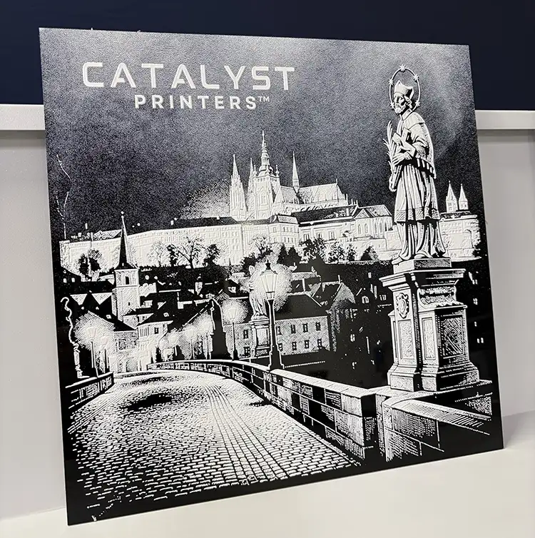
Lon Riley is the founder of DPI Laboratory and the architect behind the Catalyst Printing Platform™, an integrated UV printing ecosystem engineered for speed, uptime and scalable production. With more than 30 years in digital printing, engineering and workflow optimization, Riley applies systems thinking and design thinking to modern UV manufacturing. Through Catalyst Printers, including the Nanos, Aventra and Nexus platforms, Riley develops comprehensive production environments that unify hardware, bulk ink systems, color management, coatings and software into reliable, growth-ready solutions for modern businesses. Riley contributes to industry discussions on UV system architecture and workflow design, drawing from hands-on experience in building and optimizing production environments. For more information, visit https://dpi-lab.com.
Gold Leaf Awards Promotion Blends Digital with Conventional Embellishments
Jeff Peterson, editor-in-chief, PostPress
The Foil & Specialty Effects Association (FSEA) recently produced an oversized postcard, which was mailed to FSEA members and others to promote the association’s Gold Leaf Awards. Several parties were involved with the production of the piece that combined digital 4-color printing with opaque white ink on holographic paperboard and refractive foil stamping. The final result was a spectacular showcase of embellishment techniques.

“Our idea was to combine digital embellishment technology with more traditional foil stamping,” commented Jeff Peterson, FSEA executive director. “The FSEA Gold Leaf Awards recognize achievements across all types of embellishment techniques, so it was important to highlight multiple processes – the combination resulted in an impressive final product.”
The postcard was printed on an HP Indigo 7K using 16 pt SBS Blinking Blocks Holojet® supplied by Hazen Paper. The design was a collaborative effort between FSEA’s staff artists, Hailey Mann and Becky Arensdorf, and FSEA member Tactive (Indianapolis, Indiana), which specializes in print and tactile marketing. Based on the tonal values of the images, Ruby Porter, director of art at Tactive, took the “jungle theme” design and incorporated a white underlayer using a variety of tints. One hundred percent white was added behind the background of the piece while the headline, “Gold Leaf Awards,” had no white underlayer – allowing the gold gradient to fully show through the holographic pattern. The tiger, chameleon and leaves at the bottom of the card had various tints added to reflect their individual tonal values. This created reflective areas on the brighter parts of the imagery and a flatter appearance on the darker elements.
A challenge during production was that, when overprinting CMYK on top of the white layer, the ink did not fully cure on the holographic stock. The surface was scratching easily, which was particularly concerning since it was a self-mailer without a protective outer envelope. To solve this, Tactive added gloss lamination on the front surface of the card that both preserved the appearance of the holographic stock and provided a better surface for the foil stamping in the last stage of production.
Once the postcard was digitally printed and laminated, the cards were sent to Baugh Graphic Finishing House in Indianapolis, Indiana, for foil stamping. A Unifraxion® engraving, supplied by Universal Engraving, Inc., was produced to apply a green metallic foil (Infinity Foils, Inc. MH grade) to the design’s top “jungle leaves.” The foil stamping added movement and detail to the leaves, providing an incredible finishing touch to the postcard.
The postcard recently won the Great Lakes Graphics Association (GLGA) Excellence Award for Single Promotional Self-Mailer, capping a successful project and promotion of the FSEA Gold Leaf Awards. A special thank you from FSEA to all the companies and individuals involved in the project.