


The secret to achieving “wow-factor” on any budget
By Trish Witkowski, president, foldfactory.com
It can be hard to break out of a tri-fold funk and try something a little different. Sometimes different feels too far from normal – requiring too much thought, runway and budget. Maybe different (aka “unproven”) is hard to sell to your internal team. I understand. That’s why I’m giving you my 10 best high-impact folding tricks that are easy on the budget, uncomplicated to set-up and produce, and much more engaging than the everyday tri-fold. We’re going to crawl, walk, run to trying something new!
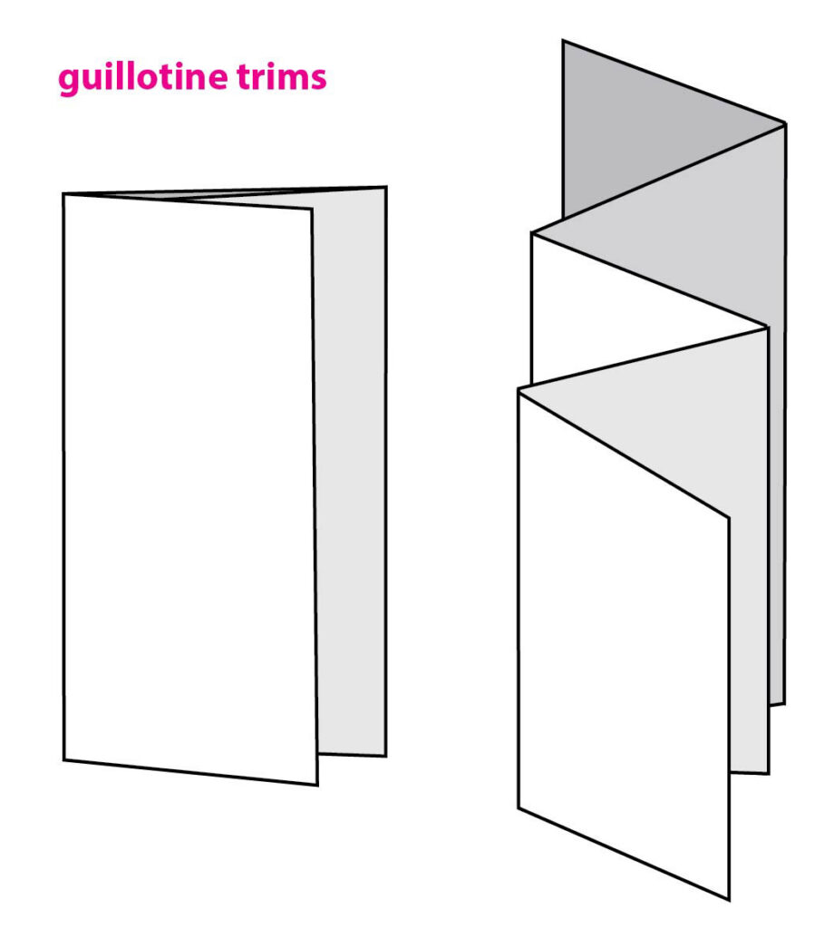
1. Simple Guillotine Trims
Guillotine trims can give the effect of a die without the price tag. It’s amazing what a simple short trim on a cover or fold-in panel can do to even the most basic folding styles. Plus, guillotine trims don’t have to be straight: Add an angled trim to a cover, or even better, along the top of an accordion fold for a waterfall effect.
2. Directional and Format Changes
We get so used to looking at the same few formats every day that sometimes we forget that we can change these formats in even the simplest ways to make them feel and look entirely different. If you don’t believe me, then take your usual 4 x 9 tri-fold and make it 9 x 4 and see what that does to your layout and your mind.
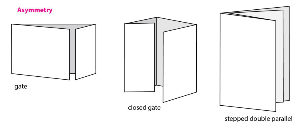
3. Asymmetry
The key to getting attention is to do something unexpected. Asymmetry is a fun way to get a viewer’s interest. Asymmetry works with double parallel folds, gate folds, accordions and many others. On a standard gate, push the break between the panels to off-center. Interesting! Vary the sizes of the panels on an accordion fold or play with fold placement on a double parallel. There’s a lot you can do.
Scan the QR Code for more asymmetrical inspiration: https://www.youtube.com/watch?v=QcdCdzBPDOg[EJ1]
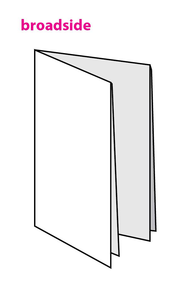
4. Broadside Folds
A folding style can take on a totally different personality when it’s in a broadside format. The broadside option doubles the total area for a spacious, poster-style interior, yet it folds down very neatly into a
tailored package.
Watch the video for my favorite broadside format, the broadside booklet: https://www.youtube.com/watch?v=G1JkZ5fQf9U&list=PL227C113FF159890D&index=57
5. Visual Tricks
Folding offers interesting ways to reveal information. Sometimes the way to create impact with a folded piece when you’re on a budget is to do so with a snazzy visual trick. A basic short trim panel can be lifted to reveal interesting imagery, which can engage the recipient, and engagement can lead to response.
See three image tricks on three different folds: https://www.youtube.com/watch?v=mmsUqnv7mzc
6. Short Folds
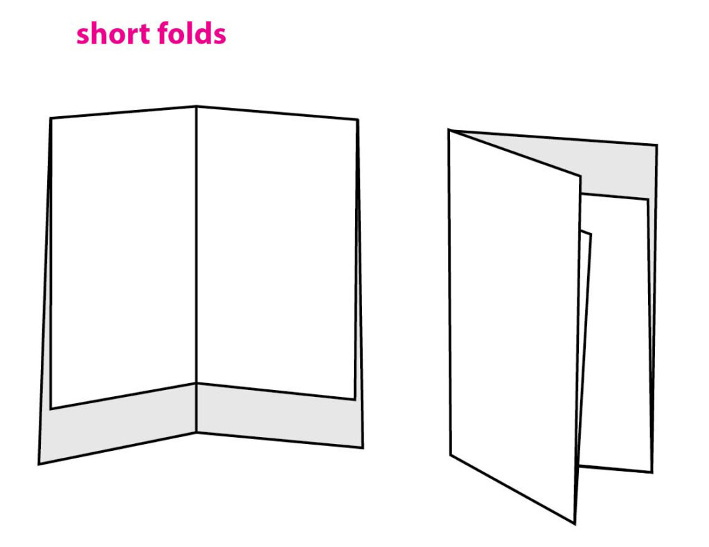
Short folds are broadside folds that do not meet at a flush edge. They’re shortened by whatever length you want, and you get a nice “banner” effect along the bottom of the piece (on the inside or outside). Usually, short folds are designed to lift up, but a fun trick is to design the short fold to pull down instead – an inverted short fold. If that’s not enough, turn the inverted short fold into a glueless “pocket” to hold a sell sheet or smaller brochure. The “pocket” technique creates a nice little package without the extra cost of a die or glue.
7. Diecuts
Everybody loves a diecut. Although not usually in the “cheap tricks” category, some of the simpler forms of diecutting can happen inline during the print finishing process. Sometimes a simple slit and tuck or rounded corner can make things interesting. Tip: Ask the printer about its existing die inventory – you may be able to save money by utilizing a “pre-enjoyed” die.
Scan the QR code for an example of cut corners: https://www.youtube.com/watch?v=2AVjvAxDG-A
8. Extended Panels
The opposite of a short trim is an extended panel. In comparison, a short trim interacts with the content on the panel beneath it, whereas an extended panel usually is an extension of the back cover. An extended panel can create a fun graphic teaser, or a tab for information or branding. Long panels work well for accordion folds and double parallel folds because they have open trailing edges.
9. Interaction
If you can get viewers to interact with your printed piece, that’s a major win. Whether it’s through an interesting opening order and reveal, or a little diecut window that they have to open, a zip strip or a sticker they have to place, think about creating an experience that pulls viewers in and gets them involved. It’s a proven technique that gets results, and it doesn’t have to break the bank.
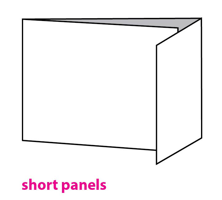
10. Short Panels
Short panels, or flaps, are used commonly in brochures for business reply cards; however, there are many other creative opportunities for panels that are drastically shorter than their companion panels. For example, a tri-fold where the fold-in panel is designed as a short panel can be a coupon, a call-out testimonial or a fun way to use a visual trick (see Tip #5). Change the folding order so that the fold-in panel actually is on top of the cover, and it becomes an opening mechanism.
Come on, give it a try!
I’ve now given you 10 ideas to explore, and at least ONE of these should catch your interest. If you ask me which of the 10 tricks is my absolute go-to, it’s #5, visual tricks. Combine with interaction (trick #9) for added intrigue. I love a good peek-a-boo window image trick, or a zip strip reveal of an image or message. You can do it! In the meantime, if you’re looking for real-world examples to get inspired, there are lots of great ideas at the Foldfactory YouTube channel. Start with these five low-budget folding ideas: https://www.youtube.com/watch?v=n29YGPUyDTg
Trish Witkowski is president of www.Foldfactory.com, curator of the world’s most exciting collection of folded print and direct mail samples, and host of “60-second Super-cool Fold of the Week” on YouTube. Witkowski also is an instructor for LinkedIn Learning and the author of several books on folding and direct
mail strategy.
Gold Leaf Silver Award for Unique Fold Inspired by Fold Factory
By Erin Judge, managing editor, PostPress
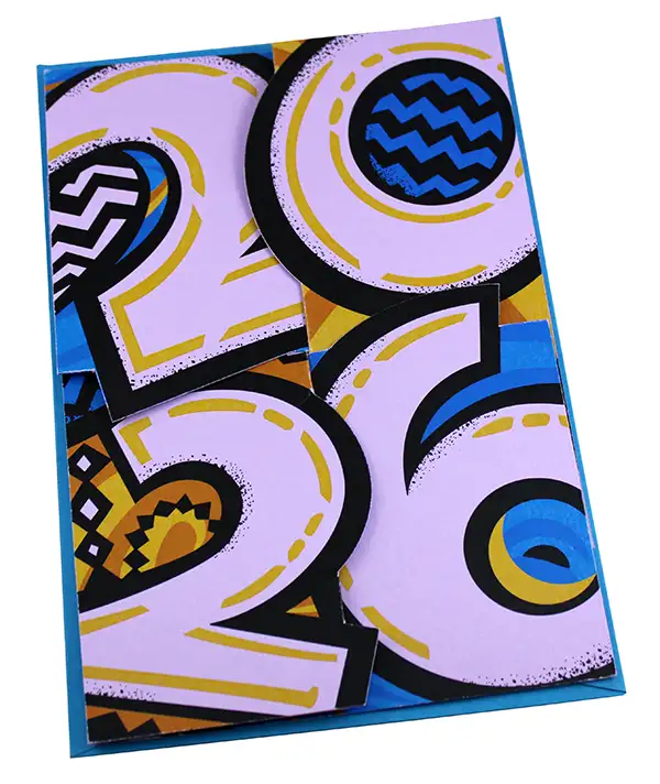
The Foil & Specialty Effects Association (FSEA) recently awarded Silver for “Unique Fold” at the 33rd Annual Gold Leaf Awards to Molly McCoy Graphic Design, Oakland, California, for its Happy New Year 2026! card. Designed to “illicit delight in the recipient while showcasing the unique skills of the studio,” the card features bold artwork and lettering, hand drawn by McCoy and inspired by the theme “Let’s Get Loud.”
“This yearly expression was a very good exercise in engineering with paper, printing and image,” said McCoy. “This job is an opportunity to stretch design muscles and execute some unusual undertakings with our printer, JP Graphics.”
Inspired by the “twist fold,” as featured on Trish Witkowski’s Fold Factory, the structural design of the card incorporates a twist-fold device that securely nestles and locks the panels together. When the recipient pulls the corners, the card releases and dramatically “pops” open.
The card was printed digitally on a Xerox Iridesce press, using four-color process plus white on Lessbo Amethyst 83 lb cover, digitally diecut on the Zund and then hand folded. To properly match the “jovial” tone McCoy wanted to set for the card, the designer worked with Santa Clara printer JP Graphics through various production hurdles, including experimenting with numerous layers of white to ensure the graphics made a strong visual impact on the colored stock. Additionally, the cuts and scores for the twist-fold mechanism required exceptional precision to ensure the panels aligned and locked together properly when constructed from the heavier-weight cover stock.
“We were thrilled with the results of this year’s card,” said McCoy, “and its ability to hold the recipient’s delight in the forefront and provide warmth and encouragement, along with a bit of a surprise – appealing to a broad spectrum of clients from business industries to activists to nonprofit entities.”