By Trish Witkowski, CEO, Foldfactory
Print is an opportunity like never before. It always has been a proven and powerful medium, but after a full year of being forced into virtual-only experiences, print media and multisensory experiences are a deeply desired break from the monotony. According to Google, only 10% of people’s media interactions are non-screen-based these days – and the more time people spend on their screens, the more they value the time they’re not. So, now is the time to leverage print for all it’s worth.
The following are nine categories for printers and finishers to think about. Choose one technique at a time or combine a few together if desired. It’s important to note that piling on extras does not necessarily make a piece more effective or compelling. It’s kind of like when Photoshop came out and everyone was making complex photo montages using every tool and image effect because it was there. The same principal applies to value-added print: “Just because you can, doesn’t mean you should.” A bit of creative restraint, skilled application and a strong concept are the keys.
Create texture
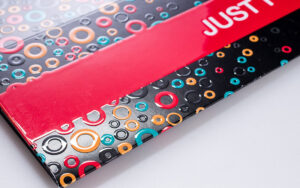
Touch is one of the strongest senses, and whether it’s an embossed pattern or a press coating, the ability to distract and engage people with touch is one of print’s greatest strengths. There are so many great ways to make texture – for example, raised digital effects and textured press coatings, laminate films in soft-touch or high-gloss and a world of other unique effects. Printers can create an overall texture or even mimic a physical surface like leather, woodgrain, rubber, etc. Some brands even are developing proprietary textures to create the look and feel of their products.
Textured paper, layered textures from die or laser cutting and embossing/debossing also are great strategies – and don’t forget the envelope! When carrying a handful of mail, recipients likely are going to choose the interesting mail first. Texture applied to the outside of the mailer will grab their attention before they even realize that their senses are being manipulated.
Engagement devices
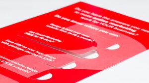
Think about fun ways to get someone to open, lift, peek, slide or tear-off. Pique their curiosity with perforated windows to peel and lift. Add a belly band to make it feel special and exclusive. Tip-on a coupon, a gift card or a keepsake for them to remove. Make an interesting way to get into the envelope, like a zip strip. Zip strips make a fabulous noise when they rip open and are a lot more fun than a basic envelope flap. Zip strips also have been used on bound materials where recipients zip open the cover to access the contents and as a way to get into folded self-mailers as well.
Great paper
Intentionally choosing papers that are different from the norm in some way – brighter and whiter, smoother and glossier, colored and textural – can send subliminal messages to recipients. Leverage paper choice (and weight) to communicate sophistication, eco-consciousness, style and personality. Designers even can deliberately choose low-budget papers to look “bargain basement.” It all depends upon what they are trying to accomplish from a brand perspective. Properly chosen paper, complemented by a strategic design direction, can support the message, the brand and the offer.
Add dimension
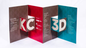
Often when thinking about adding dimension in print, our mind goes to elaborate pop-ups – and we think about the budget and hand work and give up. However, there’s more than one way to create dimension in print. There are ways to fold paper to expand when opened. Even a parallel diecut across the fold can turn into a popped-out dimensional box shape. Easy!
Inks and coatings
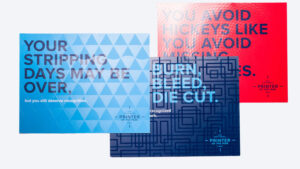
Choosing beautiful inks and coatings is one of the easiest and most cost-efficient ways to add pop to print. Many designers don’t know all that’s possible, since this category has exploded in the past few years. It is well worth providing some resources and samples of what varnishes, coatings and specialty ink techniques printers can provide for digital and offset printing. Designers would be thrilled to know that white ink, transparent and raised ink, spot colors, metallics, fluorescents and specialty coatings are within reach for their short- and long-run jobs.
Add shimmer
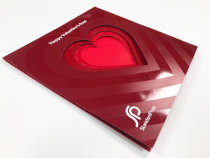
Things that sparkle tend to catch the eye and create a sense of importance. Depending upon how it is used, shine also can make materials feel expensive and exclusive. What is neat about adding shine is that printers and finishers really can meter it out to create the effect they’re looking for – from quiet sophistication with a light-touch application to “Look at me!” So, think of adding shimmery press coatings, foils and metallic inks into the mix.
Cover diecuts
Diecutting is a huge category, and there are so many ways to do it. One approach is to narrow it down to the most exciting and impactful place to add a diecut: The cover of a book or brochure. From a shaped cover to cut-out letters to a diecut that is on multiple panels and layered to create depth and interest, focusing on the cover is an easy way to add a touch of “Wow.”
Scale
Big is “big” these days, as marketers are leveraging larger sheet sizes and creative formats that allow for maximum impact and real estate for eye-catching graphics. Size also is a tool that can be used to create presence, influence and larger-than-life brand experiences. Oversized brochures, newsletters, posters and mail have a distinct opportunity to grab the viewer’s attention and hold onto it. Alternately, something small can feel special, tucked into a larger piece and discovered along the customer journey.
Shape and format
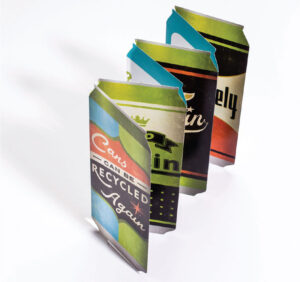
Printers and designers are so used to looking at the same few formats every day that sometimes it’s easy to forget these formats can be changed in even the simplest of ways to make them feel and look entirely different. A great modification is to change the perimeter shape of a classic format like the accordion or the tri-fold. Round the corners, reshape it to a circle or hexagon or mimic a real object like a wine bottle or a shoe. If low on budget, get creative with the guillotine trimmer and angle chop a corner or one of the panels for a custom diecut look.
Creative specialty formats that present in unique ways can be impactful and fun, too. As for which to choose, make that decision based on the content and the desired viewer experience. Different stands out, and the opportunities are endless. If looking for a place to start, check out the 30 Designer Folds at Smartpress.com.
The sample conundrum
Now, for everyone out there reading this and saying “My clients don’t do these types of projects, so I don’t have any good samples to show” or “My clients do some of these things, but we’re not allowed to share their work” – this is called the Great Sample Conundrum: printers and finishers need great designs and willing customers to get the samples, but to get those customers, they need great designs and samples to showcase. The solution is to invent reasons to create inspiring samples to share!
A great example comes from Standard Press in Atlanta. The company designed and produced a creative valentine to send to its customers to show its appreciation (“We love our customers”). In sending it, the company accomplished two things. First, the company surprised its customers with a valentine and made them feel appreciated. Secondly, it showed off a creative snake fold format with layered diecuts and special heart-shaped, dull and high-gloss UV print effects. It was a brilliant move that made a big impression. So, a suggestion is not to wait for the great projects – make the great projects.
Pro tip: If a shop does not have mad design skills in-house, consider investing in a professional graphic designer who can produce some really nice designs. Designers respect good design. They ignore bad design – even if it has cool print effects on it.
Finish with a BANG!
Hopefully this exercise in engagement and value-added print has given printers and finishers some fresh ideas and strategies to add to their repertoire. If looking for more real-world inspiration, check out the blog and the Fold of the Week database at Foldfactory.com, and the Foldfactory YouTube channel (youtube.com/foldfactory) for hundreds of creative print ideas to watch.
Trish Witkowski is an industry veteran who specializes in creative mail formats and direct marketing solutions. A self-described “analyst with great presentation skills,” she is known for her research in areas of direct mail, marketing strategy and folded formats. For more information, visit www.foldfactory.com.

