by Trish Witkowski, foldfactory.com
Everyone loves the specialty folds that I share on my “Fold of the Week” video series – they’re so creative! However, I get the same comment over and over when I’m out in the field: “We love all of the ideas you’re sharing, but we’re never going to get to do any of them. We don’t have the budget.”
Hey, I can relate. I lived the agency life for six years, and I truly understand that often the desire to do something exciting is squashed by the reality of a super-slim budget. The good news is that I’m always in hot pursuit of low-budget wonders. To me, a low-budget wonder is something that feels especially engaging, but comes with an economical price tag on the production side. I love sharing these types of things, because I enjoy proving to people that some of the most powerful formats come in low- to moderate-budget packages. The other reason I like the low-budget stuff is that anything can be done when the budget is generous, but it takes some real smarts to do something exciting when there’s not much money to throw around.
It was actually very hard to decide what to feature, as my collection is so large and I have seemingly endless solutions to choose from, but I decided to focus on clever options for folded self-mailers for this article. Each of these solutions also was featured on “60-Second Super-Cool Fold of the Week,” so I invite you to visit the videos to really get the full experience.
Dual-purpose freemium self-mailer

This first format (Photo 1) is great for non-profits and fundraisers. When the objective is to raise money, often the strategy is to include freemiums, or free token gift items, as a motivator. The freemium, often address labels, calendars and the like, becomes an extra expense in the campaign. This particular format uses a simple and ingenious idea that makes the folded format itself become the gift, so to speak.
Think of it like a tri-fold where the fold-in panel is trimmed a bit short and fugitive-glued on two edges to form a pocket. The pocket holds the letter and response mechanism, and then when you remove these items and peel open the pocket, the interior of the format becomes a commemorative poster. It’s an amazing, fun and practical idea that truly does double duty.
Glued gate fold self-mailer

Now that I frequently speak about mail ideas and strategies, I am getting a lot of questions about simple mail solutions that go a bit beyond the basic card/postcard format. This piece (Photo 2) is as easy as two panels glued together at the edges. A fun zip strip – one of my favorite mail engagement strategies – is embedded down the middle, enticing the recipient to tear it open. Once torn, the zip strip releases two interior gate panels that reveal the marketing message. With one easy pull, you’re giving the recipient a fun and interesting way to get to the content. The powerful “card” mailer is simple, mail-friendly and loaded with creative possibilities.
Poster fold self-mailer

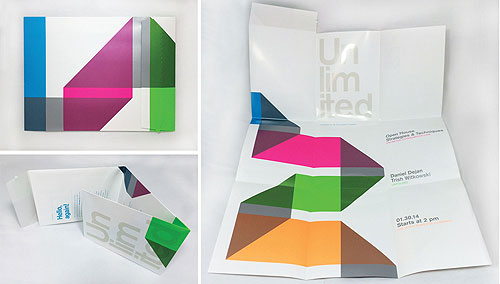
Now, let’s go large and blow things out of the water. To me, it’s really inspiring when I see a format that is very efficient to mail, but also offers a tremendous amount of real estate for graphics. This format (Photo 3) is, in my opinion, a stroke of genius. They figured out that with the addition of a small flap with a zip strip opening mechanism (there it is again!), they could take a huge poster, fold it down and it would self-mail with style.
Pull the zip strip to open, and the piece takes on a tri-fold into tri-fold poster fold format. This sample also is really well-designed and uses wonderful paper and printing techniques to give it pop. Great stuff.
Pull-tab self-mailer

I have one more for you, and this is another “super card” format (Photo 4). Again, two panels are glued together at the edges, but this time there is a perforated pull tab that is lifted to reveal the interior contents. What I like about this is that it could have been two panels wafer-sealed shut, but instead they chose an interesting way to reveal the content – in this particular instance, little tipped-on coupons. Clever little opening mechanisms can be truly irresistible, and that’s what you want.
Tip: Peek-a-boo windows add engagement
One thing that all of the samples have in common is that they utilize techniques designed to get people engaged or interested in the piece. If you’re looking for something simple to get started, add a peek-a-boo window.

This can be done with any folded format – all you need is two panels to glue together. This sample card mailer (Photo 5) from Rider Dickerson in Chicago, IL, glues two panels together to create three peek-a-boo windows that reveal QR codes which jump to promotional videos for a college. This piece was responsible for drawing a sold-out crowd for the event it was promoting.
I hope these “low-budget wonders” have given you some great ideas for your own promotional opportunities and also for your clients. After all, you don’t have to spend a fortune to get a great result.
Trish Witkowski is chief folding fanatic at foldfactory.com. An educator, author, speaker and award-winning designer, Witkowski specializes in creative solutions for mail and marketing. She hosts a popular e-video series “60-Second Super-Cool Fold of the Week.” Witkowski has an MS in Printing and a BFA in Graphic Design from RIT.

