by Brittany Willes, editor. PostPress

As little as 10 years ago, the Chicago Blackhawks hockey team was considered an afterthought – even in its own hometown. Unfortunately for its various sports teams, Chicago has long been home to one-year wonders, and the Blackhawks’ chances of winning another Stanley Cup were considered practically nonexistent. This changed in 2010 when the Blackhawks faced the Philadelphia Flyers, defeating the Flyers four games to two and winning the team’s first cup championship since 1962 – one of the longest active Cup droughts in National Hockey League history. Luckily for Blackhawk fans, this was only the beginning. The Blackhawks would go on to defeat the Boston Bruins in 2013 and, most recently, the Tampa Bay Lightning, once again claiming the Stanley Cup for the 2015 season.
While winning three championships in six years is certainly noteworthy, 2015 was doubly special for the Blackhawks as it signified the team’s first championship on home ice in 77 years. Clearly, a celebration was in order – one that would be kept alive for years to come with the publication of commemorative book detailing the team’s journey from invisible to indivisible.
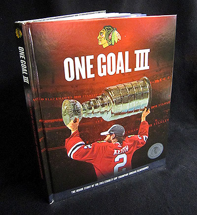
Against a deep red and black background, the headline “ONE GOAL III” stands out in stark white lettering. Below, a solitary figure stands with his back to the viewer while raising a gleaming trophy above his head in obvious triumph. The glimmer of the silver trophy is brightly complemented by a silver banner with further white lettering proudly declaring “The Inside Story of the 2015 Stanley Cup Champion Chicago Blackhawks.”
After a 2-0 win in the final game against Tampa Bay, it could only be fitting that the cover of the team’s 2015 championship book be as distinctive and memorable as the game itself. “Our main objective with the cover was to create something that would be impactful, timeless and reflective of the team’s achievement,” explained John Sandberg, creative director for the Blackhawks. “We wanted to showcase the power of the moment of the 2015 Stanley Cup clincher.”
In creating the book and its memorable cover, Sandberg reached out to Universal Bookbindery (UBB), San Antonio, Texas. Casebound using PUR adhesive, UBB used a book block produced on a Kolbus Ratio perfect binding line with PUR glue. The printed cover wrap was applied to the board on a Kolbus DA-270 high-speed casemaker. The embossing to register then was done on a Sheridan four-post embossing press. Finally, the book was cased in tight-back on a Kolbus fully-automated casing inline machine.
“We decided to use embossing on the cover from the very early stages of the process, Sandberg remarked. “We knew that embossing certain elements on the front would add an extra visual element to the design. We have used embossing on a variety of other print projects in the past, so we knew how to incorporate it into the design in a way that would only enhance the final product.” In addition to adding an extra visual element, the cover’s embossings also added a unique production challenge.
While UBB has created many similarly produced books, special to the championship book was “printing on a silver met polyester film which required the embossing die to register to the image of the player holding up the Stanley Cup after it was wrapped onto the heavy binding board,” remarked Trip Worden, president of Universal Bookbindery.
For the embossing, a 80# silver metallic poly paper was selected in order to give certain areas, such as the Stanley Cup on the front, a little extra shine. However, the designers did not want to have the stock overtake other areas. To avoid this, “we printed a white opaque at varying opacities before printing the cover art on top,” stated Sandberg. “This gave us some flexibility to see how much of the silver could show through on other parts of the cover, while still keeping the integrity of the overall design intact.”
The cover is not the only impressively detailed part of the book. The inside pages abound with colorful photos, interviews, player profiles and game recaps. Just as impressive are the several tip-ins placed strategically throughout the book: a replica of the home game ticket, a magnet bearing the Blackhawks logo next to the Chicago skyline, several holographic photos depicting some of the most exciting moments from the game, a team poster and even a miniature championship flag have all been incorporated into the almost 250-page volume. Finally, secured to the inside back cover via a thin plastic covering is a Blackhawks DVD. Every detail has been carefully thought out to provide fans with the ultimate piece of Blackhawks memorabilia.
According to Worden, the books creation required extensive collaboration between Sandberg, Jamie Carter with Rock Communications and Lotus Creations, which made the sculpted embossing die. “Thanks to this collaboration and all the work done in advance, the process was able to run smoothly and achieve the desired results,” said Worden.
The final product exceeded Sandberg and the designer’s original hopes for the cover from a production perspective, tastefully incorporating a variety of techniques to enhance the original design. Furthermore, the book received recognition during the 2016 FSEA Gold Leaf Awards. In a fitting tribute to the team the book is meant to commemorate, the championship book received the Gold award for best use of foil/embossing in the bound book category.
Related Stories
- Candy-Coated Brilliance: Thoro Packaging Sets New Standards in Folding Cartons
- Purple Pride Wins the Gold

