by Brittany Willes, contributing editor
PostPress
Everyone knows the old adage: the devil is in the details. This was especially true when it came to designing business cards for 13 Devils, a Poland-based company focused on design and conceptual ideas for entertainment and creative industries like television, film and gaming, as well as for cosplay community and other individual customers. With a name like 13 Devils, an appropriately sinister – and stylish – business card was a necessity.
“13 Devils is a company created by a few friends interested in cosplay, fantasy and sci-fi games and themes. Naturally, we wanted to reflect these motives,” stated Adrian Chytry, creative designer for Foxtrot Design Studio. “Additionally, we wanted to create a bold and impactful design to show that these are serious and capable people committed to creating beautiful products. The name itself gave us the initial idea for the direction. The motif of the devil in the logo, typography in the style of a hard rock band from the ’80s, stylish ornaments and black and gold foil for a premium and classy look – everything connects together to create a stunning final look.”
Along with the stunning design, part of what makes these cards unique is their unusual thickness. This is a result of the cards being constructed in two layers. The outside layer was printed using Antalis paper stock – black PLIKE 300g/m2 cover. The PLIKE stock allows for a distinct, rose-petal feel. The inner layer was done using Curious Metallics 300g/m2 stock. The two layers were tri-plexed together to create a distinct card consisting of two black outer layers with a white inner layer.
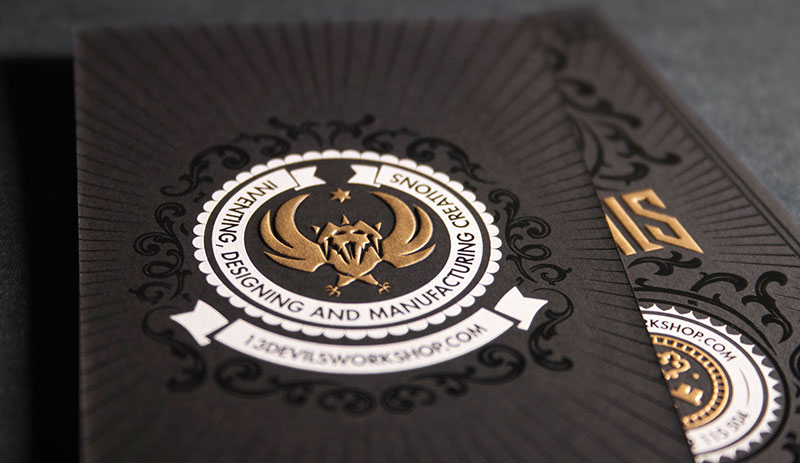
 While the tri-plex design helps the card stand out, it’s the foil and embossing that elevates it. The main logo – the devil and surrounding decorations – were drawn by hand, digitized and the very fine details were added using Illustrator. According to Chytry, when it came time to print the card, screen printing was selected as the best method.
Three different colors were used for the design. The background pattern was created using black foil on the black paper stock. This creates a bit of shiny contrast against the duller black of the paper. The white foil used for the contact information provides more contrast and makes the necessary information easy to read. Finally, a gold metallic ink was used for the company name and devil logo.
Once the foils and metallic inks were applied to the card stock, the next step was embossing the cards. This step represented a very meticulous and precise part of the process as it was tricky to align the print and embossing together given the highly detailed graphics.
“The embossing process was quite difficult,” said Chytry. “The level of detail on the card is exceptional and the overlapping of the embossing with the screen print had to be perfect. It took a lot of precision and craftsmanship, but at the end the additional effort was worth it.”
Despite the challenge of keeping everything perfectly aligned, the 13 Devils business cards turned out beautifully. “Everybody loved them. The production team was thrilled, and we were more than happy with the final look,” said Chytry. “To this day, we get a lot of questions and comments regarding this project.”

