
by Katy Ibsen, managing editor
PostPress
First impressions mean a lot, especially for print magazines and catalogs. A cover image carries significant responsibility, capturing enough of a reader’s attention to be picked up. Iconic artwork isn’t going away, but many publications now are incorporating texture and specialty effects on covers for added impact.
“Neurological studies show that humans gather their information through all senses, and people remember things longer and more clearly if they address more than just the eyes,” said novum Editor-in-Chief Christine Moosmann. “Consumers quite happily spend more money on packaging that is well designed and uses a paper with interesting haptics or elaborate printing.”
novum is known for eye-catching covers that feature a variety of applications, but the magazine isn’t alone. Overwhelmingly, consumer, business to business (B2B) and catalog publishers are seeing embellishments as a critical value-add to differentiate themselves from competitors or to elevate their brand.
PostPress explores this trend by visiting with a few magazine publishers that have found print embellishments beneficial to their brand awareness.
Worth magazine
 Worth is a global media brand connecting to an audience that embraces worth beyond wealth. “Worth informs and inspires a community of affluent, influential and aspirational individuals to be their best selves,” said Amy Petriello, art director.
The quarterly print magazine regularly uses spot gloss for its masthead/logo and dull UV on the balance of the cover to create a matte effect.
“We almost always feature an original illustration on the cover and have [art] submitted to us as vectors, so that the illustration can have spot UV applied on portions we’d like to highlight,” she added.
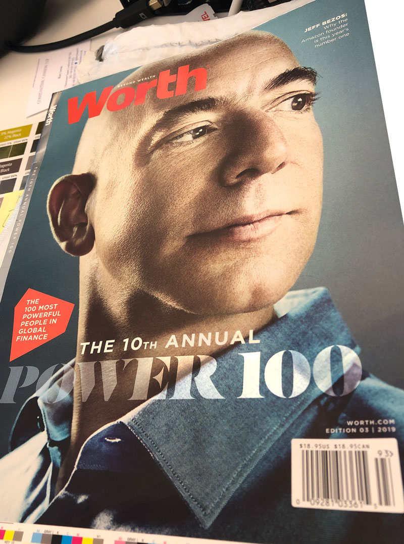
Worth’s “Power 100” edition, recently released, features a 4-color silver metallic ink with gloss UV coating.
“This is our 10th Annual Power 100 issue, about the most powerful people in the world of global finance, so it is a special issue that we wanted to celebrate,” she said.
According to Petriello, postpress applications have helped to emphasize Worth’s covers, which showcase beautiful lasting artwork, intended to be kept, displayed on coffee tables and collected.
novum – world of graphic design
 novum, a cult design magazine, was founded in 1924 under the name of Gebrauchsgraphik. Published in German, English, French and Spanish, novum is read by designers all over the world.
“Now in its 95th year, novum has certainly written design history and still has a very high standing in the design community,” said Christine Moosmann, editor-in-chief.
As one would expect, a design magazine strives to set itself apart and novum doesn’t disappoint readers with its captivating covers, featuring many variations of specialty applications. In 2000, the brand began experimenting with fine papers and various print finishing techniques on the cover.
“In the beginning, we just did it for fun, but we got a strong response from our readers. They loved the papers, the finishings and the inspiration they got this way,” said Moosmann “Eventually, paper manufacturers and printers realized that our covers were a great marketing tool for their products and services. So, whenever a new paper or a new printing technique came up, we got the chance to try it out on our cover – designer’s heaven!”
While Moosmann believes specialty effects are an important element of communication today, they can be overused.
“It is important to use papers and finishings intelligently,” she said. “A lot of ‘bling bling’ foils do not necessarily make a successful product. Sometimes, a rough paper combined with an unusual printing technique will do the trick. It is important to design with care; readers and consumers can sense that.”
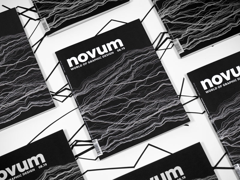
A sampling of novum covers include foil on the entire cover, diecut stacking dolls and even a cover which featured a playground for stickers found inside the magazine. The cover of the August 2019 edition showcased a highly pigmented silver on deep black cardboard for a visual and textured effect.
mg
 Serving the cannabis industry is mg magazine, a B2B publication covering retail, business and branding. According to its publisher, Darren B. Roberts, the magazine’s mission was to create a reflection of who is really behind the industry, not just on a manufacturing level, but on a legal level.
“We strive to put out an image that represents the level of professionalism, skill and education [in cannabis],” he said. That mission allowed the magazine to be more creative.
“Most B2B publications are not spending money and exploring what can be done in print – some industries don’t require it,” he said. “I think that for B2B, service companies or products, whether they be printed products, panels or whatever it is they are putting out there, it’s important that they reflect the personality and the people of the industry. And in this particular industry, you have a mix of professionalism and creativity.”
mg has achieved respect within the cannabis marketplace, elevating itself as a creative, yet trustworthy resource for industry leaders. In part, it has reached that designation as a result of its attractive covers.
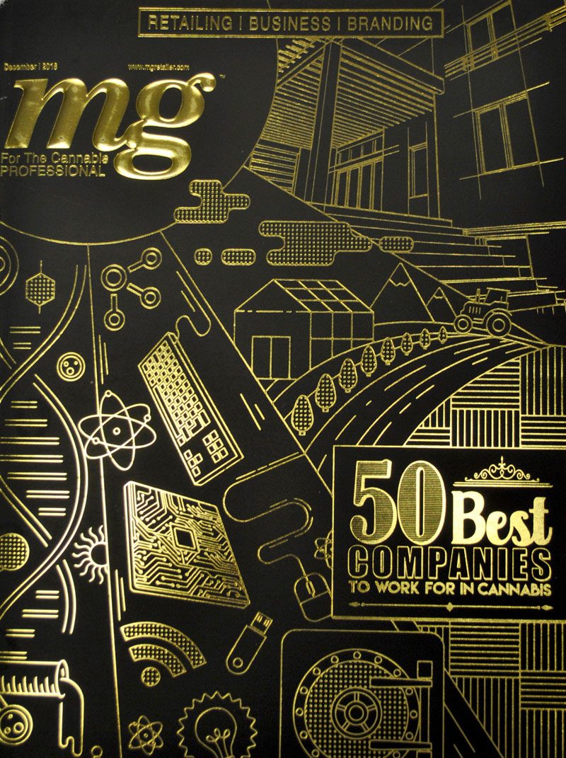
An edition that covered the vape sector featured a multi-layer emboss with both high and dull varnishes. The “50 Best Companies to Work for in Cannabis” featured a matte varnish, gold foil and trapped emboss. Roberts explained that mg wanted to represent all the various sectors of the industry on the cover, which was designed by The Hybrid Creative.
“Applications really do have an impact. And it does matter,” said Roberts. “Just the coating that you use on the cover will keep somebody reading the publication longer … and it’s all on a subconscious level. It’s very fascinating.”
Sustainability with Ecofoil®
Mark Kempster, Managing Director of Crystal Press Ltd, has seen brands and publishers wanting more and more foil embellishments, with multiple colors and more complex foil designs. To achieve this, many have used a metallized polyester (MetPol) material and printed over the top. However, sustainability has become an serious issue for MetPol users due to it being a PET laminated stock which cannot be recycled. As a solution to this issue Crystal recently launched its range of Ecofoil boards that apply the foil without the need for the lamination process. The Ecofoil board range contains no PET or any other plastic product so it is 100% recyclable and can be branded as such.
“In my opinion the use of MetPol is one of the single biggest issues facing the packaging industry and it seems likely that it is only a matter of time before there is a huge backlash against packaging materials that contain MetPol. However with the introduction of Ecofoil there will still be a cost-effective and practical way to produce foil-based packaging in all run lengths,” stated Kempster.
The Ecofoil process also provides an economical way to add a metallic foil to other pages within a catalog or magazine beyond just the cover. Crystal has one customer who has used hot foil stamping on its covers for several years; however, switching to its Ecofoil process has allowed them to add foil within the inside pages of their high-end brochure at a feasible cost.
“Ecofoil has created a massive change in our business,” concluded Kempster. “I believe it will become the biggest part of our business within the next 12 – 18 months.”
From the Printer With Love
 Printers are equally in tune with the emerging trend of distinguishing covers. Chris Haag, director of sales at Royle Printing, spoke to the printer’s role in helping deploy embellishments to create unique catalog covers – which must stand out among other printed matter.
“We have actually seen an uptick in interest in applying creative covers in particular to printed materials, whether that’d be in catalog form or magazine form,” he said. “Both of those segments are exploring it, and there has been a recognition that print provides a much more tactile delivery of information than electronic means.”
Royle’s capabilities include gloss and matte UV in line on the web press; gloss, dull or satin varnish on sheet-fed press; soft touch, UV or aqueous coatings in line; strike through (such as spot gloss UV) with a dull varnish; and reticulated strike through UV.
According to Haag, cost of applications is a factor for many publishers, suggesting that embellishments often are used for annual, anniversary or special issues.
 “You’re going to see those [applications] in a higher value catalog that is displaying products that are higher dollar volume, and in particular those catalogs are meant to have a one-year shelf life. So, we see them a lot in those applications,” he said.
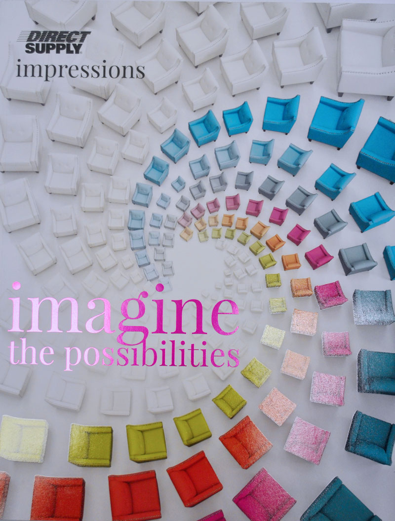
Examples of catalogs printed by Royle include Direct Supply and Diesel Forward.
In general, Haag has seen an increase in applications over what was used 10 years ago. As for the next 10? Hopefully, more of the same.
“People are recognizing that print is really mission critical to a multichannel approach. And so, even brands that might live and start online are coming into print. And then, once they get into print, they’re looking for ways to stand out in the mailbox and raise response rates, too.”