By Brittany Willes, editor, PostPress
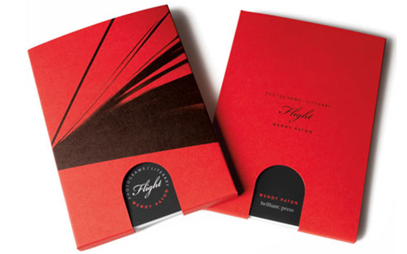
When the medium chosen to display a work of art becomes a work of art itself, something special has occurred. This is the case for artist Wendy Paton’s limited-edition photobook Flight. Boldly displaying Paton’s undeniably striking photogram-style images, the book is an accordion-style masterpiece as stunning as Paton’s photos.
Designed by Phil Unitek of Unitek Design and produced by Brilliant Graphics, Flight first draws the eye thanks to its bright red cover sleeve, which features an antique finish. Created using 130 lb. Color Plan stock, the sleeve features a diecut opening at the bottom that not only gives a hint of the book within but also acts as a push-tab for removing the book from its eye-catching sleeve. Once removed from its sleeve, the book opens accordion style to showcase dramatic, black and white photos displayed on either side.
To create the unique piece, Brilliant Graphics used offset printing, selecting Opus Dull 100 lb. cover stock. A spot gloss varnish was applied at 400-line screen using two shades of black and two shades of grey to create the brilliant contrast of the photographs. When the printing was finished, the sheets were scored using letterpress. Because the project was designed as a limited edition, only 300 copies of the book were printed.
Given its unique layout, once printed the book required special handling when it came time for the binding to be done. As a result, Brilliant Graphics reached out to its long-time collaborator Roswell Bookbinding. “It was quite a challenge, even for us, and we do challenging work every day,” remarked company President Mike Roswell. “Everything was done by hand because the material was so fragile, so easy to mark or indent. We only had three people that we let work on it, and it was white glove throughout the entire process.”
The accordion style of the book meant that the front and back covers had to be mounted to .100 pt ThruWhite Lamitech Board, lending the book some weight and stability. “The registration with the board had to be perfect,” said Roswell, “The text was cut separately from the front and back boards to avoid the risk of having any indentation on the text. This required extremely precise cutting – we had to diecut each sheet one at a time before it could be mounted.”
Mounting was not the only challenge. As Roswell noted, those working on the project had to use white gloves throughout the process to avoid blemishing the sheets. “The material would pick up any dot of dust,” he said. “The cover being soft-touch laminated with black meant it picked up anything it came in contact with and was extremely difficult to keep clean.”
Naturally, Roswell is no stranger to challenging projects. “We knew what we were getting into,” he stated. “We’ve done quite a few of this style of book over the years. It’s not that there was a learning curve; it was just a terribly slow process.”
Despite the challenges, the finished book is an undeniable work of art. “Everyone is very impressed by this piece,” said Roswell. “It’s beautifully printed, obviously. Brilliant Graphics did a beautiful job as it always does, and the company is great to work with. The design is elegant. It’s just a beautiful piece.”
Given its impressive design, it is little wonder Flight has drawn attention from many in the industry. Trish Witkowski of Foldfactory recently showcased the book on her YouTube series, “60-Second Super Cool Fold of the Week.”
To view the video, visit www.youtube.com/watch?v=CV_ orJwkBM&feature=youtu.be&mc_cid=b0a470f62d&mc_ eid=a0779d0d38.

