By Jewlissa Frickey, assistant editor, PostPress
As once stated by American Photographer Ansel Adams, “When words become unclear, I shall focus with photographs.” Photographer Gwen Norton did just that in the Bolivian high desert region. In order to capture the essence of beauty in the photographs, Yuko Uchikawa designed the book ‘The Road to Potosi’ to accompany an exhibition of Norton’s work.

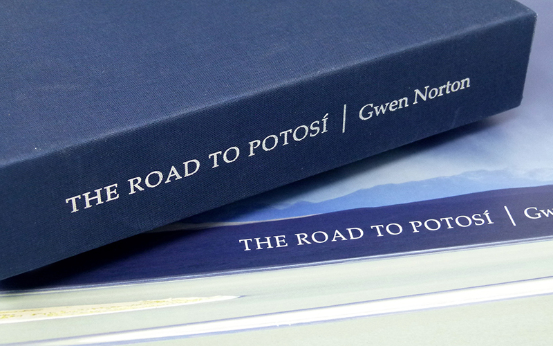
The book was digitally printed CMYK by Panoramic Press and comes tucked inside a slipcase produced by Roswell Bookbinding – a Brillianta Blue cloth over 118 pt. board, with the book’s title printed in matte silver foil on the front and spine.
“The designer wanted something that was going to be unique and different, as opposed to how photographers typically present their artwork,” said Kortez Brown, specialty division manager, Roswell Bookbinding. “The way this book was designed and manufactured allowed for a panoramic shot to be seen in full view on the full-page spreads.”
Wanting to give its audience a true impression of what it was like to walk through the Bolivian desert, the art starts from the first page. Panoramic landscapes begin at the cover, with a view of land and sky, the title and photographer’s name in white against the dark mountain range that divides them, giving the appearance of a natural bellyband.1
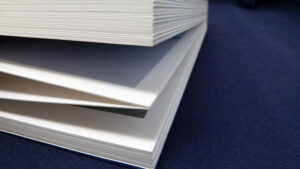
After opening the cover, viewers are immersed into the scenery. Each page was laminated to the next to create one long sheet, folded down accordion-style into a single 11.875 x 9 inch book. With each turn of the page, the accordion style illuminates the movement of art and enhances the story to its audience, pulling the next page forward.
“The book was printed on a KM-1 digital press, a UV press, with pretty unique settings,” said Art Webb, senior account executive, Panoramic Press. “Konica Minolta didn’t even really know it was possible to do what we did on uncoated paper.” Webb explained that Panoramic Press was only the third company to have the KM-1 installed, hoping it would handle its work long term. This included the high-end photography Panoramic Press wanted to produce in distinctive ways.
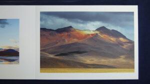
On top of the print, the size and placement of the photographs were diligently thought out, starting with a small full-body portrait of the photographer against the Bolivian backdrop that then folds out to a larger bird’s-eye view of the area. The sharp, colorful printing quality was a result of the use of Konica Minolta AccurioJet KM-1 digital press.1
“We were experimenting with things once we had the press installed and had run this on a coated setting that was in ‘rich’ mode,” said Webb. “There are no coatings whatsoever on it. The UV inks that the press uses gives it the ability, when on a coated sheet, to look glossy and, when on uncoated sheets, the fidelity of the pictures become remarkably crisp.”
“A tremendous amount of engineering by both plants was necessary to make this book what it is,” said Webb, in reference to the partnership with Roswell Bookbinding. With a working history of over 30 years, both companies were ready to take on the project to make a final product like no other.
Panoramic Press worked closely with Roswell and the designer to generate multiple test prints using a variety of paper weights, first and foremost to see if the idea would even work. After many trials, the team finally decided on the Neenah Classic Crest Cover Solar White.
Neenah’s entire ‘Classic Crest’ line is FSC Certified and manufactured with 100% renewable energy – available in Smooth, Super Smooth and Eggshell finishes. The whites and duplex combinations allow for outstanding image reproduction that made the choice even simpler for the book production.
Each page is printed with a blank backside to paste the pages in accordion fashion. Because of this, each page has specific requirements, including a certain thickness to apply both pieces together without wrinkling while still having the pages look as flush and square as possible.

“My favorite part about this project is that the book was handmade,” said Brown. “Each page was pasted, by hand, back-to-back, by the handful of operators that can manufacture this type of binding.”
In a digital age, the reliance on hand-pasted book binding is becoming less frequent. By relying on one of a limited number of manufacturers capable of such specific binding, the project’s outcome was even more of a rarity. “The accuracy of hand-pasting pages together is not an easy task and was by far the hardest part of the project,” said Brown.
“It’s an inspiration to do something unique,” said Webb. “I try to get it in the hands of as many designers as I can.”
“The road to Potosi is long and winding,” the photographer wrote about her excursion, and the movement of the photos inside the book gives the same impression – one of hiking through that same beautiful terrain with miles behind the reader, and miles still to go.1 In total, ‘The Road to Potosi’ stretches across 46 feet of paper.
“The beauty of the book is not just the photography and the things from the printing press. It’s, like Kortez has mentioned, the handmade section of this book that takes it above and beyond,” said Webb. “I’ve never seen anything, even in all my years working with Roswell, as incredibly well engineered as this project.”
As the final touches were made to the 100 + cover page product and handed over to the designer, the feedback from the client was simply put – “Astounding.” Winning Best of Show in the Western States Printing Alliance (WSPA) Awards for 2020 in the category of Digital Hardbound Books only solidified the success of the tremendous amount of work and detail that was put into this project by all contributors.
References
- PaperSpecs, “Creative Book Design: ‘The Road to Potosi,’” 2021, www.paperspecs.com.

