By Erin La Row, editor, PostPress
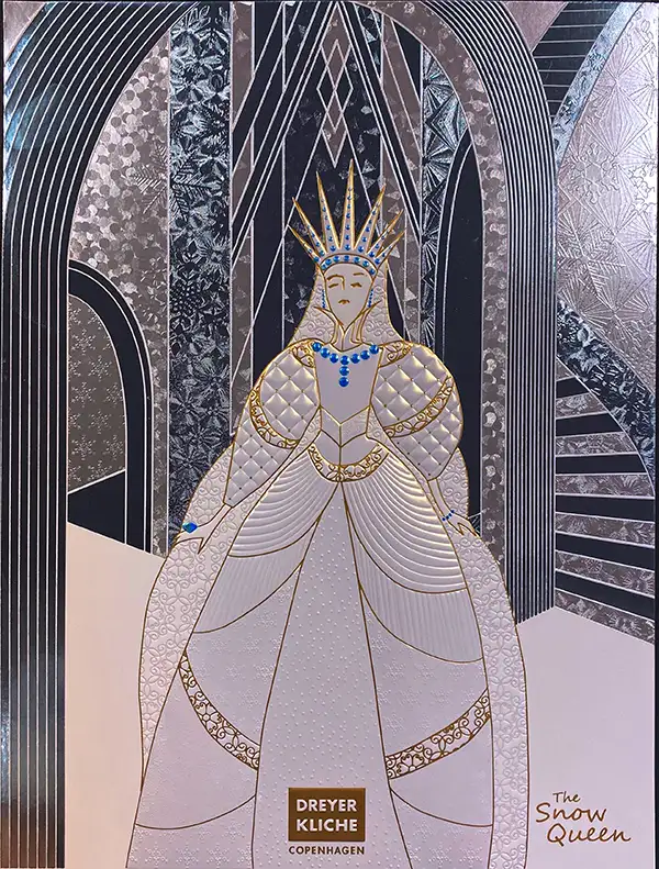
Nineteenth century author Hans Christian Andersen dreamed up The Snow Queen – a fairy tale of good vs. evil, friendship and love, and adventure. Nearly 180 years later, Dreyer Kliche, a creative die manufacturer based in Copenhagen, Denmark, brought its interpretation of the enchanting story to life with its The Snow Queen self-promotion posters – a project to demonstrate the creative extremes of hot foil stamping and embossing.
“We used our own national treasure, Hans Christian Andersen, with this year’s self-promotion theme – The Snow Queen,” said Conni Dreyer, CEO and owner of Dreyer Kliche. “The mixed imagery of the story gives us so many opportunities to be expressive and varied.”
 Dreyer Kliche collaborated with Foilco, a company based in Warrington, England, on the hot stamping foils for the project. Several foil colors were incorporated with the use of Dreyer Kliche’s brass engravings for all the foil elements. This included flat stamp and multi-level embossing engravings. Micro-structured patterns also were used in several areas. The micro-structured patterns provide a visual change in the look, as well as add a tactile finish. Dreyer Kliche structured dies can be incorporated into small and larger areas of a foiled image.
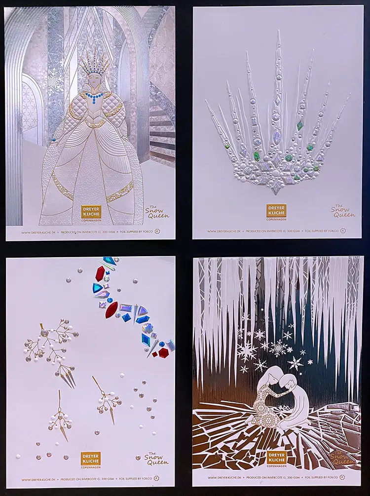
The result is a beautiful, multi-sensory four-piece printed interpretation of the Danish author’s fairy tale.
“Across the pieces, we used stamping foils for every print component. It ensured totally exact registration when combining so many foils and effects,” Dreyer said.
The imagery
The engravings were precision engraved brass for foil stamping and multi-level embossing. All of the foil and embossing passes were accomplished on a Kluge foil stamping press. The paper stock used was Iggesund’s Invercote G, 300 gsm board.
“The Invercote always is consistent and can handle numerous processes,” Dreyer said. “It is an excellent paper for accepting both the foil and deep embossed images.”
The Snow Queen used five flat foil dies and five foil colors combined with micro-structure, flat stamping and multilevel embossing. Most of the sheet is covered in several layers of metallic and pearl foils.
The Crown used five flat foil dies and four foil colors and a specially designed stamping foil Foilco created and branded as Clarity. Clarity is a transparent stamping foil that has had a small percentage of tint added to it. The contrast on the white board is, therefore, much greater and more luxurious than ordinary clear stamping foils that simulate spot UV.
“It’s totally unique, and we find we are constantly drawn to it for a lot of our creative ideas,” Dreyer said. “We used multi-level emboss diamond shapes to add high levels of detail out from the board.”
The Jewelry design draws on a similar desired effect but with six flat foil dies and six foil colors. The shapes are varied on the embossing for contrast and offer very fine line foiling.
“This challenged our embossing techniques even more,” Dreyer said. “If we cut too deep, then we faced splitting the board from the back, so we pushed the 300 gsm as far as we could go. The tactility we created is something very special.”
The Kai and Gerda sheet used four flat foil dies with a choice of four complementary foil colors. This used different combinations of foils on the icicles artwork with embossing, in contrast to the background cave image with added micro-structure in the foiling die.
“There is no other print medium that gives you these opportunities. With each success we achieve, and winning awards, like the FSEA Gold Leaf Award, it just pushes us on to take new challenges in our work,” Dreyer said. “A collective team effort means a sense of shared pride for us and also means we will be back next year with something just as special.”
Dreyer said The Snow Queen designs position the company with its customers as a recognized premium die supplier. She added, “The goal is to inspire them to be increasingly creative. If we can do that, we’ve done our job.”

