
By Erin Judge, managing editor, PostPress
As digital technology advances and pressure to stand out on the shelf rises, print embellishments are becoming more popular and widely accessible. However, despite their growing availability, many designers still lack sufficient knowledge to effectively incorporate these elements into their design files.
Once a file is handed off to the prepress department, a range of issues can emerge – slowing turnaround times and sometimes resulting in unintended, disappointing production outcomes. Yet, in most cases, a few additional considerations during the design stage can help streamline production and ensure embellishments achieve their intended impact. To explore how designers and printers can get the most out of embellishments, PostPress spoke with several design and prepress professionals about the key “do’s” and “don’ts” of optimizing designs for print embellishment.
Selecting the Right Embellishment
“Selecting the right embellishment starts with defining the creative intent of the piece,” said Ruby Porter, director of art at Tactive. “Almost any project could benefit from a specialty finish; the key is selecting the one that best represents the message, medium and audience.” She notes three key elements to consider prior to selecting an embellishment: Legibility, branding and cost.
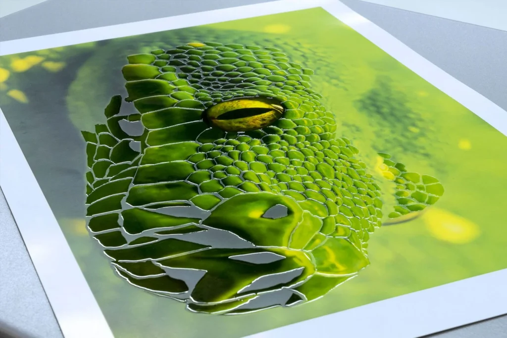
From a legibility standpoint, embossing and debossing can add dimension and texture but are not ideal for smaller or more detailed type. Similarly, foil struggles with very fine lines or extremely small text but is well suited for bolder elements like headlines, logos and icons. For a more subtle effect, techniques like blind embossing, spot UV or clear varnishes on a solid background can create a subtle, high-end effect without sacrificing clarity.
Branding also should play a central role in embellishment choices. Tactile elements, such as embossing, metallics or textural laminates, can help to reinforce the story of a brand. In many cases, the brand’s personality and target audience may naturally dictate the best embellishment options.
Cost is another critical factor. Mark Geeves, co-founder of Color-Logic print embellishment solutions, recommended understanding not only the cost of the embellishment used in production but also the average waste associated with each process, which directly affects overall cost.
For smaller production runs, digital embellishments typically are more cost-effective than traditional options like embossing, debossing or hot foil. Larger production runs, however, may justify the set-up required for traditional finishing, lowering the cost per piece and opening the door for more embellishment possibilities.
“Each embellishment method has strengths and limitations,” noted the prepress team at TEAM Concept Printing (Joe Kroushl/Angie Guzman/Aldo Risolvo). “In general, clean logos, icons and bold graphic elements translate well across all embellishment types. The choice depends on the desired visual and tactile effect, as well as the paper stock being used.” They advised using embellishments strategically – focusing on one or two key elements; less often is more.
Designers also should consider how the finished piece will be handled by the end-user and the positioning of each embellishment. According to Ed Zarazua, prepress manager at Brodnax 21C Printers, designers should think about where the piece will be held, folded or diecut. “A stunning raised digital coating positioned directly on a fold line will crack in production,” he said. “A beautiful foil that extends to the bleed on a tightly trimmed piece must account for die tolerances at the trim edge.”
Considerations for File Set-Up
Once the approach for incorporating embellishments has been determined, designers should focus on proper file set-up. One of the most common mistakes is improper use of layers and spot colors, particularly for diecutting and specialty inks.
“Dielines and embellishment assets often are flattened into the base artwork rather than separated onto their own layer with a designated spot color,” said Porter. “When this happens, it limits our ability to accurately separate those assets, which can lead to delays while we request corrected files or determine alternate solutions.”
She recommended creating separate layers – with clear and intuitive names – for each embellishment type and assigning each one its own spot color.
“What one designer calls ‘spot UV’ might be referred to as varnish, lacquer or even lack by another,” Geeves said. “These variations – both in terminology and spelling – can create confusion and production errors if not handled correctly.”
During file set-up, designers also should account for trapping, knockouts and overprints, along with appropriate font sizes and line weights. Traditional embellishments should be set to overprint to prevent unwanted knockouts. For digital embellishments, designers should check with their print service provider for guidance; Porter noted that using a “multiply” setting may be necessary to avoid “unpredictable appearances.”
TEAM Concept Printing also recommended avoiding tight alignment between embellishments and printed elements unless proper trapping or tolerances are built in. When production involves multiple machines, designers should allow for registration shifts of at least 0.25-0.5 mm between processes.
Porter added that modern digital presses and prepress workflows often include auto-trapping and other features that reduce alignment issues during production, helping to simplify the designer’s job.
When considering font sizes and line weights within an embellishment, “small text, thin lines – generally below 1 pt – and overly intricate details often get lost during production, particularly with foil and embossing processes,” noted TEAM Concept Printing. “Traditional methods tend to have stricter limitations than digital embellishment technologies, which sometimes can achieve finer detail.”
Zarazua added, “Traditional foil stamping with dies produces beveled edges, as the die surface tapers at its boundaries. Fine print elements placed too close to an emboss border can become distorted due to the deformation of the paper. This doesn’t happen with digital embellishments.”
Digital embellishments also have their limitations. Line weights should be no thinner than 1 pt, and font sizes should be at least 8 pt for both digital and traditional methods. Porter noted that digital foil, in particular, typically requires a minimum line weight of 5 pt. “When the foil bonds to the toner or ink, sufficient surface area is needed to maintain tension as the foil separates from the carrier. If the design is too thin or too sparse, the tension may not be sufficient for clean adhesion, resulting in spotty coverage or visible gaps in the foil,” she said.
For both traditional and digital embellishments, designers also should avoid adding drop shadows, gradients or screens or using low-resolution or raster artwork. “Embellishment artwork must be hard and discrete vector objects,” said Zarazua.
Downstream Production Issues
When files are not properly prepared, certain production issues may not become apparent until later in the workflow. Using lines that are too fine or fonts that are too small can lead to a loss of detail in foil or embossing. Similarly, failing to account for registration can result in unintended visible gaps between print and embellishment layers.
Porter also commented that production issues can arise from hidden file attributes, such as unintended transparency or overprint settings, which may not be obvious in the original design. “These issues especially are common when files are converted from non-native formats – like Canva PDFs, PowerPoint or Excel. Hidden elements often can surface during conversion. In many cases, these weren’t intended by the designer but are a result of how programs interpret or flatten the file.”
To help mitigate issues, she recommended that designers work in Adobe programs wherever possible and package their working files before submission. This ensures that prepress has access to all links and fonts to easily make file adjustments should they be necessary.
Other production issues still can occur even when the design file is properly prepared. “The interaction between paper stock and embellishment can significantly affect the outcome,” said TEAM Concept Printing. That can include paper distortion from large embossed or debossed areas, visible imperfections in large foil coverage and inconsistent results on textured or uncoated stocks. They recommend softer, thicker stocks for embossing/debossing and coated stocks for foil and spot coatings. Textured stocks should be avoided for embellishments with fine detail.
To minimize production issues, designers should involve prepress and print production teams as early as possible. Zarazua advised against “designing in a vacuum” – making embellishment decisions without first consulting a print provider. “By the time it lands in prepress, the design has been approved, and structural changes that may need to be made are harder to get done,” he said.
Early collaboration with the production team helps designers better understand production capabilities and limitations, as well as material compatibility. “Prepress teams are knowledgeable on both design and production capabilities and can advise and offer alternative solutions before reaching the production stage,” said Porter. “We also may recommend prototyping when the project requires it, preventing further project delays and ensuring the final piece meets both creative and production expectations.”
Digital Technologies
While traditional embellishment techniques remain strong, the industry rapidly is shifting toward digital embellishment technologies. These advancements allow for greater flexibility in design,variable embellishments,faster turnaround times and reduced set-up costs.
“As a result, designers must adapt by thinking more dynamically about how embellishments are applied, while still respecting the physical limitations of materials and processes,” said TEAM Concept Printing.
Variable data printing is not new, but many designers and print service providers have yet to fully leverage its potential when combined with digital embellishment techniques.
“When a project requires both VDP and digital foil, we’ve found that incorporating the variable elements directly into the foiled layer produces the best results,” said Porter. “It’s a smart way that designers can leverage evolving digital techniques to enhance both engagement and production capabilities, all while providing an easy, value-added upsell!”
As digital techniques evolve, they also enable alternative approaches that can reduce cost and simplify production. By printing digitally on metallic stock using white plus CMYK inks or toners, designers and printers can minimize the cost and set-up associated with traditional embellishments – delivering high-impact effects in a single pass through a digital press.
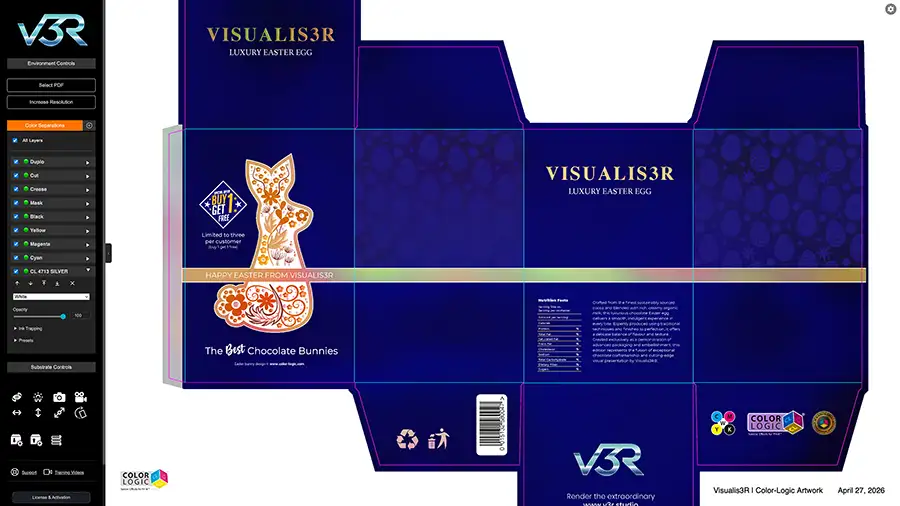
“In combination with the Color-Logic System for metallics, designers can provide 924 shades of foil colors with various print embellishments that can be created at the design stage,” said Geeves. “Plus, Color-Logic’s FX-Viewer allows for those effects to be viewed on your monitor prior to going to press.” The system also now allows for UV spot coatings/varnishes or polymers to be added on top of the Color-Logic effects to accentuate embellishments and add a tactile feel.
Clarity, Restraint and Collaboration
In the context of embellishments, the longstanding principle that “printing starts in finishing” remains relevant. Zarazua recommended that designers understand the process they’re designing for – “a hot foil stamp, a digital coating and a screen-printed spot UV are three completely different processes with different tolerances, different set-up requirements and different aesthetic results.”
Porter added, “As a designer myself, I understand having big dreams when it comes to print, but presses and finishing methods come with real constraints that can limit those dreams. Projects tend to run much more smoothly when designers work with those limitations rather than against them.”
Ideally, prepress should be involved at the concept stage, especially for high-end or complex embellishment projects. Early involvement allows teams to recommend appropriate processes and materials, identify potential risks early and provide clear design guidelines.
“Ultimately, successful embellishment design comes down to clarity, restraint and collaboration,” concluded TEAM Concept Printing.
10 Designer Considerations Before Submitting a File for Production:
- Meet with prepress and production before designing
- Verify compatibility with selected materials and processes
- Ensure proper spot color set-up and layer separation for each embellishment type, including clear naming
- Convert all embellishment elements to vector
- Check overprint settings for embellishments – may differ for traditional vs. digital
- Avoid drop shadows, gradients or screens, low-resolution or raster artwork for embellishments
- Adjust line weights and spacing to meet minimum production requirements
- Refine or simplify intricate elements
- Add or adjust trapping
- Avoid tight alignment between embellishments and printed elements
Visualis3R has also created Educational Guidelines for print embellishments at: www.v3r.studio/education/guidelines/