By Lara Copeland, contributing editor
PostPress
 For thousands of years, humans across several civilizations have cultivated cannabis, and the controversy surrounding the plant is just as ancient. In the spring of 1909, along the central coast of California, William “Bull” Lowell started growing what he called Indian Hemp (since the term “marijuana” was relatively unknown by Anglo Californians) on his farm.
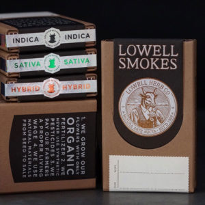
Public concern about Indian Hemp was nonexistent, but that changed in 1913 when Henry J. Finger conspired to outlaw cannabis and helped pass the 1913 Poison Act. This, however, did not deter Lowell. Believing in a man’s right to smoke the dried plant and enjoy its benefits, he refused to stop growing it. When Finger caught wind of this act of rebellion, he shut down Lowell’s farm and eventually threw him in jail. Over 100 years later, Lowell Herb Co. still is in operation. Paying homage to Bull Lowell’s respect for the plant, the company’s standard is to only use “natural materials from seed to sale,” and this is evident even in its packaging. The organic cannabis farm turned to Twin-City-based Studio On Fire to help create packaging for its pre-rolled smokes.
“When assessing the goals of the packaging early on, it was obvious that the organic process should be seamlessly conveyed to the consumer,” said Ben Levitz, Studio On Fire founder. “It also was important that the final product should feel like a piece of design ephemera from another time, nodding to the 100-plus-year history of the farm itself.”
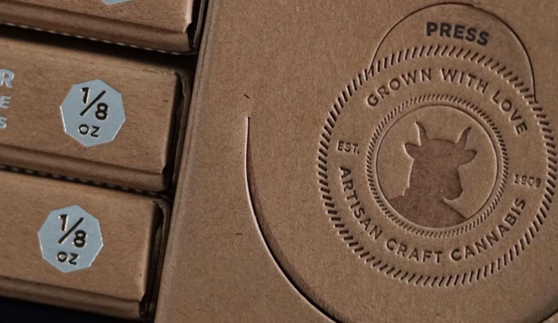
Studio On Fire offers letterpress and foil stamping/embossing – all of which use special letterpress and foil stamping equipment to create designs by means of pressure. As a result, Studio On Fire creates pieces that are eye-catching and tactile, much like the carton for Lowell Farms. Made out of Neenah Folding Board 26pt Grocer Kraft, the carton features original artwork of the farm’s logo. The logo – an emblem featuring a bull’s head on a human body encircled by the company name and other details – was created on scratchboard, which then was provided to Studio On Fire to translate to vector artwork. The packaging design was completed by Lowell’s team and translated into the final foil stamping of the emblem on the front of the carton.
“We thrive when combining techniques, and several were used on this project,” Levitz said. In this case, Studio On Fire needed “to produce an aesthetic that walks the line of raw/refined,” he added.
To create this look, a flood of letterpress ink was used to naturally provide a textured area that supports the ephemeral quality of the piece. The carton was passed through a Heidelberg cylinder press for letterpress on the interior as well as the exterior, and the pass utilized photopolymer plates that Studio On Fire makes in-house to apply a soy-based ink.
The carton then had two passes on a Kluge for foiling and embossing on the darkly printed tab that falls over the front of the carton. First, a pass of matte silver was applied and then over-stamped with a metallic copper – both from Infinity Foils. The next pass, a heated blind impression was made with the combination of a heated metal die and pressure without using any foils or inks in a secondary logo with the bull’s head on the outside of the carton. The carton then was diecut on a Saroglia FUB and folded and glued on a Kluge Omnifold. A custom micro-etched pattern in the die was used on a rainbow holographic foil with an overprint of black for the final package seal. All engravings, including the UniFraxion® engraving, were supplied by Universal Engraving, Inc.
Levitz said that a detailed piece, like the Lowell Smokes carton, that required many passes through a press or presses in Studio On Fire’s shop, is going to suffer from stretching.
“All of the processes that happen under our roof are impression-based, so if we’re not careful we’ll warp the sheet into a giant ruffled potato chip,” he added. “It takes a lot of skill to get the correct amount of tactility in the final product without ruining things along the way.”
But, this is the challenge that propels the company to continue providing premier printed and embellished work with a distinctive look.
“In general, a huge part of what Studio On Fire does is design via production planning: Selecting stocks, planning press sheets, designing dielines, figuring out what presses will work best, what foils will stick, what order things should happen, advising artwork revisions – all of those things are key to getting the high quality final products that we’re known for,” Levitz said.
This high-quality and detailed work results in satisfied clients, like Lowell. “We’re happy to have been working with Lowell for several years now, and it’s clear that the level of consideration the company has given its packaging really stands out to consumers in an ever-growing market.”

