Printed with permission by PaperSpecs
Towering above Vancouver’s high-end Coal Harbour neighborhood, the multimillion-dollar luxury apartment building Fifteen Fifteen provides its residents vast floor-to-ceiling windows and large outdoor spaces that give their owners the impression that they have only to reach out their hands to touch the trees of nearby Stanley Park.
To convey the nearness of this natural beauty, design legends Pentagram NY worked closely with Metropolitan Fine Printers (MET) and Bindtech Roswell to craft this enormous volume, which packages lavish photographs of the building’s 202 residences in a case that never lets you forget one of the property’s biggest draws: trees!
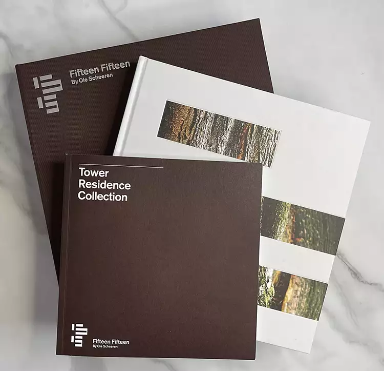
The exterior of the case is tastefully low key with the name of the property and its designer (renowned architect Ole Scheeren) hot foil stamped in matte silver foil on the front cover and spine. The pattern of the Winter & Company 100 gsm (68 lb) Wibalin Flute Mahogany cover material provides both a touch of visual sophistication and a finger-pleasing texture to the presentation.
 Opening the piece reveals a clamshell case, with the inside cover and spine seamlessly lined with a gorgeous, detailed photograph of a tree beautifully offset printed on 80 lb Mohawk Superfine Text Eggshell.
What instantly impresses even more than the rich, vivid imagery is the precise way everything fits together when the clamshell is closed. The spine, in particular, has been well-thought-out, showing no signs of cracking despite repeated openings.
Tight fits continue with the large book resting snuggly in the tray opposite the inside front cover, and a color-coordinated ribbon lays across it to aid in its removal – a welcome touch to the elegant design.
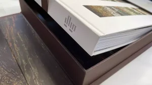
Inside, the 216-page Smyth-sewn volume features the same matte silver hot foil stamping as found on the cover of the box. This time, though, the cover is Winter & Company’s imitation leather – 80 lb Cover Ecorel Matte Chevo Touch of Gray, which looks and feels like fine goatskin.
Going the extra mile, another tree image has been added to the front cover in the form of three horizontal debossed tip-ons stacked together, calling to mind the cantilevered nature of the Fifteen Fifteen tower this kit is meant to celebrate. And, while the book still rests in its tray, the cover photos look like the right side of the tree pictured on the inside of the clamshell opposite!
Inside, large, sumptuous photographs bring the Fifteen Fifteen living experience, as well as its Vancouver surroundings, to life.
 Printed CMYK along with a custom grey and brown PMS color, plus a dull varnish – all in-line on a 100 lb Text Mohawk Superfine Eggshell, these pages are broken into sections exploring the architecture and using hot foil stamped short-page tabs on 80 lb Cover Superfine.
Tucked inside a grotto at the center of the tray that held the book is another smaller volume that can be removed by tugging on another ribbon. The same tree photo is so seamlessly reproduced across the frame and the cavity holding the book, you can barely see the step between the two – another example of just how tightly everything fits together here.
Also Smyth-sewn, the softcover, printed on 80 lb Cover Mohawk Superfine Eggshell, is all business, laying out the individual floorplans for the various apartments in the Fifteen Fifteen building.
BindTech Roswell, in Pheonix, Arizona, was a partner in binding and debossing. Kortez Brown, specialty division & business development manager with Bindtech Roswell, said there are a few reasons why Smyth sewing is popular: The functionality of the layflat binding because the signatures are sewn in sections allowing flexibility in the spine; library binding quality adds strength and integrity to the spine once the pages are sewn and reinforced with a flexible PUR glue and capped spine; and due to the layflat quality, a designer can create seamless crossover images that transition from page to page.
Taken together, this mammoth sales kit blends craftsman-like precision with luscious images of nature, echoing the cutting-edge “home in the clouds” lifestyle promised by this Vancouver property.
Smyth-sewn binding turned out to be a great choice for this book and created a masterpiece for the client.
“Any other binding options such as adhesive, side sew or saddle stitch do not provide the same layflat or timeless binding strength you will experience with a Smyth-sewn binding,” Brown said.
As for challenges with this project, Brown said, “The hardcover had three tip-ons that were all placed by hand, one at a time, into a recessed deboss impression. Not an easy task, and ALL handwork, which seems to be a dying art these days. There is a lot to be said about the performance and precision our employees have acquired over the years to make products like this look perfect.”
The clamshell was no easy task either. “As you can see by the imagery of the bark on the trees that cross over from the inside lid of the clamshell all the way into the tray looks visually seamless. Precision cutting and again … The handwork required was a challenge,” Brown said.
PaperSpecs is on a mission to provide graphic designers with the swatchbooks, resources and tools they need to create innovative printed pieces that wow their clients. For more than 15 years PaperSpecs has been providing creatives with the latest trends, inspiring videos, free webinars, and virtual/hands-on PaperSpecs Live mini design conferences. Find them at www.PaperSpecs.com.

