• Home
  • Article
    • Article Archive
    • Digital Archive
    • ENews Archive
  • Buyers Guide
    • Buyers Guide
    • 2025 Online Form
  • Advertising
    • Ad Options
    • Media Kit
    • Editorial Calendar
    • Electronic Files
  • Awards
    • FSEA Gold Leaf
  • Subscribe
  • Video Vault
  • Webinars
  • Amplify
  • Contact
  • Events
    .smi-preview#smi-preview-10580 { --smi-column-gap: 10px; --smi-row-gap: 20px; --smi-color: #ffffff; --smi-hover-color: #90c43c; ; ; --smi-border-width: 0px; ; --smi-border-radius: 0%; --smi-border-color: #3c434a; --smi-border-hover-color: #3c434a; --smi-padding-top: 15px; --smi-padding-right: 0px; --smi-padding-bottom: 0px; --smi-padding-left: 0px; --smi-font-size: 20px; --smi-horizontal-alignment: flex-end; --smi-hover-transition-time: 1s; ; }
    • Skip to main content
    • Skip to secondary menu
    • Advertise
    • Subscribe
    • Contact
    • Events
      PostPress

      PostPress

      Print Decorating, Binding and Finishing

      • Home
      • Articles
        • Article Archive
        • Digital Archive
        • ENews Archive
      • Advertising
        • Ad Options
        • Media Kit
        • Editorial Calendar
        • Electronic Files
      • Buyers Guide
        • Buyers Guide
        • 2025 Online Form
      • Awards
        • FSEA Gold Leaf
      • Subscribe
      • Video Vault
      • Webinars
        • Upcoming Webinars
      • Amplify

        Letterpress

        A Letterpress Journey to Learn From

        June 12, 2019

        interview by Katy Ibsen, managing editor
        PostPress

        letterpress
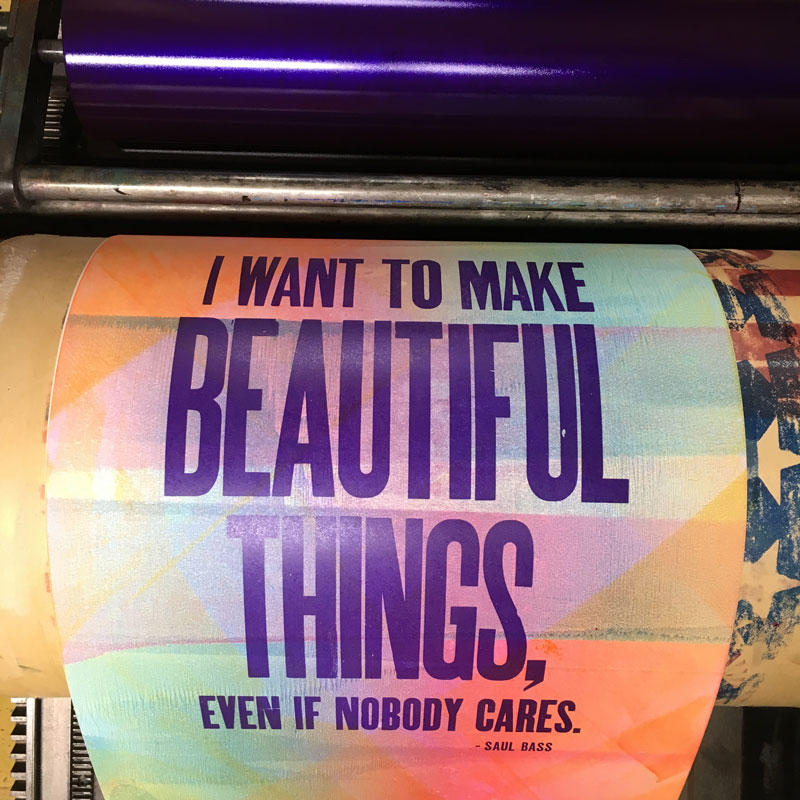
Chris Fritton, author of The Itinerant Printer, a 12″x12″-coffee table book that commemorates his two-and-a-half-year travels to 137 letterpress print shops across the United States and Canada, has become a curiosity-seeker in the world of letterpress.

        Better classified as a tramp printer, Fritton used his journey to discover the vast world of letterpress from regional, economic, historic and creative vantages (as exhibited in his 320-page book).

        In this interview, Fritton shares information gathered during his capstone project and information on how letterpress on a commercial level can elevate brands in unexpected ways, including the various avenues in which letterpress currently intersects with brands and commercial use.

        Letterpress as a compelling form of printing

        There’s something about physically building the words that makes them more meaningful. Beyond its appeal as a constructive medium, I’m excited about the myriad unexplored possibilities in letterpress – it isn’t the most popular medium, and that means it’s still ripe for a lot of experimentation and play.

        Letterpress as a desired medium among commercial brands

        Letterpress had a resurgence, I think, as a reaction to digital media. People, including designers themselves, were feeling very removed from their products and their modes of production. In the end, the pendulum swung back in the opposite direction, away from the clean, hygienic, sterile space of digital graphic design toward the grittier, more visceral and haptic world of letterpress.

        It isn’t just what’s become popular; i.e., a deep impression on soft cotton paper that announces itself as handmade. It’s also the boundless repository of visual information. There are so many millions of images and fonts that have never been digitized, and all of that visual information is just begging to be used.

        I think (letterpress for commercial use is) good in the short term, but it might pose a challenge in the long term.

        When something trends, whether it’s a medium or a style, it is susceptible to becoming a novelty, and a novelty grows old and gives way to the next big thing. Whether it’s big, blocky wood type or detailed metallic foil, its day will come and something new will be waiting to take its place. The thing that I like most about seeing more letterpress printing commercially is that it puts pressure on innovators and visionaries – it makes all of us work harder to figure out what’s coming next.

        Using letterpress to make a statement

        It’s an unpopular thing for me to say, as a letterpress printer, but I use letterpress printing because it’s the medium I have the most facility with – if another medium would give me better results, I’d use it. And I’d advise that for anyone, and I think most tradespeople would immediately see the wisdom in that.

        But I’d also say letterpress just doesn’t look like anything else in the world. It’s not only tactile, but also visually arresting and challenging. Many people come away from looking at a letterpress piece wondering how it was made. That’s what I love about it – it draws you in and makes you ask questions about its origins. That kind of work will start thousands of conversations.

        Managing client expectations with letterpress

        This is definitely a challenge. As letterpress went from commonplace to uncommon to almost obsolete, it left the common consciousness. What makes it intriguing now, as I said before, is our lack of familiarity with it. But, that lack of familiarity also is a huge obstacle, one that requires a lot of education. You have to take the time to explain, sometimes even demonstrate, how the pieces are made in order to convey a sense of value to the client. I think once you’ve invited people into that space, they come away with a greater understanding of why the pieces are special and they’re also more forgiving of idiosyncrasies based on the handmade nature of the product.

        Letterpress trends

        letterpress
        Letterpress is not only tactile, but visually arresting and challenging.

        Integration of new technologies! Some of the best printers that I know all across the world are using laser cutters, 3D printers, CNC routers and more to create blocks, plates, stencils and type for printing. I believe there are endless possibilities in merging digital and analog – it’s never helpful to think of them as mutually exclusive – and the most forward-thinking printers see them as working hand-in-hand. Recently, in addition to this convergence, I’ve been seeing trends toward more abstract, painterly work – pieces that use type, plates and even the presses in new ways. It’s all about imagining how else the tools at your disposal can make a mark on the page.

        The value of printed matter

        letterpress
        letterpress

        I’ve been thinking about this a lot lately – recently, at an exhibition I did in Boston, dozens of people came “because they saw the poster hanging up” somewhere. It was really eye-opening. A good visual message does its job regardless of the medium, but in our increasingly digital surroundings, there’s something more compelling about a handmade object – it’s like it’s an artifact from a bygone era living in the present, and in many ways, because it’s an anachronism, it does its job better than it would’ve 100 years ago when it was drowning in reams of other printed matter. I also believe humans are inherently attracted to physical objects; there’s an intimacy that we cultivate with them, a closeness that we can’t replicate with digital information – call it romantic, but I think, at the end of the day, we still want something to hold in our hands.   

        In January 2015, Chris Fritton began traveling the US and Canada to visit small, obscure and unique letterpress shops in an effort to learn more about the medium he had come to love.  During his two-and-a-half year journey, he visited 137 letterpress print shops covering more than 47,000 miles and making over 15,000 prints. His journey is chronicled in his new book, The Itinerant Printer.


        The Itinerant Printer’s Letterpress Tips

        After visiting 137 letterpress studios across the US and Canada, Chris Fritton, author of The Itinerant Printer, shares his tips for working in letterpress.

        Baby wipes. Use baby wipes for cleaning your hands! Baby wipes have a tiny bit of baby oil on them, and that acts as a solvent for most inks. Instead of running to the sink to wash up every five minutes, just wipe down and keep working.

        Scotch tape. Use Scotch tape for makeready, not masking tape or painter’s tape. Masking tape has goopy adhesive that gets left behind, and both tapes are too thick to build up makeready slowly. Scotch tape is thin, clean and the transparency really comes in handy sometimes.

        Post-It Note. When you’re doing makeready with wood type and you need to slip a sheet of paper under a sort, use a Post-It Note. It already has a little built-in adhesive, and if you have to move it again, your shim will move with the type instead of getting lost.

        String. When you’re using a flat drying rack, be sure to run string or twine down the back of it vertically about every 6″ – that way if the racks get lifted accidentally, the prints won’t slide out the back onto the floor.

        Paint the end of your furniture correspondent to its length for quick and easy sorting back into the case (yellow for 10 pica, green for 15 pica, etc.).

        Get a tackle box. Sort your letter spacing for metal type into fishing tackle cases by size instead of leaving it in California job cases. It makes finding the right spacing faster and easier, especially when you’re dealing with really old cases that could have decades-old assortments of spacing.

        Wistful Wedding Bells – Haute Papier Invitation Combines Culture and Class

        December 18, 2017

        by Lara Copeland, assistant editor, PostPress

        The greater Washington, D.C., area, a popular international and domestic tourist destination and home to a multitude of historical treasures, is a continually evolving metropolis. Following the flight of the middle class during the last half of the previous century, today’s young professionals have been lured back to the city over the last 10 to 15 years. Enticed by job opportunities, new condos, hip restaurants and 80 miles of dedicated bike lanes, millennials are flocking to this urban center.

        In the midst of this influx, Sarah Meyer Walsh and Erin Miller opened their custom design and letterpress print studio business, Haute Papier. Over a decade ago, the pair adopted their first press, Pearl. Since then, the duo’s products have been offered in big-name retailers, like Anthropologie and Banana Republic, and featured in several publications, such as Martha Stewart and Southern Living. The company draws clients as prominent as The White House, as close as personal friends and everything in between.

        Haute Papier recently designed an invitation suite for a local wedding planner. A combination of gray and copper colors was carefully chosen to reflect the wedding’s locale. “The bride’s family is from Portugal – which was where the wedding was held – so we wanted to pull in lots of little details to get the guests excited to visit for the special day,” Walsh said. “The copper colors and foils were chosen to represent the Portuguese pots that are traditionally used to cook over fire,” she added.

        The suite contains five cards/invitations. A Heidelberg Windmill was used for the foil stamping and letterpress work. The edge of the wedding invitation was beveled and painted a metallic copper. The calligraphy was hand drawn and written by Written Word Calligraphy for the couple’s names, the location of the wedding and a few of the titles on the tops of the cards. The copper calligraphy was foil stamped with Owosso Graphic Arts magnesium dies on foil provided by Infinity Foils and Crown Roll Leaf. The other lettering on the cards was created with letterpress – a process similar to foiling but without the use of heat. “We used polymer plates for the letterpress work,” Walsh noted. “In this process, the ink is applied via a cylinder and rollers that move up and down over the base where the plates are attached, and then the paper is fed through the Windmill via suckers (air).”

        In total, there are six envelopes – gray and copper-colored – within the suite. The largest envelope shape was custom diecut on a Kluge diecutter. The underside of the envelope’s flap features a unique design foil stamped in a metallic copper. Walsh explained how the team designed the pattern “to recall the olive trees and the tiling you see all over the countryside.”

        While the creators admit that they didn’t do anything that hasn’t been done before, “almost everything was custom created for this customer – from the shape we used for the actual envelope flaps to the sizing of each of the pieces,” Walsh elaborated. “We love working with clients to help bring their visions to life like we did with the tiny details of the copper color and the tiles.”

        Though the team didn’t encounter any challenges or issues in the production stage, their “biggest concern was that everything would fit thickness-wise into the custom-made envelope.” Their expertise was on target. The suite not only won a 2017 Foil & Specialty Effects Association (FSEA) Gold Leaf Award for “Most Creative Use of Foil & Embossing – Announcement/Invitation,” it also left their client feeling elated with the detailed work. “It was remarkable to see such a beautiful design come to life,” bride Jeannette Tavares exclaimed. “It is a true representation of the symbolism that inspired the design – the copper reminds me of my grandmother’s pots and the tiles of my father’s town – and it is a tangible item that now hangs in our home.”

        Letterpress: Old is New Again

        December 9, 2016

        by Melissa Larson, contributing writer, PostPress
        Fey Printing wanted to create a holiday card with a simple message as a way of showcasing the print shop’s own capabilities. Courtesy of Paper Specs.
        On a quiet side street in Belvidere, Illinois, in a building that once housed a social club, is Locust Street Press. This letterpress printing shop – which once seemed to be a fading business – is riding the wave of popularity for a variety of applications, including wedding invitations, baby announcements, business cards, greeting cards and stationery.

        Shop manager Heather Steines explained that her business straddles the old and the very modern. The shop features some 15 presses – the oldest was built in 1890 – and also houses machines for diecutting, embossing/debossing, scoring and foil stamping.

        But the process of obtaining orders from graphic designers, or directly from consumer clients, is strictly up-to-date. “We work mainly with graphic designers who have their own clients,” said Steines. “Most of our orders come in online.” Usually the graphic designer already has created the design for the invitation when Locust Street Press gets involved. The rest of the communication with the customer is via the LSP website (www.locuststreetpress.com) where old meets modern.

        Allure of the tactile

        Locust Street Press further promotes letterpress by using the technique to decorate its shipping boxes.In much the same way that baby boomers are rediscovering the joys of vinyl record albums, graphic designers and printers are coming to a new appreciation of the strengths of letterpress. When combined with thick cotton papers and finishing effects, such as foil stamping, letterpress printing lends an Old World touch to social communications.

        “In an age of hurried, digital communication, the intimate, deliberate feel of letterpress printing is a personal touch that won’t be overlooked or forgotten,” read a statement on LSP’s website.

        “In a digital, one-dimensional world, consumers are discovering and loving the look and tactile feel of hand-crafted finishes. They add beauty, dimension, feel and pizzazz,” said Tom Otto of Otto Printing.

        Paper chase

        In describing working with clients online to process letterpress orders, Steines summarized it this way: “It is actually pretty straightforward. They simply email us. We can suggest stocks for clients: however, many times they know exactly what stock they would like. We work with each client on an individual basis and individual quotation.”

        According to Steines, the three main components of a letterpress wedding invitation order, for example, are deciding what paper to use, creating plates for the invitation design and determining the printing schedule. LSP stocks Crane Lettra papers in several thicknesses.

        Made especially for letterpress, Crane’s Lettra 100-percent cotton papers have the feel of fabric and the look of handmade art paper. According to the Crane website, Lettra papers are engineered to stand up to the great pressures of letterpress printing and have the complex structure and strength of cotton papers, allowing them to withstand multiple press operations with correct registration.

        Yet, the fact that Crane’s Lettra® Papers are unsized and uncalendered leaves the fibers relatively uncompacted, giving the sheet an extra bulky, even fluffy feeling that absorbs ink while remaining soft to the touch. These “softer” sheets accept the heavy pressure and accentuate the type impression without cracking the paper’s surface.

        In a letterpress project, typography is king. Without the dot patterns needed to reproduce photography, the basic typography can truly be an art form. The strengths of a letterpress design are crisp, sharp lines; pattern or grid work; and of course, typography.

        Since letterpress printing is very much a manual process, that hand must be experienced. Rusty Prentice, pressman at Locust Street Press, has been running letterpress machines and finishing equipment, “for oh, about 50 years,” he chuckled. Although LSP does not make its own dies, Prentice does just about everything else in the shop, with unhurried, methodical care. He mixes inks by hand using the Pantone book, runs the presses, guides the foil stamping operation and even sets type in a pinch. In a typical day, he may set up and run several different jobs, typically from one to 85 pieces each.

        Online warehouse

        A nautical themed letterpress design makes extensive use of holographic foil. Courtesy of Paper Specs.

        Print designers have a vital resource in an online paper warehouse called Paper Specs (www.paperspecs.com). Started by print designer Sabine Lenz, it includes lots of up-to-date information about choosing and working with paper for print projects. Even more resources are available to professional paid members, including a searchable online paper database; extensive Binding, Printing and Paper Facts sections where designers can learn the latest techniques; on-demand webinars; and even a live concierge for out-of-the-box questions.

        Two striking examples of letterpress projects – a wedding invitation and a holiday card – appear on the Paper Specs website. A nautical themed design makes extensive use of holographic foil. Said designer Justin Kowalczuk, “With the foil and nautical theme in mind, the front of the invite draws inspiration from classic compass elements with a modern mono-line aesthetic. As a designer with a focus on custom typography, I also was able to create a custom ‘sailor jerry-esque’ typeface and paired it with Niveau Grotesk.”

        Project Details
        Title: Brittany & Tony Wedding Invitation
        Design: Justin Kowalczuk (www.justinkowalchuk.com)
        Print Shop: Mama’s Sauce, Orlando, Florida
        Paper: Neenah Classic Crest Smooth Patriot Blue 130lb. Cover, Neenah Classic Crest Smooth Solar White 130lb. Cover

        Production Details
        Dimensions: 5″x5″
        Print Quantity: 100
        Production Cost: $665
        Printing Method: Letterpress, holographic foil
        Number of Colors: One (Letterpress ink to match Patriot Blue)
        Finishing and Binding: Duplexing

        To close out 2015, Fey Printing (www.feyprinting.com) wanted to create a holiday card with a simple message on a single, unfolded card. It would be a way of showcasing the print shop’s own capabilities while sending its clients some holiday cheer.

        Fey Printing’s Paul Siekert created a stylishly sweet design, which the company letterpress printed onto 5×7″ Neenah Crane’s Lettra Pearl White 220lb. Cover, using three PMS colors. The design also incorporated a silver foil stamp for the company logo, a blind debossed background pattern, diecut round corners, plus a bonus item. “The blind debossed pattern doesn’t leave room on the card for a signature, so we diecut a hangtag and hand attached it with string to provide a place for a personal message,” Siekert said.

        Project Details
        Title: Fey Printing 2016 Holiday Card
        Client: Fey Printing
        Date: December 2015
        Design: Fey Printing, Paul Siekert
        Print: Fey Printing, Wisconsin Rapids, Wisconsin
        Paper: Neenah Crane’s Lettra Pearl White 220lb. Cover

        Production Details
        Dimensions of card: 5″x7″, hang tag: 1.5″x2.875″
        Print Quantity: 400
        Production Time: Eight days
        Printing Method: Letterpress, blind deboss
        Number of Colors: Three PMS colors, soy inks
        Finishing and Binding: Silver foil stamp, diecut round corners, diecut hang tag, hand-attached with string

        Where does letterpress go from here?

        Prentice of Locust Street Press started his print career via a graphic arts course at his junior high school in Rockford, Illinois. The question of where the next generation of letterpress operators will learn this craft keeps some practitioners up at night, along with such issues as the suitability of photopolymer plates, possible supply line disruptions, the future of letterpress inks and keeping the aging machines themselves running. As a recent poster to a letterpress discussion board put it: The real question is, how sustainable is letterpress?

        As long as designers and end customers want the particular look that letterpress provides, it will continue to endure and grow. It provides a type of classy look and feel that cannot be duplicated by the latest digital printing process. It is unique and personal.


        The finishing touch

        Letterpress is not the only technique experiencing a re-emergence for customized printed pieces. Harry Otto Printing Company, Elburn, Illinois (www.ottoprinting.com), started in business as a letterpress print shop in 1941, specializing in fine stationery and announcements. It still is family-owned and -operated and still dedicated to letterpress.

        According to Tom Otto, owner, his company offers a range of postpress decorating techniques that even further enhance the look of invitations and other social products. These include beveling, foil gilding, deckling, glittering, hand bordering, edge coloring and even a technique called Parchtiquing, which lends a “burned” antiqued edge to the paper. Exclusive Bordering Co. was established as a division of the original company to offer these techniques.

        “The beauty of these hand-crafted finishes is they can be incorporated with almost any graphic process,” said Otto. “We are seeing everything from photos to digital, to offset printed pieces that are embellished with sheet pasting, beveling, letterpress, gilding, even laser diecutting.”

        Otto is sanguine about the future. “We have had steady growth the last five years, and I only see continued growth, as people will always want their product to stand out above the others,” he concluded.


        The Official Publication of the Foil & Specialty Effects Association
        © 2025 All Rights Reserved
        Peterson Media Group | publish@petersonmediagroup.com
        785.271.5801
        2150 SW Westport Dr., Suite 501, Topeka, KS 66614