• Home
  • Article
    • Article Archive
    • Digital Archive
    • ENews Archive
  • Buyers Guide
    • Buyers Guide
    • 2025 Online Form
  • Advertising
    • Ad Options
    • Media Kit
    • Editorial Calendar
    • Electronic Files
  • Awards
    • FSEA Gold Leaf
  • Subscribe
  • Video Vault
  • Webinars
  • Amplify
  • Contact
  • Events
    .smi-preview#smi-preview-10580 { --smi-column-gap: 10px; --smi-row-gap: 20px; --smi-color: #ffffff; --smi-hover-color: #90c43c; ; ; --smi-border-width: 0px; ; --smi-border-radius: 0%; --smi-border-color: #3c434a; --smi-border-hover-color: #3c434a; --smi-padding-top: 15px; --smi-padding-right: 0px; --smi-padding-bottom: 0px; --smi-padding-left: 0px; --smi-font-size: 20px; --smi-horizontal-alignment: flex-end; --smi-hover-transition-time: 1s; ; }
    • Skip to main content
    • Skip to secondary menu
    • Advertise
    • Subscribe
    • Contact
    • Events
      PostPress

      PostPress

      Print Decorating, Binding and Finishing

      • Home
      • Articles
        • Article Archive
        • Digital Archive
        • ENews Archive
      • Advertising
        • Ad Options
        • Media Kit
        • Editorial Calendar
        • Electronic Files
      • Buyers Guide
        • Buyers Guide
        • 2025 Online Form
      • Awards
        • FSEA Gold Leaf
      • Subscribe
      • Video Vault
      • Webinars
        • Upcoming Webinars
      • Amplify

        Paper

        Rethinking Paper Choices for Distinctive Designs, Sustainability

        March 15, 2023

        edited by Erin La Row, editor, PostPress

        Neenah Paper, headquartered near Atlanta, Georgia, manufactures writing, text, cover,
        packaging and specialty papers. The company has a rich history of 150 years of innovation, service and growth. Paper choice can make or break a project; today, there are more choices than ever. PostPress magazine talked to Victoria Apenteng, senior manager, marketing services at Neenah, about paper choices and marketplace trends.

        What are the biggest trends driving paper decisions in today’s marketplace?

        The biggest trend that has infiltrated not only paper decisions, but everyday life, is sustainability.

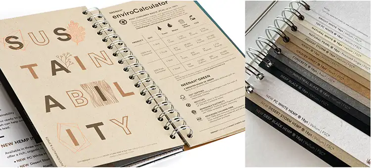
        However, we don’t like to call it a trend. It’s more of a movement, and we hope it is here to stay! US paper mills have been making paper with post-consumer waste, using renewable energy and practicing conservation for over 30 years, but the popularity of recycled paper has waxed and waned over time. The current conversations around sustainability in all aspects of life have created both renewed awareness and demand for “sustainable” papers. But what exactly does that mean? For some, the biggest concern is using less virgin pulp, so they are seeking high post-consumer content. For others, using responsibly sourced fiber is critical, so third-party certifications, such as FSC®, are the priority. And for some, just simply using uncoated or “earthy” colors is enough.

        How do different types and colors of paper communicate to specific audiences?

        Imagine the same product in two different white boxes – same graphics, but one box is coated board and the other is uncoated board. The common perception is the product in the uncoated box is better for the environment, easier to recycle and maybe even healthier. Papers that have a natural or kraft shade have the same effect. This is critical when it comes to personal care products, as consumers naturally gravitate toward what seems healthy and feels more natural.

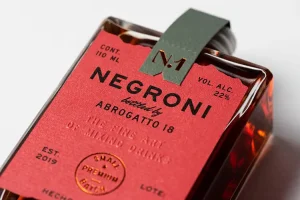
        Distinctive use of color also is powerful, and using specific colored paper for direct mail or packaging is a great way to not only differentiate but also communicate subconsciously. For example, bright red packaging definitely attracts attention and also might convey a sense of energy and action – perfect for food and beverage, or maybe the cannabis market. When it comes to beauty, brands need to communicate not only beauty and elegance, but care and nurturing. Soft tones; uncoated, textured papers; and minimalistic design are trending in this vertical.

        Sustainability continues to be a hot topic with brand owners and others. What can be shared about Neenah’s commitment to sustainability?

        At Neenah, we strive to minimize negative environmental impacts by conserving energy and natural resources. Every product we make carefully is crafted, ensuring the highest standards and practices in pulp sourcing, energy consumption, water usage, packaging, shipping and more. Third-party certification for pulp is an increasingly important part of educating consumers about the use of trees in papermaking, certifying that paper mills and pulp suppliers are harvesting trees responsibly. Trees are one of Earth’s most renewable resources. At Neenah, we want to be as transparent as possible, educating our customers on the sustainable features of our products by including information such as post-consumer content and third-party certifications on all of our marketing materials.

        Neenah educates customers on the sustainability of its products, including information on post-consumer content and third-party certifications on its marketing materials.

        What additional considerations and trends are influencing paper
        and board specifications?

        Consumers have become increasingly aware of excess packaging, recyclability of materials and general environmental practices by the brands they interact with. When it comes to paper and board, this is a big driver in the minimalist trend: smaller packaging, less decoration and more papers that intrinsically feel “responsible.”

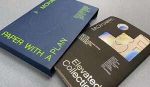
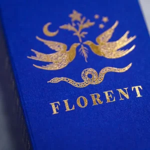
        Another trend is color – using distinctive colored papers for packaging, direct mail and print communications. For example, a brand may choose a bright blue paper for its packaging, which becomes the “anchor” to the overall brand. When it comes to packaging, it is a surefire way to stand out on the shelf and build brand recognition.

        What types of paper choices are being made in growing markets, such as cannabis, craft beer, wine and spirits?

        Colored papers attract attention and can convey a sense of energy and action.

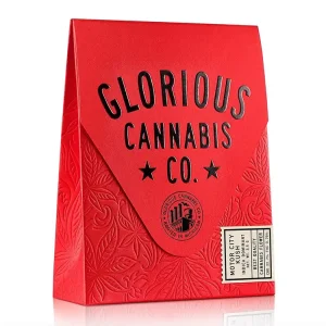
        Distinctive papers! New brands trying to establish themselves are seeking something new and different. They’re looking for color, texture and anything unexpected. It’s all about standing out. The last thing they want is to blend in on the shelf.

        When it comes to the beverage market, the competition is overwhelming. People naturally are attracted to a unique label, especially something that feels hand-crafted vs. mass-produced. As established brands look to grow and evolve, that might mean an updated label that subconsciously communicates sustainability or just has a different look to it! Texture is a great way to get attention.

        PostPress would like to thank Neenah Paper for its assistance with this article. Learn more about Neenah Paper at www.neenahpaper.com.

        Paper with a Plan – a DataGraphic and Mohawk Collaboration

        March 22, 2022

        By Jewlissa Frickey, editor, PostPress

        Sample booklets are nothing new to the paper industry, but Mohawk sought to revamp its own with an entirely re-imagined process of paper selection. The Paper with a Plan Collections Kit is a set of five sample booklets in custom slipcases that feature its papers grouped by their primary attributes: Beautiful, Sustainable, Expressive, Elevated and Practical.

        DataGraphic, located in Commack, New York, was involved in the project and printed the multi-process Elevated Collection booklet as well as the screen printed custom slipcases that hold all five collections.

        “Mohawk was interested in doing something unique and, of course, well executed,” said Glenn Schuster, president at DataGraphic. “We thought screen printing would be a great solution given the nature of paper stock.”

        The Paper with a Plan Collections Kit was designed by Hybrid Design, San Francisco, California, and produced by Tocci Made, New York, New York. Other partnering print came from Kirkwood Printing Company of Wilmington, Massachusetts, and Flash Reproductions of Etobicoke, Ontario.

        Photo courtesy of DataGraphic

        The slipcases, printed by DataGraphic, used a Carnival Deep Blue felt cover with an M&R Renegade UV flatbed screen press. The five custom slipcases were screen printed in a green gloss ink and embossed with the graphic symbols that represent each collection.

        Specialty effects and embellishments were not spared during the project, Schuster noted, “On just the slipcases alone, we included debossing on our Thompson machine, then two hits of screen printing and, of course, the diecutting and assembly.”

        “Printing on such dark paper was a challenge,” said Schuster. “But we were able to screen print first. Then we debossed and did two hits of green.” Schuster continued by saying, “We had a lot of trial runs to try and get that right, but we were all excited with the way the custom slipcases came together.”

        Photo courtesy of DataGraphic

        Among the challenges was an initial registration issue. “Registration was challenging because of the fine type and the precision of the stamping,” said Schuster. “With the two hits of the screen press at two different passes, it took some time to get it perfect.”

        Mohawk’s Paper with a Plan Collections Kit is a 6 x 9″ container filled with five unbound booklets representing each collection. Each booklet contains printed demonstrations and samples, including printed color and texture chips, that are approximate representations of all the papers that can be found from the full product offering in that Collection.

        “In addition to the slipcases, we also were able to produce Mohawks Elevated Collection booklet,” said Schuster. The Elevated collection showcased some of Mohawk’s more famous stocks, traditionally used in stationery and letterpress, in various tones. Embellishments, such as embossing, engraving and foil, are more popular pairings with the papers in this collection.

        Photo courtesy of DataGraphic

        “The Elevated cover is diecut and shows through to beautiful holographic foils and impress papers that also are cotton,” said Schuster. The papers included in the elevated booklet include Crane’s Lettra Dark Black for its cover, the impress cover used Crane’s Lettra Light Pink and Crane’s Ecru and the interior also used Crane’s Lettra Light Pink.

        The ecru sheet was letterpress printed, while the light pink sheet was offset printed and foil stamped with holographic foil. “The booklet consisted of some really interesting artwork that really made the holographic foil stamping and letterpressing fun,” said Schuster.

        Along with the pink sheet, the black cover was foil stamped and diecut and the white sheet was offset printed. Then, all four leaves were die-scored, closed gate folded and nested into three folded pieces above and below the box to create the completed collection.

        Photo courtesy of DataGraphic

        “The binding process consisted of four sheets in various sizes that have four gatefold panels,” noted Schuster. “This creates a waterfall of the different sheeting, leaving it loose bound. The final product is just collated and nested without any mechanical binding.” Leaving the booklets unbound gives viewers the opportunity to discover more information about the product. Each of the pages can be taken apart to find detailed chart information on the back of the sheets.

        On top of the slipcases and Elevated booklet, DataGraphic produced an introduction card. It was made with a blue stock with green letterpress printing, similar to the green printing on the sleeve of the slipcases.

        “We used a Heidelberg KSB Letterpress for the introduction card as well as for the letterpress printing of the inner sheets in the Elevated collection,” said Schuster.

        “The collection itself still is pretty new,” Schuster stated. “It hasn’t been in the field too much, but we’ve already received great accolades from the industry. Our name being on it gives DataGraphic a lot of credibility, especially since the product was for Mohawk.”

        The collections

        Beautiful, Sustainable, Expressive, Elevated and Practical. These five categories bring the collection together with a more straightforward and simple way to think about paper.

        The Beautiful collection focuses primarily on the photography industry with its formation papers, while also supporting other illustrations and solid ink coverage. Next, the Sustainable collection is for papers with recycled or alternative fibers and a compelling sustainability story, from hemp stalks to straw waste and recycled cotton fiber, to the highest levels of PCW fiber and certifications. Expressive collections are papers with distinctive tactile and colorful properties. The Elevated collection focuses on papers made from cotton and premium fibers for stationery and letterpress while the final collection, Practical, is made of the economical “workhorse” papers.


        The Official Publication of the Foil & Specialty Effects Association
        © 2025 All Rights Reserved
        Peterson Media Group | publish@petersonmediagroup.com
        785.271.5801
        2150 SW Westport Dr., Suite 501, Topeka, KS 66614