
By Sabine Lenz, president, PaperSpecs
“The book’s design is beautiful but look at the production values – it’s basically falling apart.”
Designers always want to know what is fresh and impactful – trends are indeed an essential part of design – from typography to logos to the big reveal of Pantone’s Color of the Year. It is vital for designers, printers and finishers to maintain a working knowledge of what is currently trending, especially when it comes to out of the box designs and styles. For example, exposed binding for things like event programs and booklets currently is very much on trend. But, for those who are unaware of the trend, it could mistakenly be dismissed as bad craftsmanship.
This article explores this year’s top three print design trends to better help designers, printers and finishers shape their client’s vision from the very beginning.
Trend 1: Naked and exposed
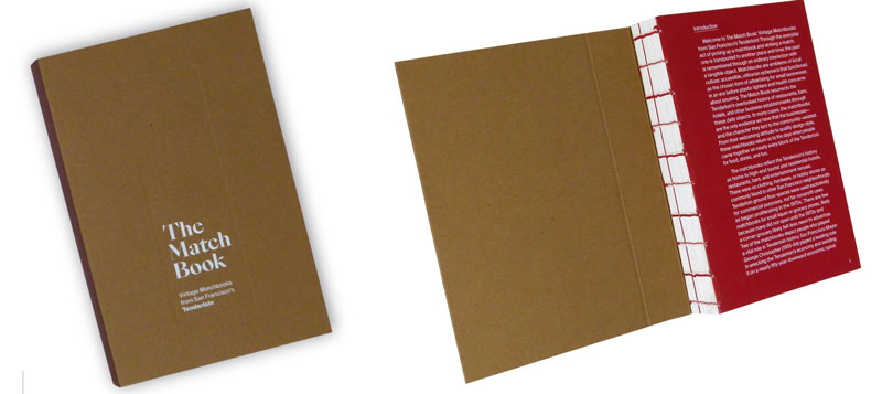
In the last few years, it has become more common to see books and booklets that proudly show off the thread that holds them together, resulting in exposed spines. From Singer sewing to Smyth binding, creatives have embraced the visible thread as an additional design element. Instead of trying to hide it or have it blend in, they use it to show off brand (and other contrasting) colors.
Some may question: Hasn’t this been trending for a while now? If so, why are people still talking about it? Looking at the way any trend develops, first there are the early adopters, then it becomes more popular, then it peaks and slowly fades away. That is, unless someone adds a twist to that trend.
While Singer sewing and exposed Smyth binding still are popular, what is trending now is a twist on the exposed spine – a combination of the naked spine and a hardcover book: meet Swiss binding.
While the text block in a normal hardcover book is attached to the case at the spine, in Swiss binding the text block is mounted onto the inside back cover, leaving the spine and its colorful thread exposed. Swiss binding can be used in combination with various text blocks. While Smyth sewn ones are among the most popular options, perfect bound and even side-stitched text blocks
can be used to create the same effect.
Trend 2: Vivid colors
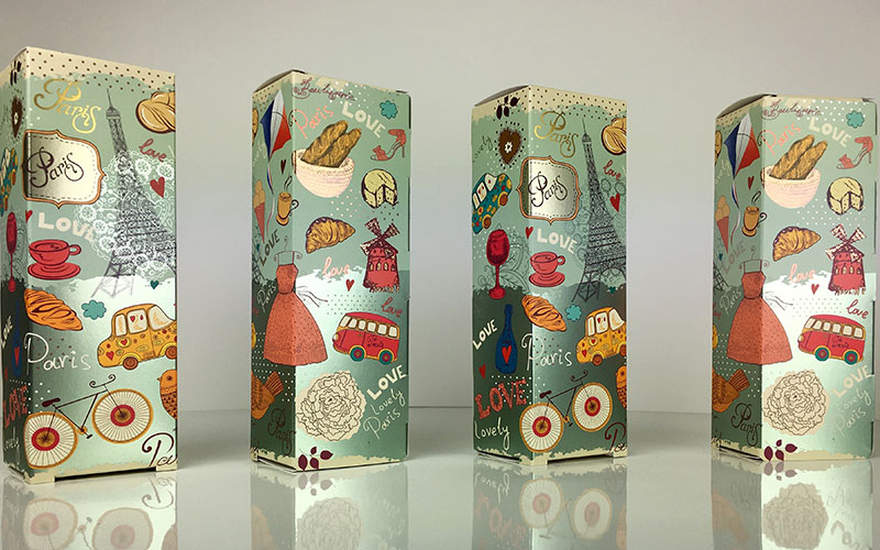
As the value of design rises, brands are going crazier than ever with colors in an attempt to stand out from the crowd. While bold colors have been trending in the online world for a while, thanks to enhanced print technologies designers are going bolder, louder and brighter than ever in their printed pieces. The secret sauces (or, in the case of printers, inks) are neon or fluorescent inks.
Naturally, they can be applied with traditional printing techniques – offset, letterpress or silk screen. But, what is fueling the popularity of this trend now is the ability to print these colors digitally. Depending on the press provider, printers can add neon yellow, pink, orange, violet, green… using these vibrant neon colors as spot colors is a great way to encourage clients to crank up their design’s “look at me” factor.
But, it is not just about the neon effect. It also is about extending the overall color gamut that can be achieved. When talking about 5-, 6- or 7-color printing, it means adding more colors to a conventional 4-color process setup.
This is popular for two reasons:
- Printers can increase the overall range of colors, which allows for really rich hues.
- The extra colors (and, thus, enhanced gamut) can be used to reproduce a special hue that is out of range of the normal CMYK mix; meaning around 99% of Pantone colors can be matched.
Thanks to those expanded color options, expect color schemes in 2020 to get even more vibrant and luminous, even in the digital printing world.
Trend 3: Shimmer and foil
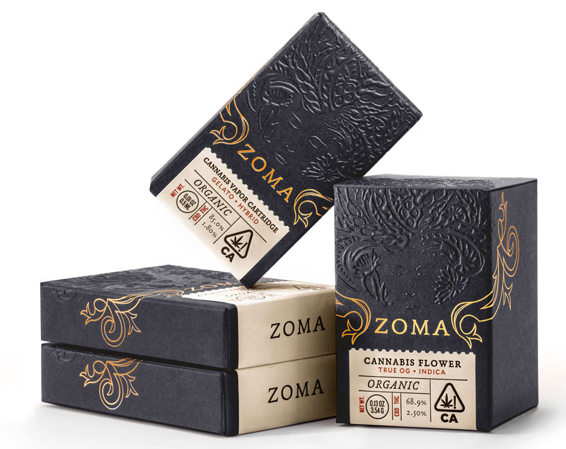
Granted, foil and shimmer have been on trend for a while now, but as a number of newer technologies are becoming more widely available, foil now is an option for super short to medium to very long print runs and even for variable data.
The key is knowing when to choose which option to add that extra shine, as well as when and how to steer clients in the right foil direction. Just because you have a hammer does not mean that every one of the client’s projects is a nail.
Hot foil stamping
When it comes to a true tactile experience, there is not much better than hot foil stamping. By choosing the right paper and pressure, a nice deep impression is achieved that designers and clients alike love. As the gold or silver foils are completely opaque, they can be used on white paper or go super dark; the sheen will never falter.
Cold foil
When it comes to longer print runs and the foiled image is quite large on the sheet, hot foil stamping may not be the best option. Cold foil can be the printer’s best friend in this case, especially when it comes to applications with large-run folding cartons or magazine covers. In addition, cold foil can be applied on the first station of the printing press and then overprinted inline, creating a range of metallic colors without multiple passes on the press.
Cold foil is run inline with two extra stations on an offset press. As the foil is put down first, this allows for a multitude of shiny colors when printing CMYK on top of the foiled areas.
Digital foiling
Enhance an offset and/or digitally printed piece with that extra-super shine with this offline option. As the process is digital, this means:
- No die, plate or film is required.
- There is no pressure used, thus no bruising on the back of the sheet.
- It is ideal for short to medium print runs.
- It offers the opportunity to use variable-data foiling.
Foil substrates
Printers also can turn their approach upside down by utilizing a foil substrate. Use offset or digital technologies to print CMYK right on top to enjoy the same multitude of shiny colors as with cold foiling. Remember though to underprint white in the areas where colors need to stay true.
Conclusion
Designers love the creative freedom the combination of foil substrates with digital printing and digital foiling allows. It gives them room to test different options, to push the envelope that extra bit further, to tweak and compare and decide which version matches their vision best.
No matter which of these trends speaks to designers, printers and finishers most, knowing what is trending allows them to guide their clients that much more expertly. It also gives them a chance to be part of the design conversation early on, helping to shape the client’s vision.
One of the most useful tools for designers, printers and finishers is The Foil Cheat Sheet, developed and produced by FSEA and PaperSpecs. It is a single, go-to source explaining the different techniques available for creating metallic foil finishes. From hot and cold foil to toner-based and varnish-based digital foiling, the guide describes each technique, showcases examples and provides the advantages and disadvantages of each. To order the Foil Cheat Sheet, visit www.fsea.com (FSEA member and quantity discounts
available).
Sabine Lenz is president of PaperSpecs.com, an innovative space for highly committed creatives who are in love with the tactile and interactive experience provided by paper and print. PaperSpecs inspires, shares insights and provides access to crucial, hands-on tools and resources to bring print creations to life. For more information, visit www.PaperSpecs.com.