
How the sense of touch creates physical and emotional experiences that engage customers, drive sales and build brand loyalty.
By Vicki Strull, design strategist, Vicki Strull Consulting
As designers, marketers, printers and converters, most of us can’t help but think about the power of touch when we think about the essence of print marketing and packaging. Over the past several years, the latest research attests to the relationship between touch and human emotional connection. The importance of special effects and embellishments for the entire print and packaging industry can be summed up quite simply: touch creates memorable customer experiences that build connection, sales and brand fans.

The Neuroscience of Touch
There are dozens of studies on the sensory connection of touch. Neuroscientists have discovered that more than half of our brain energy is devoted to processing sensory input. The part of the brain that receives input from our sensory receptors is called the somatosensory cortex, and a significant portion of that is devoted to our sense of touch.
Findings like these are revealed in “The Neuroscience of Touch,” an extensive piece on “neuroscience, communication, paper, persuasion and touch,” conducted by Sappi North America in conjunction with neuroscientist Dr. David Eagleman. ¹ For example, one of the questions explored in the research is whether or not we remember content differently when we read it digitally (such as online or on an iPad or Kindle) vs. when we read it on paper (such as a newspaper, catalog, magazine or book).
When we consume content online, we tend to read or scroll pretty quickly. But when we read something on paper, we engage in touchpoints, such as folding down a page or marking an item or highlighting a passage. Actions like these help us remember the content better, longer and more accurately. That’s the mental sensory mapping that occurs in our brain when touch is involved. The answer is yes, we do remember content we read on paper better than content we read online.
Following that study, researchers began to wonder if the medium of paper itself could explain the memory advantage of print vs. digital. Turns out, that is exactly what makes the difference. One theory is that the physicality – the realness of print and packaging – has a powerful effect on how we comprehend and retain messages, as compared to digital mediums. ² And, because more parts of our brain are activated when we are touching or holding a printed piece or packaging, we again are creating stronger memories and remembering the content better.
Touch, Texture and Trust
This tactile research also applies to substrates, special effects and embellishments. A texture on a package may encourage someone to take it off the shelf or hold it a little longer. That kickstarts a connection to the product or brand that is both physical and emotional. It affects our perception of the product’s quality and value, too. And since research shows that 95% of our purchasing decisions are subconscious and based on emotions ³, you can see how haptics drive sales. One more important finding is that because paper and paper-based packaging have a tangible quality – that realness mentioned above – humans also put greater trust in it. And trust is essential to building brand loyalty.
Recently, Sappi partnered with Clemson University to undertake a series of custom research studies to compare premium packaging and non-premium packaging to see which sold better. For the studies, premium packaging was defined as printed on Sappi’s Spectro®, a solid bleached sulfate (SBS) paperboard of the highest quality, and with at least one special effect or embellishment – namely metallic foil, spot gloss or embossing. Non-premium packaging was defined as printed on coated recycled board (CRB), typically used for household goods or nonfood-contact dry food packaging, such as cereal, crackers or processed foods.
To test the comparison, 60 participants shopped in a mock retail store. One data point became very clear: people overwhelmingly chose the premium packaging over the plain. They touched it, held it, turned it over in their hands. Specifically, 93% of people chose to purchase premium; they also chose the packaging with metallic foil 50% more often than any other packaging.
“The Packaging is the Product.”

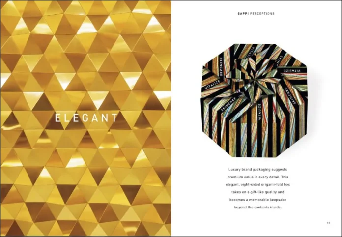
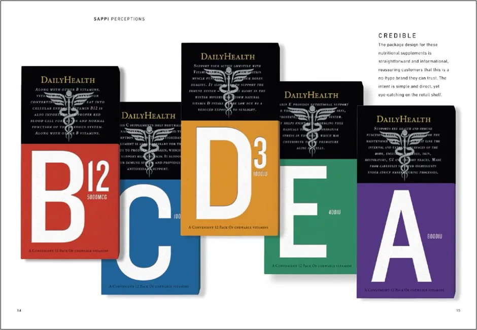
Twentieth-century graphic designer Saul Bass liked to say, “The packaging is the product.” For examples, see Sappi’s Standard 7, “A Guide to Designing for Print: Tips, Techniques and Methods for Achieving Optimum Printing Results.” On one page, a brand that uses a uniquely shaped box with subtle color and jewel-like metallic foil creates a sense of elegant luxury beyond the product itself. On another page, a package with bold typography, pearlized graphics and straight-forward information offers the credibility of a high-quality brand that reassures shoppers. In another instance, a package with muted gradations and a spot gloss wave pattern evokes serenity and tranquility. All of these examples show how packaging becomes the product, how it reflects the brand and how it creates a positive perception that gives the consumer confidence, builds trust and creates a memorable customer experience so people will choose that brand. Sensory embellishment can drive that.
Although multiple techniques are both inspiring and effective, the Sappi and Clemson study showed that even just one embellishment, just one special effect, can have a very big impact on consumer behavior and conversion.
Outside the Box: From Packaging to Other Touchpoints
The data regarding the power of touch and the influence of haptic techniques also are relevant to general commercial print, marketing materials, direct mail, catalogs, magazines, hang tags and book covers. Marketers and printers recognize that these various touchpoints are all critical for creating a comprehensive customer experience of a product or brand. Consistency of design, story, color, quality and imagery across the digital and print world is imperative. Everything needs to work together as an integrated, omnichannel marketing strategy, with a cohesive look and feel, while sensory print and packaging reinforce the entire branding ecosystem and enhance the human emotional connection.
With today’s competitive marketplace, brands continually are looking for new and more powerful ways to connect with their consumers and create memorable experiences. While digital may be an early impression consumers see via e-commerce or online ads, print marketing materials and packaging drive the connection, the engagement, the influence and the sale.
Vicki Strull has more than 25 years of experience in the marketing and design industry as a brand strategist, creative director and packaging designer. She has advised both emerging and top-tier brands, such as Sappi, HP, Bayer, Coppertone, Pizza Hut and Wildfare, on how to leverage the power of design and packaging to increase sales, create new revenue streams and build brand loyalty. In addition to writing articles in global trade publications, Strull is an international speaker and an adjunct professor at Tulane University. Join fellow trendsetters at vickistrull.com or follow her on LinkedIn @vickistrull.
Reprinted with permission from Sappi.
See and feel how Sappi makes packaging come alive through “The Standard” by ordering your own copy at https://go.sappi.com/l/405492/2023-10-23/gnkx9c.
References
- Dr. David Eagleman is a neuroscientist, author, and adjunct professor at Stanford University.
- “How the Medium Shapes the Message,” study referenced by Dr. David Eagleman; see more at www.SappiPops.com
- Harvard Business School Professor Gerald Zaltman, Working Knowledge, “The Subconscious Mind of the Consumer (And How To Reach It)”

