
By Kim Guarnaccia, owner, Huzzah Marketing, LLC
As more states legalize the use of marijuana, new cannabis customers will be making their first visit to a dispensary to buy cannabis-related products. This can be a daunting experience, but cannabis packaging with a dependable, premium look can help consumers feel more at ease. One element that symbolizes value and permanence is gold, which has forever been linked to the enduring power of the sun, abundance, success
and prosperity. Far-sighted packaging designers already have realized the power of gold and are utilizing gold foils, board and closures to great effect.
Carton interior reflects gold mining branding
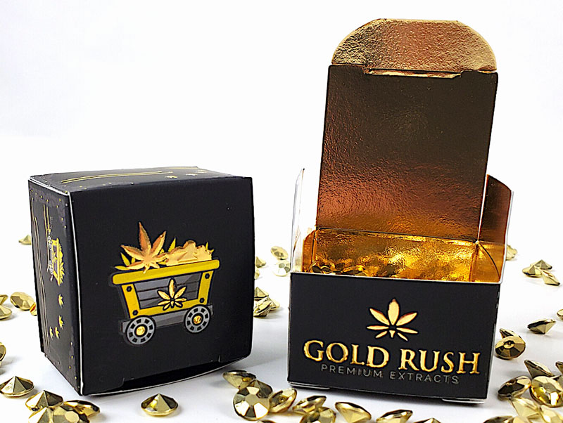 The cannabis company Gold Rush had a two-fold mandate for new packaging for its premium extracts: to maintain the existing brand design and to develop a premium package that reflected the high price point of the extract.
Since the box for the cannabis extract is quite small, designers at Gold Leaf Print & Packaging decided to keep the outside box design understated and concentrate interest on the carton’s interior by applying a bold, full-bleed, gold foil.
“Like an archaeologist digging through rich, dark soil to discover treasure hidden right beneath the surface, the interior implies that the golden cannabis extract is worth its weight in gold,” explained Gold Leaf’s Marketing Manager Stephanie Salvago.
The response from customers was so positive that Gold Rush plans on updating its other cartons in a similar fashion.
Medieval alchemy transmutes base package into gold
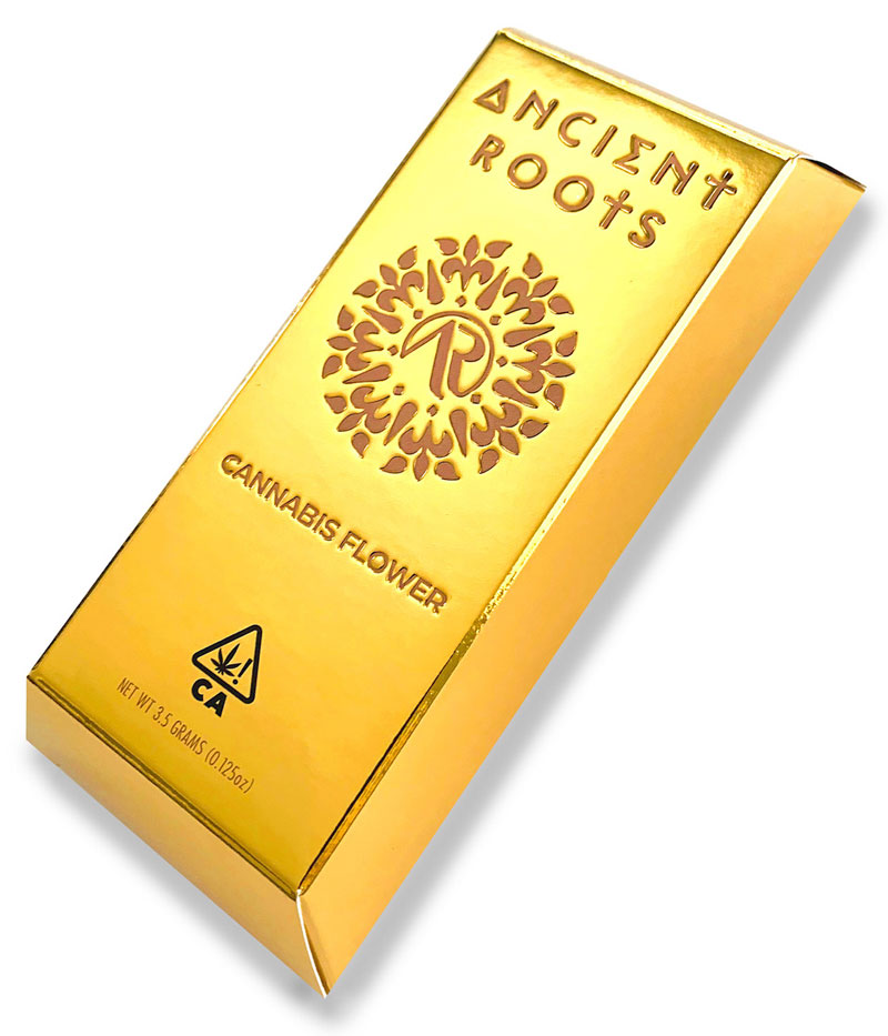 Likewise, startup company Ancient Roots took a leap of faith when it decided to utilize gold in its packaging. Yet, instead of taking baby steps by starting out with a few golden accents, the company went all in by creating a carton that has the literal look and feel of a real gold ingot.
Like a medieval alchemist, the design team at Impress Communications initially experimented with transmuting silver into gold by overprinting a series of transparent yellow inks onto silver met/pet. Once a combination was found that mimicked the look and feel of real gold, the company’s lab developed a custom PMS ink to apply to the silver board. The text then was printed in a brown PMS and debossed, to appear as if the gold ingot was hallmarked with the logo during the smelting process.
The key to the success of this piece on press? According to packaging specialist Don Romine, it was critical to print the package with UV inks on a UV press so the inks would dry quickly and trap properly. The result exceeded everyone’s expectations, including board supplier Mainline Holographics, which loved the effect so much that it now stocks gold board for its customers.
Gold embellishments hint at treasure within
Not all cannabis products require an outer carton. In many states, cannabis companies can sell buds, oils or extracts in a jar, tin or other primary container directly to the consumer, as long as it is properly labeled with the company’s logo, directions and product info. The benefit of using labels only, especially for a startup, is a sometimes substantial savings in printing, filling and shipping costs.
Cannabis company Kiva Confections decided to do just that. Combining a full-bleed of a green letterpress ink and gold foil, it decided to keep its packaging to just the primary jar and label for its limited-edition Pot o’ Gold Peppermint Pattie Terra Bites, a THC-infused fondant covered in 24k gold leaf.
Here, the gold foil – as well as the product name and four-leaf clover icons – brings to mind tales of the legendary leprechaun, an ancient creature who was an expert at
finding gold.
According to Sam Michaels, senior designer at Studio on Fire, printing labels such as this looks simple but actually can be tricky. “Every pass through a press distorts the sheet a tiny bit, so getting everything into register takes careful planning,” Michaels explained. “We have to pay special attention to which ink is laid down first, what the paper grain direction is and which press is best suited for each job.”
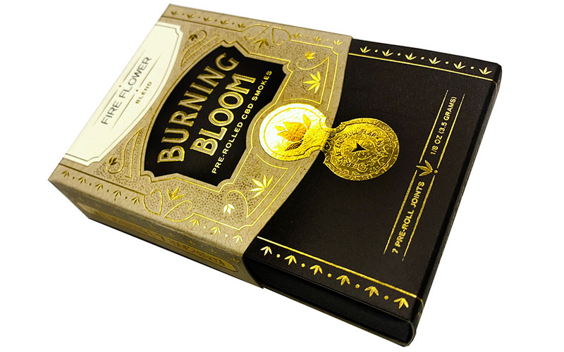
Golden seal provides old world appeal
design ability as well as common packaging solutions.
Since Studio on Fire designs packaging for many cannabis companies, it soon became evident that it needed a sample carton to showcase not only its exceptional design chops but also a packaging solution for pre-rolled joints, a common cannabis product offering.
For this promotional carton, the designers engineered a basic custom sleeve around a black, paper-wrapped tray. The natural kraft letterpress-printed sleeve with gold foil embellishments is clearly reminiscent of antique drawing rooms filled with prosperous dukes, barons and magnates of industry.
To keep costs to a minimum when printing cartons for multiple strains, a variable data-printed label was applied to the top of the package, featuring the hybrid’s name and other strain-related details. Perhaps most exciting, however, is the antique looking, gold foil-printed unifraction seal on the front of the container. Mimicking an expensive cigar label, this tamper-evident seal and the variable data-printed top label elevates this package to one that is well worth a second (and even third) appreciative look.
An appreciator of fine packaging design, Kim Guarnaccia provides marketing support to the print, packaging and paper multiverse. For more info, visit www.HuzzahLLC.com or email kim@HuzzahLLC.com.