• Home
  • Article
    • Article Archive
    • Digital Archive
    • ENews Archive
  • Buyers Guide
    • Buyers Guide
    • 2025 Online Form
  • Advertising
    • Ad Options
    • Media Kit
    • Editorial Calendar
    • Electronic Files
  • Awards
    • FSEA Gold Leaf
  • Subscribe
  • Video Vault
  • Webinars
  • Amplify
  • Contact
  • Events
    .smi-preview#smi-preview-10580 { --smi-column-gap: 10px; --smi-row-gap: 20px; --smi-color: #ffffff; --smi-hover-color: #90c43c; ; ; --smi-border-width: 0px; ; --smi-border-radius: 0%; --smi-border-color: #3c434a; --smi-border-hover-color: #3c434a; --smi-padding-top: 15px; --smi-padding-right: 0px; --smi-padding-bottom: 0px; --smi-padding-left: 0px; --smi-font-size: 20px; --smi-horizontal-alignment: flex-end; --smi-hover-transition-time: 1s; ; }
    • Skip to main content
    • Skip to secondary menu
    • Advertise
    • Subscribe
    • Contact
    • Events
      PostPress

      PostPress

      Print Decorating, Binding and Finishing

      • Home
      • Articles
        • Article Archive
        • Digital Archive
        • ENews Archive
      • Advertising
        • Ad Options
        • Media Kit
        • Editorial Calendar
        • Electronic Files
      • Buyers Guide
        • Buyers Guide
        • 2025 Online Form
      • Awards
        • FSEA Gold Leaf
      • Subscribe
      • Video Vault
      • Webinars
        • Upcoming Webinars
      • Amplify

        Applications

        Digital Embellishments Open Doors to New Business

        June 8, 2022

        By Hallie Forcinio, contributing writer, PostPress

        Digital inkjet embellishment reproduces effects that are either not possible or prohibitively expensive on traditional analog equipment. Capable of creating physical, visual and tactile effects in one pass and economically handling short runs, digital enhancement capabilities open doors to new business. Options include tactile, foil, metallic, glitter, spot and holographic effects, as well as diecutting and embossing. These additional capabilities can be an excellent complement for trade print finishers and other Print Service Providers (PSP’s) and open up opportunities for short-run digital print work for embellishment applications.

        Textured finishes, created with 3D varnish, capitalize on the sense of touch to provide a memorable impression for the consumer. Depictions of cobblestones evoke the texture of cobblestones, strings on a guitar feel real, tires feel like rubber and sand feels gritty. For example, a furniture catalog cover produced by Elite Print Finishing (EPF), Burlington, North Carolina, added texture to the pillows, a 3D effect to the windowpane and a metallic effect to the hardware. “Most folks pick up the printed piece and start petting it,” said Steven Roberts, president at EPF. “You achieve interaction with the consumer before one word is read.”

        Digital enhancement technology allows printers and trade finishers to serve a fast-growing market, short runs, and also enables jobs that were digitally printed to be digitally enhanced, boosting efficiency and enabling greater personalization of the printed piece and quick production of prototypes. “A lot of times, we sample three or four options,” Roberts said. “So many projects could be so much better with digital enhancement,” he added.

        Invitations, real estate brochures, book covers, packaging for cannabis products and trading cards are growing applications. A brochure for a luxury house being sold for $10 million provides an example. Digital enhancement can show what the tile floor feels like and economically accommodate the short run of 50-100 pieces.

        Going digital

        EPF, which handles both commercial print and packaging jobs, particularly for the pharmaceutical and nutraceutical industries, looked at the technology for three or four years before deciding to buy a digital embellishment system. Before making the purchase, the company considered return on investment, whether it would be a good fit for its customer base and how much business would be needed each month to make it profitable. It also looked at equipment from various suppliers.

        Roberts recalled, “The printed sheets were beautiful, but I couldn’t see customers paying for it. Several existing jobs we showed to an equipment provider were deemed ‘not a good fit’ for the system. But we realized there was new business out there, and we could create a market for it. It changed the way we do business.”
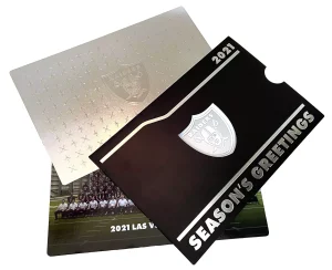
        For the annual Las Vegas Raiders Christmas card, Carlson Print Group combined cold foil done on its UV offset press with raised silver foil done on its Sense-ational system to provide contrast. The back of the card has digital raised embellishments as does the sleeve that holds the card. The design was well-received by both the Raiders organization and recipients.

        The company chose equipment from MGI Digital Technology and installed it in February 2020 just before the pandemic started. With no personal visits possible to show off the operation and output of the new system, the company shifted to online meetings to spread the word about its new capabilities and sent out samples showing the effects the equipment could produce. “We had prospective customers calling us,” Roberts said. This was new business rather than existing business wanting to convert jobs to digital enhancement. He added, “All of a sudden, we could produce effects we couldn’t do before. That was the market we wanted to be in.”

        Carlson Print Group, Eden Prairie, Minnesota, a division of American Spirit Corp., also wanted to be able to offer embellishments beyond its existing capabilities and installed a digital embellishment system from Scodix in 2021 so it could add embellishments more cost-effectively to the 28 x 40″ sheets printed on its ultraviolet (UV) offset printing presses. “It gives the sales staff another tool in their toolbox,” explained Earl Guinter, sales manager, at the specialty printer, which offers full finishing capabilities.

        The Anstadt Company, print and marketing execution specialists in York, Pennsylvania, also chose a unit from Scodix. The fourth installation of its kind in late 2016, their Scodix Ultra2 Pro digital enhancement press with foil station has been fully operational since January 2017. The company’s goal was to expand options for creativity and “add value to print and make it … an exciting, viable means for our customers to communicate that could not be easily substituted by digital marketing channels,” recalled Matthew R. Doran, president and CEO at Anstadt. He adds, “We … have years of experience with creating and producing complex print materials that involve areas such as foil stamping, embossing, diecutting, etc., so this was a great next step in our evolution.”

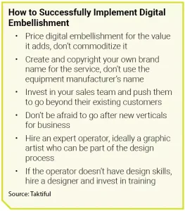
        While the ability to add effects such as embossing, spot ultraviolet varnish, 3D foil and specialty diecuts is impressive, implementation of digital enhancement presses is not without challenges. There’s a learning curve for the print sales team, operators and designers. “Artists don’t understand digital embellishments,” said Kevin Abergel, president at Taktiful, Melbourne, Florida, a consultancy of digital embellishment sales and marketing specialists with teams in the United States, Japan, Mexico and Canada. One of its services is teaching designers how to design for digital embellishments. This includes how to set up files correctly as well as tips for incorporating digital embellishments. “Creating a great file is 99% of the battle,” he noted.

        Since virtually no designers were familiar with the capabilities of the equipment, EPF hired a design firm and trained the designers. Roberts explained, “We outsource the design to them. They understand the capabilities of the machine and design
        specifically for it.”

        Guinter agrees education about digital embellishments is essential. “Customers and consumers might see the end result, touch it and feel it, but they are not sure how it was accomplished and don’t understand what it entails,” he said. The terminology is unfamiliar, and it can be difficult to discern differences among effects like clear polymer versus foil or cast and cure. To solve this problem, Carlson Print Group is developing a marketing kit and adopted its own brand name – Sense-ational – to showcase the different polymer effects it can achieve on its Scodix Ultra 6000 unit. “We also are taking some previous artwork from clients that have used specialty print in the past, adding embellishments and sending it to them to show what the equipment can do,” Guinter said. “We’ve had some success with that.”

        EPF has taken a similar approach. “We’ve developed a brochure that provides a tutorial about [our Elite3D] technology and what we need from customers to ensure a successful run,” Roberts said.

        Another challenge to implementing digital enhancement technology is a lack of standards. “Everyone interprets workflows differently,” noted Abergel.

        Another issue is the temptation to price according to the usual cost-plus model. “Don’t commoditize the technology,” warned Abergel. “Pricing should be in accordance with the value it delivers.”

        Finally, care must be taken to select the right papers, films, foils and coatings and understand what the machines can and cannot do. Typically, coated or laminated sheets are required. Uncoated sheets tend to be too absorbent and must be primed or otherwise treated.

        Implementing digital enhancement has increased EPF’s customer base. It’s bringing in 20 or 30 more jobs per week and the equipment sometimes runs 24/7. Some of the jobs must be cut on the guillotine cutter, stitched or diecut and glued. So, it’s increased workflow across the shop. It’s also created a challenge because a job with 10,000 sheets may be followed by one with 250 sheets. “One of our objectives this year is to find some equipment better suited for short runs,” reported Roberts.
        Digital or analog?

        Digital embellishment complements rather than competes with analog technology. “It’s not one or the other,” Abergel said. Sometimes, the two are complementary. Digital enhancement technology can provide a rapid prototype and help sell jobs that will run on analog equipment. Jobs may start on a digital embellishment machine but as quantities grow it may be more feasible to move to more conventional foil stamping or possibly cold foil. “Being able to see what the final piece will look like helps make the sale,” he added.

        When deciding whether a job should be finished digitally or traditionally, several factors must be considered including substrate, format and quantity as well as the level of embellishment. “Generally, the sweet spot [for digital] is under 10,000 sheets,” Guinter said. However, the breakeven points can vary from 5,000 to 20,000 depending on the level of embellishment involved.

        Conclusion

        Despite the capabilities of digital embellishments, conventional foil and spot coating have not declined. Roberts explained, “There aren’t that many jobs where it’s practical to switch from analog to digital [embellishment]. Digital opens new doors. You have to quit concentrating on the business you have, to concentrate on the business you don’t have. Adding digital embellishment technologies has actually increased the work moving through our shop.”

        Digital print embellishment capabilities have generated new business for Anstadt too. All of their core product categories from packaging, direct mail and signage to marketing and promotional collateral have benefited. Doran reported, “We have been able to create new, exciting areas of opportunity involving print … that may otherwise have never come about. Ultimately, print embellishment has opened doors to new customers looking to extend their brand appeal … in market-differentiating ways.”

        Reactions to digital enhancement capabilities have been extremely favorable. Guinter said, “We need to keep pushing it and creating a buzz around it. When people see digital embellishment, they gravitate to ideas of what it can do.” What that does is generate sales.

        Shining a Light on UV-Cured Decoration Capabilities

        September 2, 2020

        By Lara Copeland, contributing writer, PostPress

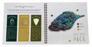
        Gold Leaf Print & Packaging is a premier cannabis printing company located in Pelham, Alabama, that specializes in creating custom collateral, packaging and branding. With the ability to embellish packaging with digital foil and varnish (eliminating the need for custom dies), Gold Leaf can save its customers money and time in creating pieces that stand out – especially for short- to medium-sized applications. Recently, the company created a guide to showcase the range of technological and decorative capabilities that it brings to its clients.

        “The brochure is a visual representation of some of the embellishments we can accomplish in-house, as well as a sampling of products and services that we offer,” Stephanie Salvago, digital marketing manager for Gold Leaf Print & Packaging, explained. “The booklet also showcases the Gold Leaf brand and allows potential customers to really feel the difference that specialty embellishments can make on a product.”

        The graphics were created in-house by Gold Leaf’s award-winning graphic designers. Assembled with wire binding, the 11-page brochure features a front cover with dark-green trees scattered across it. The trees have been digitally printed and then highlighted with a raised spot UV coating. The company name and symbol on the cover also are embellished with a raised gold foil. Using 120# Opus Dull Cover, the piece was printed on a Konica C1100 with a soft-touch laminate added to the front and back cover pages. The soft-touch aqueous coating also was applied to the majority of the inside pages before being finished with raised spot coatings and foil accents using the MGI JETvarnish 3DS.

        The JETvarnish 3DS utilizes UV LED curing as a solution to the type of environment in which these smaller units often are used. In comparison to their bigger brothers that need higher speeds and outputs due to larger formats and segment profiles, the JETvarnish has advantages in lower electrical consumption and a lack of generated ozone, making it ideal for printers who produce mostly on digital presses.

        Gold Leaf Print & Packaging appreciates that the machine offers its clients a total solution for raised spot varnish and foil. Its website explains: “Most people have seen packaging or stationery with some form of foil embellishments. Usually, it’s gold or silver and has been debossed using a method of hot foil stamping. This method requires the purchase of a die and creates indentions on the reverse side of the page… Working hand-in-hand with our raised foil is raised varnish. Raised varnish is similar to spot UV in that it accents elements of a printed piece to give it a bit of shine. However, one of the key ways it differs is our raised varnish is raised. This allows us to create textures and truly unique cannabis packaging options.”

        ​​The guide created by Gold Leaf provides specific details on how these embellishments can be used on eye-catching examples, using spot varnish, foil, 4-color overprinting and a final run of spot varnish to provide detail and texture on one example – all in perfect registration. In addition to the spot varnish and foil samples, the guide also provides information on the different types of standard boxes available, including straight tuck, snap-lock bottom and auto-lock bottom. It also showcases samples of how labels can be produced with digital coatings and foils and provides information on how to order.

        “The biggest challenges in printing this project were the multiple steps and runs on multiple machines that had to happen to create the embellishments for this print,” Salvago emphasized. “We had to make sure that the tolerance of all of the machines was perfect in order to ensure that the prints would be correctly lined up.” Through many trial runs and the expertise of Gold Leaf’s master printers, the print and finishing runs were successful and “an amazing product was created,” she said.

        Gold Leaf Print & Packaging entered its brochure into the FSEA Gold Leaf Awards and received a bronze for Best Foil/UV Coating Selection Guide. Customers also responded favorably to the project. “They enjoyed being able to see and feel the different types of embellishments, and we received many compliments on it, with many commenting on the high quality of the print,” Salvago stated. “We bring this level of quality to all our products and pride ourselves on being a one-stop shop for our clients.”

        Going Green: Texas Bindery Creates Uniquely Vibrant Label

        June 5, 2020

        By Brittany Willes, editor, PostPress

        With its extensive manufacturing and production knowledge, Texas Bindery Service, Cedar Creek, Texas, is no stranger to creating unique projects for its clients. “We specialize in implementing unique finishes and print embellishments into our hard- and softcover projects and for any project where quality, memorability and brand awareness is significant,” stated Vice President Sonja Nagy.

        When Organic Distribution LLC needed a distinctive label for its line of kratom (an evergreen tree used in some natural medicines) products, Texas Bindery was ready to help. Working closely with the printer/broker who reached out on behalf of Organic Distribution, Texas Bindery set out to create something truly special.

        “After reviewing the information presented, we had a clear vision of some options we wanted to offer to provide the highest value and impact for the client and the brand,” said Nagy. To create the label, Texas Bindery first had to determine which stock would be the best. “We tested multiple label stocks to find the perfect fit,” explained Nagy. After testing different label materials, it was determined the best stock for production was Wassau 12 x 18 DP19005 3.4 Mil White Flex Vinyl with permanent adhesive 80# scored back liner.

        With the label design and stock selected, it was time to put the project into production. “Our first step to creating this unique label design was to add the application of toner for the digital foil process,” Nagy noted. “Then we placed the label in our Duplo laminator and foiling machine to apply the digital foil to the toner areas.” The foil for the label was provided by two different vendors – a silver foil was provided by Nobelus, along with additional red and silver foils from Infinity Foils.

        Once the foiling was complete, CMYK printing was applied to the foiled label using a Ricoh 7210SX Digital Press. “At this stage, we printed CMYK colors to create the black, graphite gray, red and green colors on the Wasauu label stock,” said Nagy.

        Because three different labels were produced – each a different color – the next stage for the gray and red label was adding a soft-touch lamination to the label sheet. “We chose to use Nobelus Karess Lamination,” said Nagy, “applying the lamination to the label sheet after the final CMYK layer was completed using our Duplo laminator and foiling system.”

        The green kratom label required an extra step in the production process. “We wanted to achieve a more vibrant green color,” said Nagy. “After performing multiple tests, we determined the best way to get the result we were looking for was to run an additional press pass on the green color only.”

        Currently, the digital foil is limited in the color selections available. Texas Bindery found that by laying down a silver foil and overprinting CMYK on top of the silver, it could create additional custom colors to achieve a wider color variety. “Combining the extra pass on the green layer only, along with opacity and density adjustments on the printer, provided us with added flexibility to create slight hue changes to generate the best final piece possible,” Nagy said.

        The final stage of print and embellishment design for all three labels consisted of applying a raised spot UV coating. “We used our Duplo DDC-810 UV equipment to apply UV coating to precise areas in the label design,” said Nagy.

        Along with achieving a more vibrant color for the green kratom label, Texas Bindery also faced an additional challenge when it came to registration. “We knew registration line-ups through multiple passes would be our biggest challenge with label creation,” Nagy stated. “Once we established the precise settings needed on our Ricoh printer, we were able to fine tune everything to create the registration needed throughout all the printing, foiling and spot UV processes.”

        Despite the challenges, the end results are stunning, as noted by nearly all who have seen the label. “Our client was thrilled with the final piece,” said Nagy. “We have shown the labels to other clients and vendors, and people have been very impressed with the results we were able to achieve. They haven’t seen anything like it before.

        Flights of Fancy: Accordion Book Soars to New Heights

        June 5, 2020

        By Brittany Willes, editor, PostPress

        When the medium chosen to display a work of art becomes a work of art itself, something special has occurred. This is the case for artist Wendy Paton’s limited-edition photobook Flight. Boldly displaying Paton’s undeniably striking photogram-style images, the book is an accordion-style masterpiece as stunning as Paton’s photos.

        Designed by Phil Unitek of Unitek Design and produced by Brilliant Graphics, Flight first draws the eye thanks to its bright red cover sleeve, which features an antique finish. Created using 130 lb. Color Plan stock, the sleeve features a diecut opening at the bottom that not only gives a hint of the book within but also acts as a push-tab for removing the book from its eye-catching sleeve. Once removed from its sleeve, the book opens accordion style to showcase dramatic, black and white photos displayed on either side.

        To create the unique piece, Brilliant Graphics used offset printing, selecting Opus Dull 100 lb. cover stock. A spot gloss varnish was applied at 400-line screen using two shades of black and two shades of grey to create the brilliant contrast of the photographs. When the printing was finished, the sheets were scored using letterpress. Because the project was designed as a limited edition, only 300 copies of the book were printed.

        Given its unique layout, once printed the book required special handling when it came time for the binding to be done. As a result, Brilliant Graphics reached out to its long-time collaborator Roswell Bookbinding. “It was quite a challenge, even for us, and we do challenging work every day,” remarked company President Mike Roswell. “Everything was done by hand because the material was so fragile, so easy to mark or indent. We only had three people that we let work on it, and it was white glove throughout the entire process.”

        The accordion style of the book meant that the front and back covers had to be mounted to .100 pt ThruWhite Lamitech Board, lending the book some weight and stability. “The registration with the board had to be perfect,” said Roswell, “The text was cut separately from the front and back boards to avoid the risk of having any indentation on the text. This required extremely precise cutting – we had to diecut each sheet one at a time before it could be mounted.”

        Mounting was not the only challenge. As Roswell noted, those working on the project had to use white gloves throughout the process to avoid blemishing the sheets. “The material would pick up any dot of dust,” he said. “The cover being soft-touch laminated with black meant it picked up anything it came in contact with and was extremely difficult to keep clean.”

        Naturally, Roswell is no stranger to challenging projects. “We knew what we were getting into,” he stated. “We’ve done quite a few of this style of book over the years. It’s not that there was a learning curve; it was just a terribly slow process.”

        Despite the challenges, the finished book is an undeniable work of art. “Everyone is very impressed by this piece,” said Roswell. “It’s beautifully printed, obviously. Brilliant Graphics did a beautiful job as it always does, and the company is great to work with. The design is elegant. It’s just a beautiful piece.”

        Given its impressive design, it is little wonder Flight has drawn attention from many in the industry. Trish Witkowski of Foldfactory recently showcased the book on her YouTube series, “60-Second Super Cool Fold of the Week.”

        To view the video, visit www.youtube.com/watch?v=CV_ orJwkBM&feature=youtu.be&mc_cid=b0a470f62d&mc_ eid=a0779d0d38.

        A Little Taste of Honey

        June 5, 2020

        By Lara Copeland, contributing editor, PostPress

        One of the greatest pollinators on the planet, the honeybee, is known for its production of not only wax but, more importantly, honey. The sweet treat has been treasured by humans for centuries. Capital Bee Company, based in Savannah, Georgia, is known for its rare, single varietal mono-floral honeys. Sourcing local honey in addition to honey from around the US, the company prides itself on finding “the most magnificent honeys” and providing them to customers to enjoy. One such customer, international branding agency Stag&Hare, with offices in New York, London and Atlanta, became enamored with Capital Bee’s honey and decided to share it with clients as part of a custom promotional piece showcasing its creative abilities. To bridge the gap between the product and getting it into customers’ hands, Stag&Hare called on DataGraphic, Commack, New York, to help create an unforgettable presentation and package for the specialty honey.

        honey“Each year, this client provides a gift to its customers,” DataGraphic President Glenn Schuster noted, “and last year, the owner decided to give away artisanal honey he discovered while traveling.” According to its website, Stag&Hare works every year to develop an artful piece to present to its customers, which the company strives to make one part collective expression and one part collaboration with unique, like-minded small businesses. Branding agencies know the power of creating a sensorial experience, and this gift was no exception. Stag&Hare chose to design and produce a flavor experience using “one of the most unique, yet natural creators – the honeybee,” its website offered. In fact, “this box design and the overall aesthetic was built around the honeybee theme,” Schuster recalled.

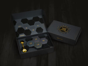
        Stag&Hare designed a custom “jewelry box” to house four jars of honey varieties: Tupelo, Guajillo Acacia, Snowberry and Frosted Cinnamon. DataGraphic brought the vision to life with tactile textures and finishes throughout. The outer box, honey jar cartons, honey jar insert trays and position-mounted inside flap card was created out of a matte black soft-touch paper, 122# Plike. The box is “adorned with layered gold foil, intricate gloss spot UV varnish and small pops of screen-printed, vibrant colors,” according to Stag&Hare’s website.

        On the inside of the box, the honey jar insert tray displays hexagonal shapes diecut on DataGraphic’s 41″ Thomson ValueLine Clamshell. The outside cover of the decorative box was first spot UV coated, creating a black over black look with the contrast of the gloss UV over the black Plike stock. Then, it was foil stamped with a bright gold foil from Infinity Foils in perfect registration over the spot UV that included an emblem stating, “Players of Creativity.” The designs on the box were all foil stamped on a Kluge press.

        The inside of the box is rich in creativity and awakens the senses as well. A honey jar insert tray holds a brass honey spoon affixed to the box with wire. It sits adjacent to four jars that are inserted into their own decorative carton, each one holding a different flavor of honey. Each jar of honey sits in its hexagon-shaped carton and is covered with a brightly decorated lid featuring a gold foil emblem and different screen-printed dots of colors that indicate the type of honey and reflect the individual flavor profiles. Each individual hexagon-shaped box also includes specific highlights of gloss spot UV over the black Plike stock.

        The inside of the front cover of the box includes several hexagon shapes that are spot UV coated over the black stock in the same size as the individual honey cartons. Around the spot-coated hexagons, there is text that ties the different honeys and honeybees to the services offered by Stag&Hare. Lastly, there are several icons around the spot-coated hexagons and text that are foil stamped in the same gold foil as the cover.

        Lastly, on the inside base of the box under where the individual cartons are placed in the insert tray, a gold stock (105# Stardream Metallic Gold Cover) is mounted to the rigid Plike board. Underneath each of the hexagon honey cartons, a “bite-sized” fact about the honeybee and honey is screen printed in black.

        Once all the decorative boxes were coated and foil stamped, they were individually diecut on DataGraphic’s Thomson diecutting press. Each piece was hand-fed to ensure perfect registration from the decorative processes to the final diecut. The design of the outside box and the individual honey cartons were such that they could be scored and folded together without the use of glue, with a unique design where the insert tray perfectly sat inside the box.

        “The registration was critical,” Schuster explained. “We originally planned the job to digitally print but the digital press would not hold the registration required, so we switched to the screen press for perfect registration.” Stag&Hare was thrilled with the final product and featured it on its website. It is hard to imagine a more decorative presentation for honey!

        Unique Book Design for University Report

        March 13, 2020

        by Lara Copeland, contributing editor, PostPress

        Belmont_applicationThe idiomatic expression “opening doors” means to create opportunities for advancement, whether in one’s career, education or other aspirations. At Belmont University, a private Christian university located next to what’s been dubbed Music Row in Nashville, Tennessee, “opening doors” is the phrase the university used to title its softcover President’s Report. This annual publication offered a quick glance at the school’s key initiatives and featured statistics and photographs from the year.

        To create an unforgettable cover for the “Opening Doors” report, Belmont called on McGraphics, Inc., a full-service graphic finisher – also based in Nashville – to accomplish the unique design.

        “The biggest challenge with this job was positioning the stamping, embossing and diecutting so that the stamped and embossed key on the cover was centered inside of the diecut and stamped wrap keyhole, considering the capacity of the book,” McGraphics’ CFO Brian Clements said.

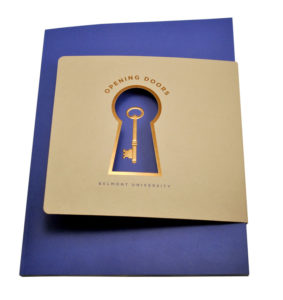
        The first portion of the project was a wrap around the cover of the report. Using a light-colored tan recycled cover stock, the headline “Opening Doors” and the outline of the diecut keyhole was flat foil stamped with a copper die from Universal Engraving, Inc., using a copper metallic foil from Kurz Transfer Products. It was stamped on McGraphics’ Kluge EGH. The keyhole then was diecut on a Thomson diecutting press with steel rule dies produced in-house by McGraphics. The diecut keyhole was designed to show through where the key is foil stamped/embossed on the cover of the President’s Report.

        The diecut steel rule die also included rounding the edges of the wrap on the front side and the scoring of the stock where it wrapped. “We received a prototype of the finished book prior to scoring the wrap to make sure it was in perfect register,” stated McGraphics Account Representative Fred Weisbrodt. “It was critical that the scores were perfect because the diecut keyhole had to be centered perfectly over the foil stamped embossed key on the cover.”

        The cover of the report was fashioned from a bright blue 100# cover stock with a soft linen pattern. The cover included a foil stamped and multi-level embossed key centered on the page and perfectly centered to show through the diecut keyhole on the wrap. The key first was foil stamped with copper dies using the same copper Kurz foil as was used on the wrap. Then, a second pass included a multi-level embossing of the key to create a 3D effect on the cover. Both dies were supplied by Universal Engraving, Inc.

        The unique aspect of the emboss was a pattern within the key that matched the linen pattern in the paper itself. “Because the run of the book was relatively small, we chose to foil stamp and then register emboss the key,” continued Weisbrodt. “This helped provide the best quality emboss and is just as fast to complete as a combination foil and emboss in many cases – especially for smaller quantities.”

        With the embossing pass of the key, a single-level blind emboss of the President’s Report seal was performed at the same time on the cover on a Brausse 402F press. Using the Brausse for the embossing helped guarantee the right pressure that was needed to “bottom out” the embossing die and get the most out of the multi-level embossing of the key.

        Once the covers and wrap were complete, they were sent back to the printer, where the inside pages were perfect bound to the special cover. There were 60 pages, printed 4 over 4. The first page, a translucent Vellum sheet, added another touch of class to the report. The last page of the report also included the same translucent Vellum sheet with a quote from Belmont President Dr. Bob Fisher.

        Once the book was bound with the foil stamped and embossed cover, the wrap with the foil and diecut keyhole was then put in place around the open side of the report. The wrap was glued on the backside of the report to keep it in place and to make sure the keyhole stayed centered over the foil and embossed key.

        The unique Belmont University President’s Report took home the Gold for Best Use of Foil/Embossing – soft and hardback book cover (creative design) in the 26th annual FSEA Gold Leaf Awards. “The finished report ended up being exactly what the customer was looking for,” commented Clements. “It always is satisfying to meet or exceed the customer’s expectations.”

        Behrmann Printing Company’s Fair Lane Invitation

        March 13, 2020

        by Lara Copeland, contributing editor, PostPress

        AnnouncementTechnical_Behrmann_Fairlane_GoldWhile war was raging across much of Europe in 1915, work on Fair Lane – Henry and Clara Ford’s 15th and final home, spanning 31,000 sq. ft on 1,300 acres – was completed. Credited with revolutionizing American manufacturing, Henry Ford often was quoted as saying, “Competition is the lifeblood of industry.” The visionary sought to create a sanctuary for his family following the success of Ford Motor Company and the Model T, which led to a skyrocketing climb to fame.

        The Fords frequently invited friends like Thomas Edison, Harvey Firestone and John Burrows to their retreat. Featuring a private laboratory space for Henry to tinker and Clara’s beloved gardens, the home was enjoyed by the Fords for more than 30 years. As one of the first historic sites to be designated a National Historic Landmark, the home highlights a mix of European grandeur and Midwestern charm with grounds and gardens designed by the well-regarded landscape architect Jens Jensen.

        Just over a century old, the ownership of Fair Lane recently was transferred to a newly established 501(c)(3) entity. The Henry Ford Estate – Fair Lane Board of Trustees launched a multi-year undertaking to bring the Ford family story to the public by restoring the estate. In order to fix leaky roofs and collapsing foundations – in addition to shoring up the riverbank that runs along the property – the estate’s board of trustees has been busy raising funds. One of its efforts, an annual affair named the Fair Lane Dinner Dance, is the elite fundraiser for the estate.

        For more than 10 years, Behrmann Printing Company, Inc., Southfield, Michigan, has been selected to produce the invitation for the distinguished occasion. Behrmann – a specialty printing operation offering small-format litho with foil stamping, embossing, diecutting and other finishing processes – has considered the project a creative challenge each year and produces the invitation with great pride that is shared with the owners (third-generation Behrmanns – Ivan, Steven and Scott) and their entire team of employees.

        “What makes this piece interesting is that it’s a very short run to a very targeted audience of high-contributing benefactors for an exclusive fundraising event,” said Steven Behrmann, who is in charge of sales and management at the company. When tables of 10 can run up to $50,000, fashioning the invitation can seem a daunting task; however, Behrmann said that “good old-fashioned craftsmanship, skill and experienced operators were key” to their success. The 2019 project from Behrmann Printing received high praise, although the project initially did present several challenges.

        Behrmann noted experiencing “the age-old production challenges, such as being squeezed on time to get the job done and making sure that perfection was the yardstick in every step.” He specifically discussed the intricate details required by the task.

        “The sheer number of pieces associated with this job, all of equal complexity that required completion for the event, was a challenge,” he noted. “We worked on the solicitation brochure and envelope, commitment card, custom multi-process letterhead and custom converted envelope, save-the-date card… and the list goes on, totaling about 15 different pieces in all.”

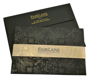
        Just for an exterior envelope, the following steps were required: Foil stamp the body of the envelope, custom convert a special size of 7 3/8 x 5 3/8″ envelope, foil stamp the liner, diecut the liner, and insert and affix the liner. The invitation also had to be assembled, with multiple pieces inserted and glued in. Once inserted into the exterior envelope, the printed and foil stamped bellyband had to be wrapped and affixed.

        Each year, the invitation’s theme reflects a different detail of the estate – perhaps a pattern within the wallpaper or a design seen in its china. Behrmann acknowledged, “There is no expense held back in the details surrounding the production, from the custom envelope liners to the full-bleed clear foil.” It’s easy to see why this invitation won the FSEA Gold Leaf Award for Best Use of Foil/Embossing – Announcement/Invitation for technical difficulty.

        The elaborate graphics were created and conceived by GTB agency out of Dearborn, Michigan. Printing was completed in-house on Behrmann’s Ryobi 9985 2-color small-format offset press. The printing is one PMS match color with hairline registration to the foil stamping.

        “We used Mohawk Keaykolour 100# cover Racing Green for the invitation holder/pocket folder,” Behrmann said. “The insert cards and bellyband used Classic Crest 80# cover Eggshell finish Classic Natural White.”

        Each piece requiring foil stamping and diecutting was run after the pieces were printed. The clear gloss foil stamping was produced on a Saroglia FUB due to the large area and impression required.

        The gold foil stamping was done on a Kluge EHD with the two insert cards and bellyband on one form. Both the metallic gold and the clear gloss were supplied by Infinity Foils, and the foils were selected by the customer. The foil stamping dies, which included relatively large dies for several passes, were supplied by Owosso Graphic Arts.

        With a foundation of attention to detail in workmanship and in customer relations, Steven Behrmann’s grandfather, Jack Behrmann, opened his small letterpress shop about a decade after the Fords settled into their Fair Lane estate. More than 90 years later, the company still is guided by the same founding principles – perhaps one of the main reasons Behrmann has been selected to produce the invitation for many years.

        Interactive Christmas: MCD Updates the Classic Advent Calendar

        March 10, 2020

        by Brittany Willes, contributing writer, PostPress

        Christmas is all about traditions – the decorations, the carols and, of course, the advent calendars. This past Christmas, specialty finisher MCD, Inc., Madison, Wisconsin, opted to take the traditional advent calendar and give it a modern twist.

        “We always look for something new or unique – as do our clients,” remarked Brad Peterson, sales and marketing coordinator for MCD. Thus, the Twelve Days of MCD Christmas card was created, combining elements of the classic advent calendar with interactive features to surprise and delight recipients.

        “Every year, we create a truly unique MCD marketing piece to feature our diverse value-added services,” Peterson explained. “Our team loves challenges. This project was all about combining some of our most interesting services into a single piece.”

        Combining several finishing processes into the Twelve Days card required a great deal of coordination between MCD’s design and production teams as they worked to create a truly unique piece. Loosely themed on the concept of a lottery ticket, the card itself was printed on 12 pt. C1S cover with 4-color and spot varnish on one side.

        A combination of black, green and red inks added an appropriate holiday feel, in addition to images of classic holiday decorations. The finished card boasted red, gold and clear rainbow holographic foil stamping to create a shimmering, eye-catching effect.

        Once the overall design was in place, MCD’s production team worked to make sure every element came together as efficiently as possible. “We set up three Kluges to run embossing and all foil passes in one pass,” said Peterson.  Foil dies were provided by Metal Magic while the foil was provided by Kurz.

        The clear, rainbow holographic foil featured a register emboss, while the double-etched red foil stamping added further detail to the foil-stamped holiday decorations. As soon as the embossing and foil stamping were complete, the card was diecut to create the interactive pull tabs. Those processes were followed by gluing, folding and assembly.

        Given the number of elements combined into a single piece, the production process easily could have been a challenging one. However, the design and production teams were able to come together in a relatively smooth process. “Designing with many different elements has its challenges,” remarked Peterson. “But overall, this process came with very minor setbacks. We knew from the start that we created a quality design, and the production
        team developed a plan to knock it out quickly and efficiently.”

        While the physical card was impressive on its own, the interactive elements took the piece to a whole new level of fun and excitement for recipients. As with a traditional advent calendar, the diecut tabs could be pulled back to reveal a surprise – a chance to win prizes in MCD’s Twelve Days of MCD holiday contest. Recipients were invited to follow along via email or through MCD’s website each business day from December 2 through  17. If the symbol revealed by their card matched the corresponding one on the website for that day, that recipient was a winner!

        “Our first thought was ‘How do we create a marketing piece to feature an interactive contest?’” said Peterson. “The pull-tab pop-ups highlighted by foil stamping and embossing were a showstopper. From planning to design, production and marketing, our team accomplished something special.”

        The card and the contest were an overwhelming success for MCD. According to Peterson, the reception to both was “Out of this world! We exceeded even our highest expectations, with over 50% read rates on our daily emails and over 30 prize winners. Even those who didn’t win prizes found the contest engaging and had a lot of fun playing.”

        A Carton that Conveys a Message from Studio On Fire

        December 17, 2019

        By Lara Copeland, contributing editor
        PostPress

        Studio-On-FireFor thousands of years, humans across several civilizations have cultivated cannabis, and the controversy surrounding the plant is just as ancient. In the spring of 1909, along the central coast of California, William “Bull” Lowell started growing what he called Indian Hemp (since the term “marijuana” was relatively unknown by Anglo Californians) on his farm.

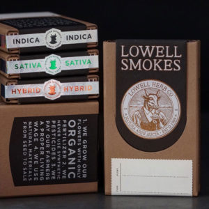
        Public concern about Indian Hemp was nonexistent, but that changed in 1913 when Henry J. Finger conspired to outlaw cannabis and helped pass the 1913 Poison Act. This, however, did not deter Lowell. Believing in a man’s right to smoke the dried plant and enjoy its benefits, he refused to stop growing it. When Finger caught wind of this act of rebellion, he shut down Lowell’s farm and eventually threw him in jail. Over 100 years later, Lowell Herb Co. still is in operation. Paying homage to Bull Lowell’s respect for the plant, the company’s standard is to only use “natural materials from seed to sale,” and this is evident even in its packaging. The organic cannabis farm turned to Twin-City-based Studio On Fire to help create packaging for its pre-rolled smokes.

        “When assessing the goals of the packaging early on, it was obvious that the organic process should be seamlessly conveyed to the consumer,” said Ben Levitz, Studio On Fire founder. “It also was important that the final product should feel like a piece of design ephemera from another time, nodding to the 100-plus-year history of the farm itself.”

        Studio On Fire offers letterpress and foil stamping/embossing – all of which use special letterpress and foil stamping equipment to create designs by means of pressure. As a result, Studio On Fire creates pieces that are eye-catching and tactile, much like the carton for Lowell Farms. Made out of Neenah Folding Board 26pt Grocer Kraft, the carton features original artwork of the farm’s logo. The logo – an emblem featuring a bull’s head on a human body encircled by the company name and other details – was created on scratchboard, which then was provided to Studio On Fire to translate to vector artwork. The packaging design was completed by Lowell’s team and translated into the final foil stamping of the emblem on the front of the carton.

        “We thrive when combining techniques, and several were used on this project,” Levitz said. In this case, Studio On Fire needed “to produce an aesthetic that walks the line of raw/refined,” he added.

        To create this look, a flood of letterpress ink was used to naturally provide a textured area that supports the ephemeral quality of the piece. The carton was passed through a Heidelberg cylinder press for letterpress on the interior as well as the exterior, and the pass utilized photopolymer plates that Studio On Fire makes in-house to apply a soy-based ink.

        The carton then had two passes on a Kluge for foiling and embossing on the darkly printed tab that falls over the front of the carton. First, a pass of matte silver was applied and then over-stamped with a metallic copper – both from Infinity Foils. The next pass, a heated blind impression was made with the combination of a heated metal die and pressure without using any foils or inks in a secondary logo with the bull’s head on the outside of the carton. The carton then was diecut on a Saroglia FUB and folded and glued on a Kluge Omnifold. A custom micro-etched pattern in the die was used on a rainbow holographic foil with an overprint of black for the final package seal. All engravings, including the UniFraxion® engraving, were supplied by Universal Engraving, Inc.

        Levitz said that a detailed piece, like the Lowell Smokes carton, that required many passes through a press or presses in Studio On Fire’s shop, is going to suffer from stretching.

        “All of the processes that happen under our roof are impression-based, so if we’re not careful we’ll warp the sheet into a giant ruffled potato chip,” he added. “It takes a lot of skill to get the correct amount of tactility in the final product without ruining things along the way.”

        But, this is the challenge that propels the company to continue providing premier printed and embellished work with a distinctive look.

        “In general, a huge part of what Studio On Fire does is design via production planning: Selecting stocks, planning press sheets, designing dielines, figuring out what presses will work best, what foils will stick, what order things should happen, advising artwork revisions – all of those things are key to getting the high quality final products that we’re known for,” Levitz said.

        This high-quality and detailed work results in satisfied clients, like Lowell. “We’re happy to have been working with Lowell for several years now, and it’s clear that the level of consideration the company has given its packaging really stands out to consumers in an ever-growing market.”

        Magic in the Cards: Foil Graphics Celebrates the Holidays with Special Christmas Card

        December 17, 2019

        By Brittany Willes, contributing editor
        PostPress

        Bing Crosby may be dreaming of a white Christmas, but most designers and decorators would agree that Christmas is all about the bright, cheerful colors. It simply wouldn’t be the holiday season without a decadent array of red, gold, silver, blue and, yes, a little white. All of these traditional Christmas colors can be found in the very untraditional, stunningly unique card from Foil Graphics. The promotional “Merry Christmas Pop-Up Card” takes the classic Christmas card and gives it a bit of modern “pop.”

        “We were after a design that could be kept as a unique piece that illustrated the special abilities we have developed over the years,” said Foil Graphics President Guy Pepoy. “We always try to push the envelope when creating a project that will represent our unique blend of capabilities.”

        Naturally, pushing the envelope comes with certain challenges. For this particular piece, given the complexity of the design, finding the time to actually bring the final product to life was a challenge in and of itself. According to Pepoy, “Like all other self-promotional pieces, it was very difficult to get the press time to produce such a complicated item. Customers always come first, so with 12 press passes and the time required to hand assemble the piece, logistics became an issue to overcome.”

        Creating the card was not the only thing that required a great deal of time. Simply choosing the design was itself a labor-intensive task. “We were not originally looking to make a two-sided pop-up,” said Pepoy. “After hours of scanning the Adobe stock pages, these two designs really stood out. After several more hours of planning, we found a way that they could be used together.” Thus, the double-sided pop-up was born.

        Once the design was settled, the process didn’t necessarily speed up. The first of 12 press passes consisted of applying silver holographic foil to select snowflakes. Next, digital printing was registered to it.

        The next three passes consisted of foil being stamped on one side of the sheet, followed by eight passes of foil stamped on the other side. For the next pass, laser cutting technology was used to create the scores and cut the center Christmas tree and the perimeter. For the final step, the bottom edge of the card was glued by hand.

        The card itself was digitally printed on 130# digital C2s cover stock. The brass dies used were supplied by Metal Magic and the card was stamped on a Kluge stamping press. The red, silver and gold foils were supplied by Great Western Foils. 

        “We are used to hearing our customers say, ‘I don’t know how to do this, so I thought of you guys,’” remarked Pepoy. As a result, Foil Graphics has become skilled at coming up with unique products and designs. “We have found it to be challenging, but that’s what makes the work so exciting. This particular card has led to the creation of many other projects.”

        The challenge is certainly worth it when the final product receives such positive feedback. Pepoy noted, “The card has been very well received by printers, graphic designers, agencies and anyone who has seen it. We’ve had many discussions from people asking, ‘How did you do that?’ or ‘You put digital over the foil?’”

        Given the positive attention the card has been given, it’s little wonder why it recently received a gold award for technical difficulty during the 26th Annual FSEA Gold Leaf Awards in the Best Use of Foil/Embossing – Greeting Card Self-Promotion category. The award is sure to add a little extra Christmas cheer to a piece that is already merry and bright. 

        Next Page »


        The Official Publication of the Foil & Specialty Effects Association
        © 2025 All Rights Reserved
        Peterson Media Group | publish@petersonmediagroup.com
        785.271.5801
        2150 SW Westport Dr., Suite 501, Topeka, KS 66614