• Home
  • Article
    • Article Archive
    • Digital Archive
    • ENews Archive
  • Buyers Guide
    • Buyers Guide
    • 2025 Online Form
  • Advertising
    • Ad Options
    • Media Kit
    • Editorial Calendar
    • Electronic Files
  • Awards
    • FSEA Gold Leaf
  • Subscribe
  • Video Vault
  • Webinars
  • Amplify
  • Contact
  • Events
    .smi-preview#smi-preview-10580 { --smi-column-gap: 10px; --smi-row-gap: 20px; --smi-color: #ffffff; --smi-hover-color: #90c43c; ; ; --smi-border-width: 0px; ; --smi-border-radius: 0%; --smi-border-color: #3c434a; --smi-border-hover-color: #3c434a; --smi-padding-top: 15px; --smi-padding-right: 0px; --smi-padding-bottom: 0px; --smi-padding-left: 0px; --smi-font-size: 20px; --smi-horizontal-alignment: flex-end; --smi-hover-transition-time: 1s; ; }
    • Skip to main content
    • Skip to secondary menu
    • Advertise
    • Subscribe
    • Contact
    • Events
      PostPress

      PostPress

      Print Decorating, Binding and Finishing

      • Home
      • Articles
        • Article Archive
        • Digital Archive
        • ENews Archive
      • Advertising
        • Ad Options
        • Media Kit
        • Editorial Calendar
        • Electronic Files
      • Buyers Guide
        • Buyers Guide
        • 2025 Online Form
      • Awards
        • FSEA Gold Leaf
      • Subscribe
      • Video Vault
      • Webinars
        • Upcoming Webinars
      • Amplify

        Foil Stamping

        Foil Set-Up and Makeready on a Clamshell Press

        March 18, 2024

        By Jeff Peterson, editor-in-chief, PostPress

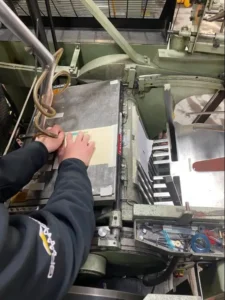
        Working with clamshell-style foil stamping presses presents specific challenges on press. Correct set-up and makeready are critical to ensure a quality job and one that runs with few rejects and at speeds that provide an adequate ROI.

        PostPress solicited the help of two experts – Mark Greenwald, Mark Andy Kluge, and Kersten Pankatz, PlatenWorks – to run through several scenarios on press and provide readers with recommendations to help solve challenges with paper stocks, inks and coatings, and more.

        When working with difficult stocks with high surface tension, what recommendations can help with foil adhesion and coverage?

        Pankatz: If coating the sheet after foil stamping is an option, that always is the best solution. Surprisingly, coating on top of the foil does not deter its sheen or brightness. If operators need to foil stamp over a UV coating, I suggest investing in a set of dyne count markers. The lower the dyne count, the more difficult it will be for the foil to adhere. There are foils that will stick to a dyne count in the upper 30s, and there are certain foil products that can work on a dyne count even toward the mid-30s. However, once a dyne is under 37 or 38, it most likely will not be stampable.

        Running the press at a lower speed may help with high surface tension. A solution for a Kluge press is to string the foil in reverse (bring the foil down the back side of the press and under the press, then up over the die). Instead of pulling the foil away from the work, this method will release the foil more slowly with the sheet, resulting in a less violent release. Also, if the image is shark toothing (triangle-shaped areas where the foil is not adhering), try prepping the image area with sandpaper. Tape a sheet of fine-grit sandpaper over the die, back off the pressure a little and run the sheets through the press. Then remove the sandpaper and run the sheets back through with foil. Registration is extremely critical when attempting this method. I suggest operators run about 50 sheets at a time until they are sure it is working and staying in register.

        Greenwald: I believe the adhesive on the foil is most important to battling high surface tension. There are several methods to help with the adhesion, including adjusting the heat and pressure and blasting air between the sheet and foil. Knowing all of the foil options available is critical. There are dozens of options through reputable foil suppliers, and operators should familiarize themselves with the different foil formulations to take the guesswork out of difficult jobs.

        If embossing on a clamshell, what suggestions help to ensure the operator ‘bottom outs’ the embossing die to get the most detail out of the impression?

        Greenwald: Every customer asks the same question with an embossing job: “Can you make it any deeper?” I suggest operators talk to their engraving suppliers about their recommendation on how deep to make the die. They will want to know the paper stock being used and the press the embossing will be run on. The key is to not have the die made too deep or the makeready will be a disaster. Again, the engraver is the best source.

        Pankatz: In many instances, I see dies etched or engraved much too deep. There is a misconception that the embossing die needs to be as deep as possible to create the best image. Work with the diemaker to get a die with a depth that works with the stock and the image. A die that is .024″ deep might work for a soft uncoated cover stock but most likely will not work on a coated text stock. I prefer a die more on the shallow side so I can iron out the grain of the paper. If the die is too deep, operators must back off the impression, giving a washed-out look, lacking detail.

        Once on press, it is recommended to heat the embossing die for best results. With uncoated stocks, 175° is a good starting point. For coated stock with ink, around 125° is recommended. These numbers are a good starting point; adjust as needed. Heat will make the stock more pliable and easier to create a deep embossing. Another suggestion: To get more detail out of the embossing die, tape yellow engraver’s board over the counter. Increase the pressure, moisten the yellow board and run several impressions, beating the die into the board. Once the image on the board firms up, make a spot sheet under the plate to even out the pressure. Any weak areas can be spotted on the yellow board with .0015 spot tape. If the image is splitting or cracking, cover the die with embossed film or Mylar. If the embossed film gives out after several impressions, string up a roll of the embossed film and use it like a foil roll, drawing a new section of the film with each impression.

        Refractive foil stamping is a great process to include image detail without embossing the sheet. Any suggestions for on press when working with a refractive (micro-etched) die?

        Pankatz: When stamping with refractive dies, I recommend black polyurethane board as a counter. This allows dwell time with each impression and helps push the stock up into the die. Another option is to tape a sheet of smooth uncoated text-weight paper over the phenolic or epoxy board makeready. Raise the die temperature a little and use a foil with an easy release. Also, refractive images work best on coated stocks, producing a better refractive image. Uncoated stocks can dull out the foil when using significant pressure, which makes it difficult to see the micro-etching.

        Greenwald: The August/September 2019 PostPress magazine included a refractive foil-stamped dragon on the cover. I was working at my family’s business, Scarab Printing Arts, at that time and was involved with the project. I remember testing several foils to achieve the best results. A heavier foil product commonly is recommended with refraction because it usually involves a larger image. We also performed tests on several makeready boards and settled on Redboard. It is much softer than epoxy glass or phenolic board, which makes it suitable for filling in the micro-etched lines on the refractive image. There are a handful of FSEA-member die and makeready suppliers that can help with incorporating refractive foil stamping into a print finishing repertoire. It is a creative way to add pizazz to a foil stamping job with a small additional investment.

        When foil stamping or embossing to print or another foil-stamped image with tight registration, what should operators keep in mind on press to ensure a quality registered image?

        Greenwald: The key to getting perfect registration on a clamshell press is all on the release of the sheet into the bottom gage blocks. Sheets must hit the blocks cleanly. Watching a machine when the sheets are hitting the blocks correctly is going to ensure proper registration. If there is any bounce in the sheet, the operator simply will not register the foil or emboss to the print and will need to make adjustments, most likely to the feeder head. Also, try moving the suckers and blocks around. I have seen operators have more success registering sheets with the suckers on the outside of the block, and others who prefer them on the inside – each with their own theories as to why one way is better than the other. Again, as with most makeready and set-up procedures, experiment and be creative. I explain that running a job is like running a race where the start line and finish line are in the same place, but the path taken to get to the end is up to the operator.

        Pankatz: When registering foil or embossing to a printed image, be sure to match the gripper and guide with how the job was printed. Keeping the guide corner the same but switching portrait and landscape orientation can cause registration issues if the stock isn’t pretrimmed or square. If possible, lay out the job with the image that is stamping closest to the gripper and guide. Sheet curl and stretch become more pronounced the further the image is away from the guides. On a Kluge press, use the lower 1/8″ blocks for the head stops and side guides. This will minimize the buckling that can occur if the stock is curling. And it might be necessary to decurl the stock before loading the press.

        A helpful move is to lock up a crop mark die off the edge of the sheet. Pull a stack out of the delivery, jog it up to the gripper and guide, and look at the mark to check registration. If possible, string foil over the die. Operators will know double sheets are being pulled if they encounter crop mark images without foil.

        Thank you to Mark Greenwald, Mark Andy (Kluge), www.markandy.com, and Kersten Pankatz, PlatenWorks, www.platenworks.com, for their assistance with this article.

        Neenah Paper Shares Holiday Spirit with Generous Self-Promo Piece

        December 11, 2023

        By Liz Stevens, writer, PostPress

        Neenah Paper, Alpharetta, Georgia, earned the bronze in the 30th Annual FSEA Gold Leaf Awards with its entry, “Deck the Halls with Neenah,” for Best Use of Foil/Embossing/Diecutting – Self Promotion (Industry Supplier). The piece includes several items, all of which feature standouts from Neenah’s wide paper selection, complemented by metallic ink, foil, embossing and spot color. Tucked inside a hanger single-pocket folder are a greeting card with an envelope and a holiday gift tag insert, a gift box with a product belly band and also a holiday belly band, and a hanging mistletoe ornament.

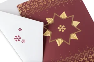
        The folder, which is decorated with tiny red winter berries and a rhyming holiday message, is diecut, printed with metallic gold, micro-embossed and foiled. Its pocket is stuffed full of promo pieces designed to be repurposed by the receiver. The sprig of three-dimensional mistletoe is diecut, printed, micro-embossed and foiled, and tied with red and white twine so that it is ready to hang.

        The gift box features rich blind embossing, a luxurious product belly band that is micro-embossed, printed and foiled, and an additional festive holiday belly band that is diecut and foiled. The showstopper of the piece, however, is the greeting card. The burgundy soft-touch paper features intricate micro-embossing, metallic ink and foil. Inside the card is a diecut gift tag insert with its own fine texture and metallic ink. The red winter berries from the hanger folder carry over to the mistletoe, the greeting card envelope and the embossed, foiled info card.

        Michele Pistone, marketing manager at Neenah Paper, described how the piece was conceived and produced. “Every year,” Pistone said, “we like to create a piece that inspires people to take their holiday marketing to the next level with the printed components of their campaign.” Neenah Paper knows that the retail and direct mail market are super-competitive around the holidays. “Our goal is to provide holiday-themed inspiration for brands, designers and anyone else doing print, packaging or collateral. We aim to showcase our papers in creative ways with different formats, diecuts and decorations.”

        Pistone explained that the piece utilizes 11 different stocks from Neenah, including selections from CLASSIC CREST®, ENVIRONMENT®, ROYAL SUNDANCE®, NEENAH® Folding Board and TOUCHÉ. “The design and graphics were created by our in-house design team,” she said. “We collaborated closely with Fey Printing, Wisconsin Rapids, Wisconsin, which was instrumental in perfecting our dielines for each piece. The company also recommended the perfect basis weights to use for optimal functionality of each piece, as well as the collection.”

        The piece includes an array of embellishments, all beautifully designed and tastefully coordinated. “Because it is a holiday-themed piece,” said Pistone, “we had the opportunity to utilize a variety of foils. We collaborated with KURZ and experimented with its MicroEmbossed foils, which was really fun. It adds another level of visual interest to several of the pieces. In addition, we have some unique diecuts, embossing and printing with metallic ink.” Neenah used foil/embossing dies from H+M. “We used laser-etched foil stamping dies on some of the pieces,” she said, “to create unique textures and novel appearances for the foil stamps.”

        Pistone explained that each component in the piece was printed as a separate job. “The unique part,” she said, “is that each piece uses no more than one color of ink, printed offset. Each piece then has various postpress effects, including foil stamping, diecutting, blind and registered embossing.” The offset press machines included a Mitsubishi 240 and a Hamada four-color press. For foil stamping/embossing, Kluge EHD presses were used. The diecutting/scoring presses used were Kluge EHD and Heidelberg windmills. The digital press used was an HP Indigo 7900.

        The team at Neenah did not encounter any surprises or production challenges in producing this piece. “We produced mockups early in the production process,” Pistone said, “so we could overcome any issues later in the process. Testing sometimes is used before producing the full volume of pieces to make sure everything is going to look the way the designer intended without any surprises.” For this piece, said Pistone, “lots of hand assembly was required. One of the components is a mistletoe piece designed to be hung. We sourced the perfect red-and-white-striped string and needed to cut, tie and attach the string to each piece.”

        This promo project was a smashing success. “Our customers loved the piece!” Pistone said. “It was a welcome burst of ideas and inspiration for designers and marketers looking to move beyond the screen and create new ways to surprise and delight their customers.”

        Company Creates Business Card Too Beautiful for the Rolodex

        September 11, 2023

        By Liz Stevens, writer, PostPress

        On Line Bindery, Richmond, California, earned the gold for Best Use of Foil/Embossing – Business Card/Stationery in the 30th Annual FSEA Gold Leaf Awards with the design and production of an outstanding business card. On Line’s triplex mounted card with foil and laser cutting was created with a three-layer card, with laser cut text in the top layer which revealed foil in the middle layer, backed by a solid bottom layer. The company used BOBST and Trotec Laser equipment for the project, along with foil/embossing dies from Universal Engraving, Inc., and foil from Great Western Foils.

        The company tackled this project to update its business cards with a fresh, new look that would grab the attention of existing customers and prompt prospective clients to connect with the company to create their own attention-grabbing print products. On Line wanted to demonstrate its creativity and versatility. “We are in the business of enhancing printing,” said Steve Wignall, manager of the coating, laminating and mounting departments at On Line. “If we can’t do something interesting for our own use, we need to reevaluate our purpose in the industry.”

        Wignall described how the design for the business card morphed as the project unfolded. “The design evolved from a single duplexed card to a triplex,” Wignall said, “and then to laser cut, and finally to a design with numerous foil colors stamped on one of the layers to show through the laser-cut company name.”

        With this project, On Line was able to showcase the high quality of its new laser. “We recently had installed a Trotec laser for cutting and engraving work,” Wignall said, “so this seemed like a good time to put it to work if we could incorporate the laser capability into our business card.”

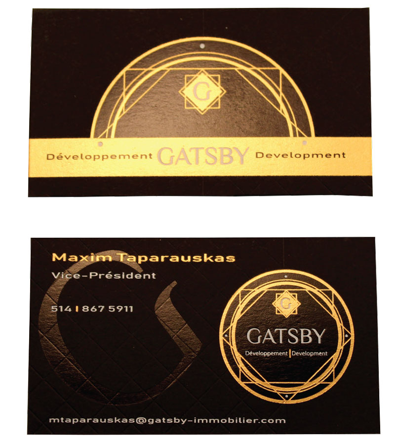
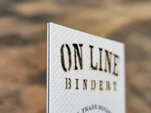
        Wignall said the challenge involved with laser cutting is trying to achieve precise cutting without leaving any burn marks. On Line finds that some substrates work well for this while others can be problematic. “With the substrate for our business card, our laser operator rose to the challenge,” he said, “and was able to make the design work even though it was not a particularly laser-friendly duplexed stock.”

        Feedback from customers and prospective clients has been overwhelmingly positive. “Our motto is ‘go big or go home,’” Wignall said, “and this card fits our motto. It has been well received by customers and others in the industry.” Numerous customers have asked On Line to make similar cards for their companies. “Everyone we hand it to instantly makes reference to the thickness and loves the tactile feeling,” Wignall said. “One of our customers who produces business cards told us, ‘This is the nicest business card I have ever seen, and I have seen a lot!’”

        The company received high praise from one of its foil suppliers, Great Western Foils, Inc. Great Western Foils’ national sales manager, Brian Bowland, wrote in an email, “The On Line Bindery business cards are a great representation of what it can offer to customers. It’s amazing to see how printing, foiling, laser diecutting and gluing and pasting all work very well on this little piece of paper.” Bowland noted how the business card design brought to mind a favorite 2014 YouTube video. “The video is called ‘Your business card sucks!’” Bowland recalled. “The presenter talks about how cheap cards are totally worthless, and he is right. The On Line business card is exactly what he is talking about. It is beautiful, it shows off what you On Line offer, and it is the kind of card that does NOT go into a rolodex. It’s too beautiful.”

        Couple Says ‘I Do’ to Custom, Luxury Wedding Invitations

        September 11, 2023

        By Erin La Row, editor, PostPress

        A wedding invitation is a first glimpse at a couple’s wedding day. It sets the tone for the ceremony before guests ever arrive. Alexia Vondrachek and the team at Prettiest Pixel, located in Shawnee, Kansas, design and produce luxury wedding stationery. The company takes classic, luxury invitations and adds a modern element. Each design is as unique as the clients it works with.

        The Prettiest Pixel team was approached by a wedding planner to provide a quote for the wedding planner’s clients, Matthew and Santos.

        “The production goals were to execute a perfect and high-quality design that is representative of our work but in line with Matthew and Santo’s vision of the perfect wedding invitation,” Vondrachek said.

        The design needed to be dark but formal, trendy and modern at the same time.

        “We needed design elements that were not too feminine but bold and high-end in concept,” Vondrachek said. “We chose a leathery textured paper underneath the main invitation to enhance the overall design.”

        Vondrachek designed and created the graphics in Adobe Illustrator. At times, pieces of stock art were used to fill in small details for the wreath or crests. “And at times, they were purely illustrated by me or our other designer, Nikole Williams,” Vondrachek said.

        The design team used Stardream cover stocks and Sirio Ultra Black for a stunning dark black finish on the envelopes. The team then used digital white printing for the writing. “We love using white printing to finish off any detail,” Vondrachek said.

        The main invitation was made of a flexible clear acrylic and finished with hot foil stamping in gold. The remainder of the items were made from Stardream Papers, which Vondrachek said run well on Prettiest Pixel’s laser printers.

        Embellishments include gold foil on the acrylic that then was placed over a deep black, textured background, providing a unique presentation for a wedding invitation. Vondrachek said the white printing also is unique given it was printed in-house using a German supplier for the toner on a small HP Laserjet printer. Other embellishments include the custom wax seal and engraving.

        “That was the perfect accent and one of our favorite things to do for our clients,” Vondrachek said. “The challenge with that is we have to use very specific temps on the wax so the seal is done without defect. Heidi Muder-Hoang, our head of foiling, is perfect at that!”

        In addition to the HP printer, the team used a Xerox printer and Metallic Elephant clamshell hot foil machine for the hot foil stamping. Ribbons and quality adhesives for the liners that are clean, clear and easy to apply with speed helped complete the project. With all of the assembly done by hand, Vondrachek said it takes a sharp eye.

        “Ultimately, the production has to be perfect, and the borders are really the challenging part. I think all pressmen and women can get on board with that! Being in the wedding industry is a challenge at times due to the fact that we have to be perfect at all times with our production,” Vondrachek said.

        The result was a stunning invitation the clients and judges loved. The Prettiest Pixel’s acrylic invitation took home gold for Best Use of Foil/Embossing – Announcement/Invitation (Creative) in the 30th Annual FSEA Gold Leaf Awards.

        One Country, One Constitution, One Amazing Design

        September 16, 2022

        By Jewlissa Frickey, writer, PostPress

        Marked with the words, “One Country, One Constitution, One Destiny” on the bottom of the poster, the sixth print in the US Landmark series by Baugh Graphic Finishing House was brought together by the US Capitol.

        “We wanted to produce the next poster in our series to highlight a sculptured emboss image as the main finishing technique with a little bit of foil stamping,” said Dave Hurdle, vice president of Baugh Graphic Finishing House. “We liked the Capitol because of the detailed architecture in the windows and dome and the statue at the top of the building.”

        UV Printed (CMYK + Brown) by Printing Partners using a 90 lb Fluorescent White Letter Press Finish Cover, Baugh was able to fulfill the need for a paper with high cotton content to showcase the emboss.

        “In order to create the graphics,” Hurdle stated, “We started with a stock image of the Capitol and then had a graphic designer convert the file. We needed something in the background to help bring the white emboss out, so we came up with the idea to print the Constitution behind the Capitol.”

        The 20 x 30″ piece is the epitome of detail with its multi-level die, viewers are able to see, and feel, the columns in the front of the dome as well as the columns on the opposite side of the building. Furthermore, it allows one to feel the curvature of the dome, columns and further details throughout the building.

        “For the specialty effects and embellishments, we multilevel embossed and used four colors of foil stamping,” said Hurdle. “For embossing we used the Bobst 126 BMA, for foil stamping we used the Bobst 102 BMA and finally, for the foil we used four colors from Infinity Foils including gunmetal, bright silver, metallic red and blue.”

        To achieve the amount of detail the poster possesses, meticulous attention was given by Universal Engraving Inc. (UE) to ensure that all details were embossed with depth and perspective. “We used a brass emboss die, which is a very intricate embossing die,” said Hurdle. “Identifying the substrate was essential in the embossing process to determine the amount of paper stretch possible. In addition, the embossing die needed to register to several foil stamping dies, some which had fine details, as well as ‘nest’ into preprinted lithography.”

        The Capitol is set against a backdrop of the original Constitution with the American flag, rendered in red and blue foil, in the foreground and the statue of freedom along top.

        “One of the biggest challenges we faced during this project was controlling the depth of the emboss,” said Hurdle. “It was necessary in order to get the most detail possible without cutting through the paper.”

        Another challenged noted by Hurdle was regarding heat compensation. “Copper Flat – Gunmetal Shade was used for the statue on top, in order to ensure registration to the emboss the die was given a special heat compensation.” All four of the copper foil dies were given special heat compensation to ensure registration to the emboss area.

        “The reaction from our clients was great,” said Hurdle. “Many requested extra copies and several questions as to how big the die was to accomplish the piece.”

        Velvet Stock, Foil-Embossed Label Helps Wine Bottle Shine

        September 15, 2022

        By Erin La Row, editor, PostPress

        The folks at Multi-Color Corporation North America (MCC) know labels. They’ve been helping clients build their brands through premium label solutions for more than 100 years. The company’s vision is to have global leadership in premium label solutions. And with more than 13,000 employees and 109 label producing operations in over 26 countries, the company is well on its way.

        labelThe wine and spirits segment is one of many market segment specialties in MCC’s portfolio. Its experts are in all major wine-producing regions helping to make every label project a success, whether it’s through embellishments, specialized inks, alternative materials or other printing specialties. One such success story – that of Gilded Letter Cabernet Sauvignon. The team at Penrose Hill had been collaborating with the team at MCC on producing their unique labels.

        “Penrose Hill was intrigued when the digital team at MCC presented the velvet stock as an innovative option,” said Scott Amoroso, director of operations at MCC. “After a few trials, the finished product ran beautifully and is now seen as the design today.”

        MCC was tasked with telling the story of a wine rich with flavor – with layers of oak and spice – from vineyards in California’s Sonoma County with its label. The team started with 155 lb. flocked black velvet stock. The team at MCC revised and proposed an improved design for the Gilded Letter label, as there were some limitations with the velvet stock. They added gold and copper foil in a thin and intricate design. Foil was supplied by KURZ and Metal Magic supplied the foil/embossing dies.

        “Specific spacing between foils was necessary to be applied to the velvet material to avoid the distortion that the felt material could cause,” Amoroso said.

        The Gilded Letter label was printed on an HP Indigo digital press and then hot foil stamped and diecut offline on an ABG Digicon press. One of the advantages of the ABG Digicon is that the hot foil stamping can be accomplished with flat dies versus a brass rotary hot stamping engraving, providing an enormous cost savings for the customer for small to medium-sized label runs.

        The result: A label that captures the essence of this limited release wine.

        “The client loved it!” Amoroso said of Penrose Hill. Judges at the FSEA’s 29th annual Gold Leaf Awards took notice, too, awarding MCC with a silver for Best Use of Foil/Embossing Label – Digitally Printed.

        “We actually created a series of these wines – cabernet, chardonnay, pinot and zinfandel – always different color velvet and different foil combos in order to create a broader luxurious and opulent brand series,” said Carolin Meier, chief wine officer, Penrose Hill.

        According to www.firstleaf.club, Gilded Letter Cabernet Sauvignon’s flavors are dense and concentrated with modest acidity and a dry finish. The wine’s tasting notes include violet, vanilla and blackcurrant, and it pairs well with bone-in Ribeye, Polenta and Italian Beef Ragu. Cheers!

        All You Need is Love – Playing Card Box Befitting of Music Icons

        June 8, 2022

        By Erin La Row, writer, PostPress

        theory11’s special edition The Beatles playing cards and box set, made in collaboration with The Beatles, pays tribute to a band that has shaped the world’s music scene for decades – nearly 60 years after Beatlemania hit US shores. The individual card boxes represent the iconic Sgt. Pepper’s Lonely Hearts Club Band marching band uniforms worn by John Lennon, Paul McCartney, George Harrison and Ringo Starr.

        The project came together when Studio On Fire, based in St. Paul, Minnesota, was hired by theory11, a producer of luxury, designer playing cards, to plan and execute production of The Beatles playing cards. Another partner in the project, Mattson Creative, was tasked with designing graphics conveying that Sgt. Pepper’s flair in a cohesive way across the set.

        “It was up to us to make sure the decks lived up to previous theory11 releases and that the special edition box felt luxurious and worth purchasing,” said Sam Michaels, creative manager at Studio On Fire.

        The team got started by asking questions: What is the best way to achieve those bright colors? How can this be done on budget? Where was it worth the splurge?

        Designing and planning

        There are many physical production steps involved in a project of this scale, and equally the same amount of work happening in the studio before paper even enters the building.

        The first step was to design the structure that would house the four decks of cards. Studio On Fire’s talented CAD department created several mock-ups that were reviewed and tweaked to get the final product. Questions had to be answered to settle on the final structure: How does this fit on a sheet, which would affect the press run and cost? Does budget allow for hand assembly? Does it hold the weight of the decks? Does it feel premium?

        “That last nugget, does it feel premium, is a question we ask ourselves a lot,” Michaels said. “Small things go a long way to pushing something into ‘premium’ territory. For example, the satisfying ‘click’ of a closure, the heft of a thick stock or the sturdiness provided by a custom insert.”

        The project’s graphics were designed by Mattson Creative. “Working with a studio that understands our capabilities helps the process, though we’re always pushing our boundaries and attempting things that really shouldn’t be attempted,” Michaels said. “But end up looking really cool, so it’s always fun to see what gets asked of us.”

        Before the design process was complete, Studio On Fire looked at initial files to start planning for potential production problems – a must in today’s world of continuous supply chain issues. The team was able to guide some final material and design choices based on availability of papers, foils, etc.

        Then it was the prepress department’s time to shine. Production processes go down one layer at a time, so it takes time to rip files into their specific passes. Michaels said the trapping, choking and altering of art all happens in this step when they’re creating the proof.

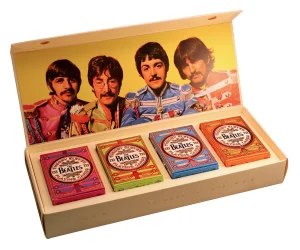
        “The Beatles box set also has a beautiful emboss happening and it’s our prepress department’s job to call out how that works: What type of emboss? What pieces of artwork? They’re making sure things won’t crack or get too close to scores,” Michaels added. “It’s a really detailed, specific set of decisions that are made in order to set the production team up for success.”

        The next step in the process is getting client approval of the proof. Then it is time to start buying materials such as paper, foil tooling, cutting dies and rolls of foil.

        “What some folks don’t realize is that a good chunk of production planning is for materials to arrive in sync with when open press time will be,” Michaels said. “It’s truly a behind-the-scenes ballet.”

        Production

        The Beatles box set is comprised of five main components: four decks of cards and the outer special edition box that houses them. Before anything can hit the press, the paper must be cut down from parent sheet size to press sheets. Everything at Studio On Fire is run sheet-fed. From paper prep, the job starts its tour of presses at the shop. The selected paper for the box set and inner tray was the Neenah Folding Board Natural White Vellum Finish.

        The outer box has three passes of foil – white, gold and black – all executed on a large format Saroglia press. After foils, the Saroglia completed the beautiful emboss, giving the artwork the tactility Studio On Fire pieces are known for. The foil for the project was supplied by Infinity Foils, Inc. and Kurz Transfer Products. The engravings for both the foil stamping and embossing were supplied by Universal Engraving. Inc.

        Both the outer box and internal tray/insert were diecut on a second Saroglia before vending out for final assembling, including the addition of a magnetic closure.

        A rare occurrence for Studio On Fire, the four tuck cases started with a vendor partner who laid down four colors of offset ink and a pass of aqueous coating before Studio On Fire took it in house. Once the sheets were on the floor, they took three trips through Studio On Fire’s Kluges to get gold, black and red foils laid down. A pass through the Saroglia for a beefy emboss before moving on to the second Saroglia to be diecut. The fold/glue team finished off the set of tucks, folding and gluing each of the four-color versions and getting them neatly packed.

        “These were made with love,” Michaels said. “Each step, from planning to production, is painstakingly executed by a staff who cares deeply about making a quality product that can’t be made anywhere else.”

        Embellishments and challenges

        “So much foil” – that is how Michaels described the project. Layers after layers of foil were laid down on every type of foil press Studio On Fire has at its disposal. After the layers of foil, everything was hit with a heavy emboss, carefully as to not crack the layers of foil, but heavy enough for the team to question whether it was too much.

        “It’s never too much,” Michaels said.

        The Studio On Fire team initially was given a rigid box concept. Michaels said the team moved this to a folding carton structure to get a more tactile result by having the ability to hit the artwork with a deep emboss. The team also chose to keep the entire product paper instead of defaulting to a foam insert, which added complexities but produced a more environmentally friendly product.

        Best of Show

        The result: The most vibrant and eye-catching playing cards ever produced by theory11. Studio On Fire entered The Beatles box set into FSEA’s 29th Annual Gold Leaf Awards, winning “Best of Show” for all the Best Use of Foil and Embossing categories.

        “Projects like this reflect a great relationship and effort between client, design, planning, and production,” said Ben Levitz, owner of Studio On Fire. “Focusing on projects with that synergy is what we love to do; we think that love is reflected in the final product and thus pushing it to ‘best of show’ level work. We’re honored.”

        The Beatles cards are available for individual purchase or in the premium special edition box set at theory11.com.

        Troubleshooting Foil Stamping Challenges on Press

        March 22, 2022

        By Liz Stevens, writer, PostPress

        FSEA Executive Director Jeff Peterson recently queried a trio of industry experts about foil stamping and embossing challenges, including working with paper stocks, coatings, digital printing and more. Bertrand Hayoz, Bobst; Andy Dvorsky, Dvorsky Press Services and Sean Hurley, MCD, answered questions and offered advice for finetuning techniques, making jobs more cost effective and speeding up production.

        Q: What are the challenges for foil stamping, coatings and embossing when it comes to paper stocks? Are there new paper stocks of particular interest? Are recycled stocks becoming more prevalent?

        Bertrand Hayoz of Bobst replied that, as he trains customers, he finds that SBS board is the best choice and easiest to work with. Hayoz pointed out that fluted stock can be particularly challenging for foil stamping. “One thing that often will happen,” said Hayoz, “is that foil stamping will crush the flute, even when using a very thin flute, like a N or E flute. The paper will be crushed, the flute will be indented.” In some instances, this result will be acceptable, but in other cases, it is not acceptable to customers.

        Dvorsky Press Services’ Andy Dvorsky brought up problems he has seen with recycled paper stock. “I have seen that a lot of recycled papers are really hard to stamp,” said Dvorsky. Dvorsky appreciates that new stocks are being introduced but wondered whether paper manufacturers are considering the embellishing processes that may be used on them. “Foil stamping, embossing and diecutting are not going away,” he said, and new ways of applying these techniques will emerge to suit different paper stocks.

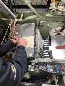
        Dvorsky described problems encountered by a customer applying foil stamping to recycled stock. “The customer was having all kinds of trouble,” said Dvorsky. “The stock would stamp perfectly before being printed. But when the customer treated the paper stock, printed digitally and then tried to stamp it, the foils would not stick.” The customer had to put a primer on the paper after the digital printing, and then the foil stamping worked properly. “It is not the paper itself that caused the problem,” he said, “but all of the materials and processes involved that caused the problem.”

        MCD’s Sean Hurley explained that when he consults with customers, he recommends a thicker stock when possible. “With a thicker stock,” he said, “you don’t have to worry about impression. With thin stocks, you may have to worry about impression, and they can be tougher to run.” Hurley said that smooth stocks typically are better and that some of the recycled stocks are very porous, which can cause issues. He noted that textured stocks are more difficult to work with, but that they allows for more creativity and can be fine for routine applications. “I see synthetic stocks as being more difficult,” Hurley said. “They can be tough to run vs. a smooth cover-weight sheet.” Stocks, such as Plike and Touche, have become very popular but can be challenging. Stocks that are translucent also can present challenges. A more expensive stock doesn’t necessarily mean it will perform well. Hurley advised checking with paper vendors for the stamping and embossing specs for their stocks and asking for recommendations.

        Q: UV coatings can produce cracking problems and create other challenges for foil and embossing. Have UV coatings improved? What recommendations, especially from a pre-planning standpoint, do you have for dealing with coatings and laminates for use with foil and embossing?

        Dvorsky has seen UV coatings improve over the years. “There is stampable UV,” he said, “but a problem with conventional UV is that it continues to include silicone. That can introduce a challenge for stamping.” A shop might be running a conventional UV on its equipment, Dvorsky explained, and then switch over to an over-stampable UV. “They will wash the machine up,” said Dvorsky, “put a stampable UV in and then try to foil stamp over it. They may have to wash the machine out five times before running the stampable UV through because of contaminant from the standard UV coating in the machine.” Dvorsky recommended doing pre-planning for using UV coatings with foil: Talk to vendors to get their specs and make sure that coatings are stampable, see if it is possible to avoid stamping on the coating and then use spot UV or apply the UV after the foil. “There also have been foils,” said Dvorsky, “that are formulated to stamp on UV coatings. Talk with your foil supplier. Talk with your coating supplier. Talk with your paper supplier. It is all in the planning to make a job beautiful.”

        Hurley agreed that a small amount of regular UV coating can contaminate a large amount of gluable, stampable coating. “We tell customers that what they want is a gluable, stampable coating,” he explained. Hurley recommends also checking dyne levels. “When we receive jobs involving a UV coating,” he said, “we check the dyne level. We test sheets ahead of time, before they go on press, using dyne pens. If you have low dyne,” he said, “you probably have to think about going to a specialty foil, and that can be a more expensive product that is made for problematic jobs.”

        Hurley has seen problems with darker colors of ink that are printed and coated inline to speed up the printing process, but this can lead to the ink below the coating still being wet. “When the face of the die hits the coating, foil might not adhere because the ink is not set, and this causes foil adhesion problems. We see a fair amount of this and it can be challenging.” Hurley noted that this problem can occur with UV cured inks as well; the key is the topcoat. “We prefer a gluable/stampable coating and a higher surface dyne level,” he said. “The chemistry from the printer needs to be compatible with foil stamping over the UV coating.” He stressed that communication is critical for success.

        Hayoz offered another solution to address the dyne level problem. “Do one pass first to stamp without foil and then a second pass to put the foil on,” said Hayoz. “Sometimes it works and sometimes it will not.” Hayoz’s suggestion prompted Hurley to offer additional ideas. “In jobs where a perfect mirror image is not required, it may be possible to run a separate pass on press with a die with a slight texture on the die face to break the surface of the coating slightly. That can help the foil to bond on the second pass.” Hayoz weighed in with a final strategy and mentioned for large foil stamped areas, the makeready can be built up like a pyramid to the center of the image and it will help the air disperse on every side of the areas that are being foiled.

        Q: Digital printing continues to grow and create challenges with foil stamping and embossing. What recommendations do you have for pre-planning on press and working with digitally printed sheets?

        Hurley recommended talking with the customer about advanced testing when working with digitally printed sheets. If the customer has used the same inks and coatings previously, he suggested asking for a few sheets to have ahead of time to test the foil. Hurley also suggested working with foil companies to learn about their latest or updated products, as well as asking for recommendations. “With newer digital equipment and newer UV inkjet, we have had better results,” he said. He did say that the registration systems with digital printing can cause challenges for conventional grippers and side guide registrations. “Something with drop-dead, tight registration can be a challenge because of the way digital printing equipment uses optical registration,” he explained.

        Hayoz commented that some machines have a registration system which makes it possible to register by a printed or stamped mark on the sheet as opposed to registering by the sheet’s edge. There is emerging foil machinery that includes a built-in registration system, along with a different method for guiding sheets through the machines.

        Dvorsky offered advice on using a primer for foil stamping over stocks with digital printing. “What I have seen is that darker inks are harder to stamp on because so much color has been put down onto the paper,” he said. “Priming the paper after the ink has been printed definitely helps, and it also can help to have a soft-touch or other type of laminate over the digital printing before foil stamping.”

        Q: Print runs are getting shorter and there is increasing concern about waste and rejects. What do you recommend, from a production standpoint, to keep rejects down when working with foil and embossing?

        Hurley stated, “A big thing is to track the waste so that your operators know that it is important. You might even save waste on a job that you know you are going to be tight on. If you look at the incoming packing slip to see what the count was and you end up short on the job, you then have a way to determine how much you had in waste, because you
        tracked it.”

        Hurley also recommended being more efficient when using sheets in makeready. “Depending upon how many operations are involved in a job, you will need to do an additional press makeready for each operation to get up and running,” he said. Each makeready adds even more spoilage and waste. Also, you might ask your customers to send their own makeready from the printing press – clearly marked as ‘makeready’ – and use it prior to using good sheets.” He also pointed out that some substrates are very expensive per sheet and that using a less expensive paper of a similar thickness for makeready might cut down costly waste.

        Hayoz added his thoughts about decreasing rejects and waste. “We see a lot of operators who just take the good paper stock right from the beginning to do their makeready and they waste a lot of sheets.” Hayoz suggested that operators use the makeready sheets from the printing for the entire set-up process, but he noted that it sometimes does require multiple sheets. “It is not only on the first stamping process,” said Hayoz, “it is all the way along the line. Cutting, gluing and all the different processes. That will save a lot of sheets.”

        Hayoz stated also that, depending on the quality required, keeping the machines and the environment scrupulously clean can reduce waste that inadvertently is generated. “A tiny piece of dust or something on the foil stamp or on the sheet, and the picky customer rejects the sheet,” said Hayoz. “When you move the sheet around, you have to keep everything perfectly clean.” He stated that if a speck of dust gets stuck between the stamping or on the top of the stamping before a coating is applied, the sheet may be rejected by a demanding customer. “We have a maintenance program that we recommend customers follow,” he said. “Mostly, they have to know when to clean the inside of a machine; not only the outside of the machine but the inside, too.” Hayoz also recommended covering loads of paper with plastic sheets to keep dust off the surfaces.

        Dvorsky added, “I look at it as an operator. Operators are craftsmen, so waste is impacted by the attitude of the operators.” Dvorsky brought up the advantages of having multiple machines in a shop. “When you are setting up a job that has to go through the press five or six times, set it up on three different machines – tracking the registration throughout – that reduces waste.”

        Dvorsky advised that having well-trained operators makes a difference and that poor training can result in waste. Dvorsky reiterated that “reducing waste requires the right state of mind, the right operators, regular maintenance of the machines, cleanliness and making sure that counters are working – all of that has an effect.”

        Q: Today’s customers want jobs faster and faster, so foil and embossing equipment must run at high speeds. Any recommendations to decrease makeready time on the press, or things to do so that setup from one job to the next goes as fast as possible and the equipment can run at optimal speeds?

        Hayoz commented that he is a stickler for saving time by having jobs queued up and ready to run. “It is not your operator’s responsibility to go looking for the next load,” he said. “Before you finish one job, the next job already could be by the machine, not at the other end of the building.” Hayoz said that documentation is a must for speeding up operations. “When you have a job change,” he said, “write down all the data from the job, especially if it is a repeat job. That way, you can set up everything on the machine before you start to do the job.” Hayoz recommended taking advantage of machines that can retain job specs in memory. “You may have a machine that memorizes the old job and you can bring it up each time. Preparations like this can be done in advance so that when you finish one job, the next job will be there. Having the next job prepped and letting the operators know what job is next can speed things up. That makes a big difference on makeready time and being able to run quickly and smoothly.”

        Dvorsky wrapped up his advice with some valuable suggestions. “Having a second honeycomb is great, so that you can start setting up your next job. Having the press maintained and the platen parallel will reduce your makeready times,” he said.

        “Having all the tools on hand, having the press parallel, level, having the operators know how to do proper makereadies, these all help,” said Dvorsky. “Operators can get lazy and do things the easy way, but that is not always the best way. I had a customer running a scratch-off job. The operator decided to use masking tape as makeready over his makeready board, which caused all kinds of issues. The job looked awful, and you couldn’t scratch the scratch-off properly. So, it is important for operators to maintain the press, have all the tools needed and run the press at optimal speeds.”

        Hurley threw in a few last bits of advice for speeding up operations. “I suggest leveling the press, doing maintenance, even tracking the speeds,” he said. “If you have trained operators that are good at what they do, they are true craftsmen in many ways, and giving them incentive to run faster is important.”

        This article was based on a panel presentation – “Troubleshooting Foil Stamping Challenges: Ask the Expert,” – which was part of FSEA’s Online Spring Summit in the summer of 2021. Thank you to panel members Andy Dvorsky, Dvorsky Press Services; Bertrand Hayoz, Bobst; and Sean Hurley, MCD for their contribution.

        Paper with a Plan – a DataGraphic and Mohawk Collaboration

        March 22, 2022

        By Jewlissa Frickey, editor, PostPress

        Sample booklets are nothing new to the paper industry, but Mohawk sought to revamp its own with an entirely re-imagined process of paper selection. The Paper with a Plan Collections Kit is a set of five sample booklets in custom slipcases that feature its papers grouped by their primary attributes: Beautiful, Sustainable, Expressive, Elevated and Practical.

        DataGraphic, located in Commack, New York, was involved in the project and printed the multi-process Elevated Collection booklet as well as the screen printed custom slipcases that hold all five collections.

        “Mohawk was interested in doing something unique and, of course, well executed,” said Glenn Schuster, president at DataGraphic. “We thought screen printing would be a great solution given the nature of paper stock.”

        The Paper with a Plan Collections Kit was designed by Hybrid Design, San Francisco, California, and produced by Tocci Made, New York, New York. Other partnering print came from Kirkwood Printing Company of Wilmington, Massachusetts, and Flash Reproductions of Etobicoke, Ontario.

        Photo courtesy of DataGraphic

        The slipcases, printed by DataGraphic, used a Carnival Deep Blue felt cover with an M&R Renegade UV flatbed screen press. The five custom slipcases were screen printed in a green gloss ink and embossed with the graphic symbols that represent each collection.

        Specialty effects and embellishments were not spared during the project, Schuster noted, “On just the slipcases alone, we included debossing on our Thompson machine, then two hits of screen printing and, of course, the diecutting and assembly.”

        “Printing on such dark paper was a challenge,” said Schuster. “But we were able to screen print first. Then we debossed and did two hits of green.” Schuster continued by saying, “We had a lot of trial runs to try and get that right, but we were all excited with the way the custom slipcases came together.”

        Photo courtesy of DataGraphic

        Among the challenges was an initial registration issue. “Registration was challenging because of the fine type and the precision of the stamping,” said Schuster. “With the two hits of the screen press at two different passes, it took some time to get it perfect.”

        Mohawk’s Paper with a Plan Collections Kit is a 6 x 9″ container filled with five unbound booklets representing each collection. Each booklet contains printed demonstrations and samples, including printed color and texture chips, that are approximate representations of all the papers that can be found from the full product offering in that Collection.

        “In addition to the slipcases, we also were able to produce Mohawks Elevated Collection booklet,” said Schuster. The Elevated collection showcased some of Mohawk’s more famous stocks, traditionally used in stationery and letterpress, in various tones. Embellishments, such as embossing, engraving and foil, are more popular pairings with the papers in this collection.

        Photo courtesy of DataGraphic

        “The Elevated cover is diecut and shows through to beautiful holographic foils and impress papers that also are cotton,” said Schuster. The papers included in the elevated booklet include Crane’s Lettra Dark Black for its cover, the impress cover used Crane’s Lettra Light Pink and Crane’s Ecru and the interior also used Crane’s Lettra Light Pink.

        The ecru sheet was letterpress printed, while the light pink sheet was offset printed and foil stamped with holographic foil. “The booklet consisted of some really interesting artwork that really made the holographic foil stamping and letterpressing fun,” said Schuster.

        Along with the pink sheet, the black cover was foil stamped and diecut and the white sheet was offset printed. Then, all four leaves were die-scored, closed gate folded and nested into three folded pieces above and below the box to create the completed collection.

        Photo courtesy of DataGraphic

        “The binding process consisted of four sheets in various sizes that have four gatefold panels,” noted Schuster. “This creates a waterfall of the different sheeting, leaving it loose bound. The final product is just collated and nested without any mechanical binding.” Leaving the booklets unbound gives viewers the opportunity to discover more information about the product. Each of the pages can be taken apart to find detailed chart information on the back of the sheets.

        On top of the slipcases and Elevated booklet, DataGraphic produced an introduction card. It was made with a blue stock with green letterpress printing, similar to the green printing on the sleeve of the slipcases.

        “We used a Heidelberg KSB Letterpress for the introduction card as well as for the letterpress printing of the inner sheets in the Elevated collection,” said Schuster.

        “The collection itself still is pretty new,” Schuster stated. “It hasn’t been in the field too much, but we’ve already received great accolades from the industry. Our name being on it gives DataGraphic a lot of credibility, especially since the product was for Mohawk.”

        The collections

        Beautiful, Sustainable, Expressive, Elevated and Practical. These five categories bring the collection together with a more straightforward and simple way to think about paper.

        The Beautiful collection focuses primarily on the photography industry with its formation papers, while also supporting other illustrations and solid ink coverage. Next, the Sustainable collection is for papers with recycled or alternative fibers and a compelling sustainability story, from hemp stalks to straw waste and recycled cotton fiber, to the highest levels of PCW fiber and certifications. Expressive collections are papers with distinctive tactile and colorful properties. The Elevated collection focuses on papers made from cotton and premium fibers for stationery and letterpress while the final collection, Practical, is made of the economical “workhorse” papers.

        7 Hottest Print Design Trends

        September 9, 2021

        By Sabine Lenz, PaperSpecs

        Each year, a handful of printing and finishing techniques set the industry on fire, transforming the way designers create their work, spread their message and even the way they think. If you’re looking for a way to help your clients jumpstart their creativity while giving you a competitive edge, you really can’t afford to dismiss them.

        1. Sustainability 

        In 2020, when many of us got to spend more time outdoors, enjoying the clean air, positive environmental change started to feel a little more doable. Increasingly, consumers are becoming more mindful of how they can help achieve this. 

        For any print project, this means:

        Reduce. The most effective way to reduce waste is to not create it in the first place. 

        Right-size. This is not only important to the final cost of the product, but also to its perceived environmental impact.

        Print on demand. Ask yourself “What is the quantity my customer needs right now,” and “What is the longevity of the piece?” Thanks to digital printing and finishing, there really is no need to overproduce.

        Reduce overall waste. Here is your chance to help creatives understand how to best utilize a press sheet. They’re eager to be more sustainable and open to your advice.

        Reuse. Help your customers explore ways in which they might be able to repurpose their packaging and materials – and yes, this includes die-lines and other tools.

        Recycle. From recycled papers to substrates made with agri-waste (hemp, wheat) and recycled jeans, T-shirts and even coffee cups, there is no shortage of innovative new materials. Be the one to bring these exciting options to your clients; they will appreciate your forward, sustainable thinking. 

        2. Gold Metallic Designs

        Metallic effects in design are becoming uber-trendy. Already ubiquitous in product design, gold especially is popular. From packaging to business cards, gold gives any printed item a luxurious, expensive feel. 

        Granted, the shimmer that foil brings has been on trend for a while now, but beyond foil stamping, several newer technologies have become more widely available, offering creatives new possibilities and creating a resurgence of shimmer and gold.

        From hot and cold foil to foil substrates and digital foiling options, there is a foil – or better said, gold foil – option for every print run and budget.

        3. Swiss Binding

        In the last few years, exposed (or naked) spines – books and booklets that proudly show off the thread that holds them together – have increased in popularity. Using contrasting or complementing thread colors, designers are reveling in these new-found binding embellishments.

        Traditionally once trends reach their peak, they either fade out or someone adds a new twist. And today’s new twist is Swiss binding.

        Instead of being inserted and mounted in casebound fashion, in Swiss binding the text block is glued right on top of the inside back cover of the book’s case. While from the outside the book looks like a nice casebound book, once the cover is opened, the text block’s spine is revealed. In most cases the text block is Smyth bound, yet feel free to use perfect bound or saddlestitched text blocks, too. 

        4. Bright Colors

        While bold colors have been trending in the online world for a while now, thanks to enhanced print technology, we can go bold, loud and brighter than ever before in print.

        All this is thanks to neon inks used with traditional printing techniques – offset, letterpress and silk screen – but also in digital printing. This includes neon yellow, pink, orange, violet and green.

        Encourage your customers to crank up their design’s “look at me” factor by using vibrant neon colors as spot colors. 

        You also can use them to extend the overall color gamut. When we are talking 5+ color printing, we are adding more colors to a conventional 4-color process setup. 

        This is popular for two reasons:  

        1. To increase the overall range of colors, creating really rich hues
        2. The extra colors can be used to reproduce a special hue that is out of range of the standard CMYK mix, meaning you can match about 99% of Pantone colors on a digital press.

        5. Haptic

        In this over-digitalized world, people yearn for a tactile experience. Tactile effects on marketing materials – but especially packaging – have been becoming increasingly popular. 

        There are two ways to enhance a project’s haptic appeal:

        1. Substrate. From classic linen and felt textures to more daring ones like wood grain, using a textured substrate is probably the easiest way to bring a tactile aspect to any printed piece.
        2. Finishing. From traditional embossing to profile-raising spot UV (using either screen UV coatings or newer digital finishing), there is no shortage of ways for you to help your customers add that extra tactile feel. Soft-touch laminates and coatings continue to be very popular, while other specialty coatings, including sandpaper and leather textures, provide intriguing options as well. New digital options for applying spot UV coatings have opened up many opportunities for adding texture to packaging, direct mail and other printed materials. 

        6. Customization and Personalization

        A recent McKinsey study found that personalization will be the prime driver of marketing success within five years.

        Nobody wants to be bothered by irrelevant coupons, emails or texts, but they do want to be informed of offers that meet their needs. 

        Personalization offers meaningful, relevant customer communication. While the technology for this (e.g., variable data printing) has been around for a while, few brands are fully embracing it. Successful brands need to focus on good customer data, insightful analytics and, above all, ensuring that they protect customer privacy.

        Customization. Thanks to processing code (a scripting language that can create graphic elements) or tools like SmartStream, the ability to create unique covers, packaging and bottle designs is at our fingertips. Best of all, your clients don’t have to be a global powerhouse to benefit from these trends.

        7. Augmented Reality (AR)

        As you know, AR enhances the user’s perception of the real world by adding a computer-simulated layer of information on top of it. In print, one of the most used interactions is when the activation is triggered by scanning a specific item, or “marker.”

        But trying to convince customers to download an app can be tricky, let alone providing an app that’s compatible with all the different types of phone and operating systems out there. 

        That’s why marketers have started looking seriously into WebAR. It may not have the power of full AR but it still has plenty of potential. 

        WebAR refers to augmented reality experiences that are accessed through a web browser rather than an app. This means all you need is your smartphone or tablet and an internet connection – no apps required.

        With the introduction of ARKit and ARCore (the Apple and Google AR developer platforms) and web-based AR platforms such as 8th Wall, marketers now have a big opportunity to create innovative campaigns that integrate the digital and physical worlds.

        Whether it’s through augmenting product packaging with interactive content, virtual tours in brick-and-mortar shops or “try before you buy” at home opportunities (Starbucks or IKEA are two obvious examples), augmented reality is enriching the customer experience digitally in a way that few technologies can.

        These are the seven top print design trends, but are they all for you or your clients? Probably not. But mix and match two or more of these trends and you will delight your customers with the opportunities you can provide.  

        PaperSpecs.com is an innovative online hub for brand owners and graphic designers who actively spec paper and print, and refuse to be limited by short print runs or tight budgets.

        Through videos, hands-on/virtual “Live [unboxed]” events, blog posts and more, PaperSpecs provides trends, insights and access to crucial, hands-on tools and resources to help creatives craft printed pieces that WOW their clients. Don’t miss the weekly tips, trends and insights: www.paperspecs.com/get-weekly-tips/

        Next Page »


        The Official Publication of the Foil & Specialty Effects Association
        © 2025 All Rights Reserved
        Peterson Media Group | publish@petersonmediagroup.com
        785.271.5801
        2150 SW Westport Dr., Suite 501, Topeka, KS 66614