
By Brittany Willes, editor, PostPress
“There is an increased need for printed educational materials,” remarked Marko Leiviskä, graphic packaging designer for Metsä Board, Espoo, Finland. “The younger generation of designers is focusing more on electronic media formats. Printing and converting is a world of its own where designers can have a greater role in creating something with a ‘wow’ factor vs. just ‘Okay.’ But an understanding of how the process and equipment work to create outstanding visuals is needed. The printer and converter should be seen not simply as the place to print everything but rather as an important part of the creation chain.”
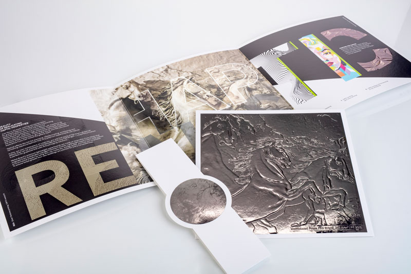
With that in mind, Metsä Board set out to create a promotional brochure that would showcase various specialty techniques, specifically hot foil stamping and embossing, demonstrating how printed pieces can be made to stand out. “The brochure serves as a tool for storytelling,” said Leiviskä. “Stories and pictures are easier to recall than technical specifications or details and can be used as a guideline for creating. That’s why we wrapped everything into one brochure.”
A particular story told by the brochure is how metallic effects can be utilized and enhanced to create a stunning piece. “Our perspective pays homage to the surface characteristics of metal,” Leiviskä continued. “There are techniques that can be used to enhance the metallic appearance – from cheaper to more expensive. We wanted to highlight and compare these.”
 To do so, Leiviskä opted to have the brochure printed on Metsä Board Prime FBB Bright 355 g/m2 I 23.6 PT. “Because we used hot foil stamping on both sides, heavy grammage was chosen,” he explained. Thickness also played an important role. If the material was too thin, tooling marks easily would be seen from the other side of the sheet when the hot foil was applied with great pressure and temperature.
According to Leiviskä, the sense of touch also was an important consideration when selecting the paperboard. The reverse side forms the outside of the brochure; the side that the consumer touches. That’s why Leiviskä wanted to highlight the printing results and capabilities on that side. The front cover actually is the reverse side of the board and the opened spread is the coated side.
Because touch would be such an important element of the final piece, Leiviskä specifically chose not to use silver PE/PET laminated board to reduce the use of plastics and to reveal as much paperboard as possible. “Laminated surfaces would impact the touch and feel given that the consumer would be handling the plastic surface instead of paperboard,” he said.
The 3-fold design illustrates a variety of foil stamping and embossing choices, including the cover that was first foil stamped with a silver metallic and then overprinted CMYK. Demonstrations of overprinting foil, foil on top of printing, embossing, foil embossing and micro embossing were all present in the piece. “We even foiled on the reverse side, which is not usually done, to show that it is possible,” said Leiviskä. “We added microembossing of the foil to highlight what can be achieved with foils above and beyond applying them on top of the printing.”
For replicating the metallic output, “We showcased several options benefitting from the fact that offset colors are transparent, which allowed for the possibility of using overprinting with each process color,” he continued.
When it came to printing on the foil, common litho-offset was used instead of UV offset. “This works when special overprintable foil is used,” said Leiviskä. Using the hot foil stamping instead of PE or PET lamination when creating the metallic effect left paperboard surfaces visible on areas where the metallic did not appear and without the plastic lamination. Furthermore, water-based varnishes were used to keep everything as environmental friendly as possible.
Overall, the final product went through machinery approximately 26 times, with the final brochure boasting matte and glossy water-based varnishing with five different types of foil and embossing techniques. While the graphics and layout were done by Leiviskä, all specialty treatments, such as the foiling and embossing, were done by specialty finisher Starcke Oy in Eura, Finland. The brochure then was printed using 6-color printing (CMYK plus two Pantones) by Grano, Helsinki, Finland. The brochure was finalized in English before being translated into six additional languages. Luckily, all the special treatments were designed so that only the printing plates needed to be replaced, streamlining the production process and making it more efficient.
With so many elements at play, it is no surprise the brochure presented some challenges during the production process. “When you push everything to its limit and beyond trying to achieve perfection, you also face challenges,” Leiviskä confirmed. “For this project, we experimented with several foils before we started the printing process to find the right combination – printable foil that also adhered the best on the paperboard’s less-coated side.” While doing test runs, Leiviskä found that it helped to use water-based varnish on the reverse side, then apply the hot foil on top of the varnish and then print on top of the foil to get the best results.
“The foil sticks on the reverse side without the varnish,” he said, “but when you print on top of it, it may cause some challenges.” According to Leiviskä, this is a good example of the importance of knowledge of printing and converting with regard to the designer. “Understanding, pre-working and study of machinery and techniques in general help to overcome the challenges and master the cost effects,” he stated. “We are glad to have professionals like Grano and Starcke to help create such a demanding project.”
It is impossible to successfully complete a project like this alone. “This type of project, with this much sophisticated printing and embellishments, must have trusted partners and continued communication,” stated Markus Jensen-Eriksen, production director of Grano. Minna Tervo of Starcke commented that four different over-printable silver foils were tested and KURZ foils were selected for the project. Tervo, who was in charge of the project at Starcke, said that the machinery used for foiling and embossing were both Bobst and Kluge EHG and EHD foil stamping presses.
The brochure has been a great success for Metsä Board. “Response has been extremely positive,” said Leiviskä. “It has been warmly welcomed as a tool to communicate further on printing and converting-related subjects. The ‘wow’ effect has clearly been achieved.”