• Home
  • Article
    • Article Archive
    • Digital Archive
    • ENews Archive
  • Buyers Guide
    • Buyers Guide
    • 2025 Online Form
  • Advertising
    • Ad Options
    • Media Kit
    • Editorial Calendar
    • Electronic Files
  • Awards
    • FSEA Gold Leaf
  • Subscribe
  • Video Vault
  • Webinars
  • Amplify
  • Contact
  • Events
    .smi-preview#smi-preview-10580 { --smi-column-gap: 10px; --smi-row-gap: 20px; --smi-color: #ffffff; --smi-hover-color: #90c43c; ; ; --smi-border-width: 0px; ; --smi-border-radius: 0%; --smi-border-color: #3c434a; --smi-border-hover-color: #3c434a; --smi-padding-top: 15px; --smi-padding-right: 0px; --smi-padding-bottom: 0px; --smi-padding-left: 0px; --smi-font-size: 20px; --smi-horizontal-alignment: flex-end; --smi-hover-transition-time: 1s; ; }
    • Skip to main content
    • Skip to secondary menu
    • Advertise
    • Subscribe
    • Contact
    • Events
      PostPress

      PostPress

      Print Decorating, Binding and Finishing

      • Home
      • Articles
        • Article Archive
        • Digital Archive
        • ENews Archive
      • Advertising
        • Ad Options
        • Media Kit
        • Editorial Calendar
        • Electronic Files
      • Buyers Guide
        • Buyers Guide
        • 2025 Online Form
      • Awards
        • FSEA Gold Leaf
      • Subscribe
      • Video Vault
      • Webinars
        • Upcoming Webinars
      • Amplify

        Diecutting

        Rollem’s Insignia Diecutting Systems

        September 16, 2024

        Edited by Cori Watkins, editor, PostPress

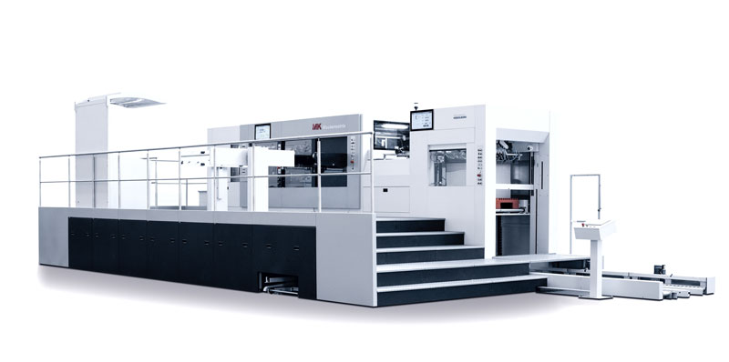
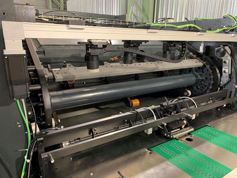
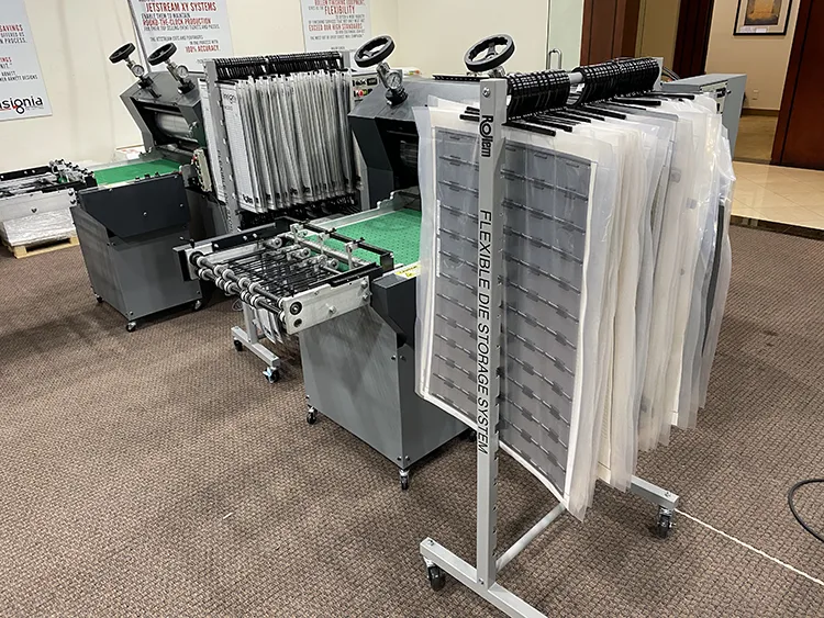
        Rollem’s line of Insignia diecutting systems offer a modern option to traditional methods of diecutting. Flexible diecutting systems provide the advantage of reduced and streamlined makeready processes compared to the conventional diecutting methods. While the traditional machinery requires skilled operators to perform complicated procedures to achieve the desired cutting results – skilled operators who rapidly are departing the workforce and leaving a void of technically capable machine operators – the more contemporary machines like Rollem’s Insignia offer simplified operation with the use of flexible dies and a faster learning curve for unskilled operators.

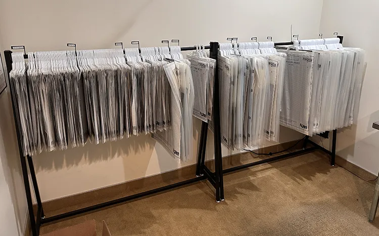
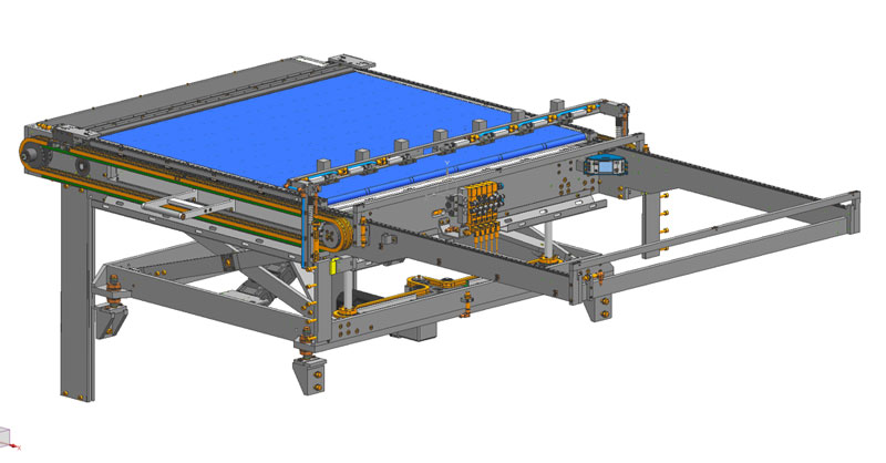
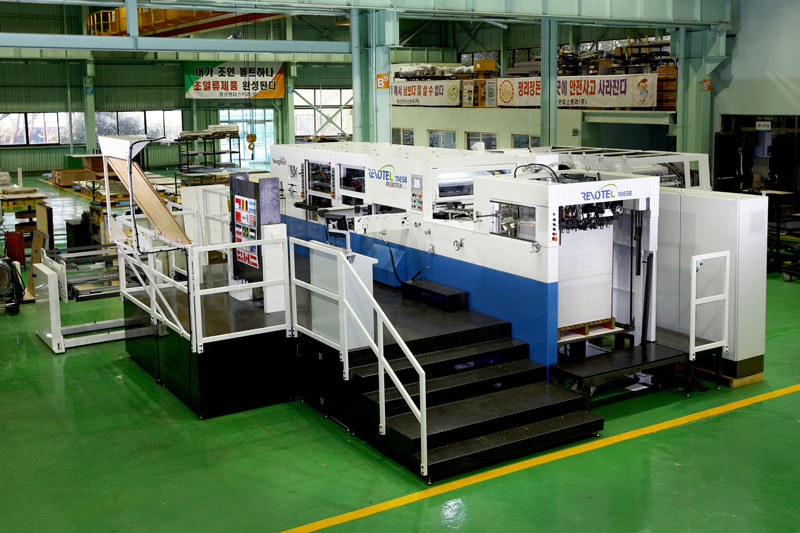
        The Insignia enables very quick changeover times and efficient processing of short-run work. It will diecut along with related functions, such as partial cutting, creasing and embossing. Insignia has an automatic waste stripping unit to divert the matrix of the sheet, leaving only the finished product with no extra manpower. It is integrated with either a slow-moving conveyor for easy off-loading of the product or a StackMaster receding stacker delivery. It also can operate inline with folding/gluing units for a single, uninterrupted finishing line, such as flat sheet in folded/glued box out, all with one operator.

        The flexibility of Insignia’s design, as well as its multi-function capacity, makes it ideally suited to meet the converting demands for a wide range of printing operations. It is capable of handling shorter runs and repeat jobs while also being able to output runs in the hundreds of thousands due to its heavy-duty, production-built design.

        Advantages of Diecutting Systems

        The Insignia line includes features allowing the user to convert unlimited products with just one machine and just one operator. It easily handles common products, such as shaped photo, greeting cards, door hangers and presentation folders, while providing the ability to expand offerings into the packaging sector as well. Folded cartons, card carriers, insurance ID cards and industrial component overlays are just a few products guaranteed to add value when produced on the Insignia diecutter.

        An additional benefit of the diecutting system is its faster turnaround time – given that the majority of customers need their work completed yesterday. Most Insignia customers develop a ‘flex-die’ library, allowing them to sell products already sized to their existing dies (i.e., 5″ x 7″ postcards, mailers, ID cards; most of which have standardized sizes). Thus, the return on investment on the flexible die is met quickly as the customers continue to generate profits with the longer lifespan of flexible dies.

        The Insignia line is offered in four model sizes, from 20″ x 15″ up to 30″ x 24″, guaranteeing a diecutting solution for all press sizes. The Insignia6 and Insignia7 machines are offered in a ‘dual magnetic H’ model, which utilizes two flexible dies running as a male/female paired set-up to channel score or emboss substrates. Alternately, the “H” function accommodates a single upper die, utilizing a lower solid ‘blanket’ or ‘jacket’ die on the bottom cylinder to function as the cutting surface when strictly cutting is desired. The “H” feature offers the operator the benefits of using paired die sets or a single die, depending on the product. This versatility of functions is a valuable feature on the Insignia H models.

        A recent addition to the Insignia line is the PLUS feature. This package is ideal for digital print users who change jobs frequently. The touchscreen interface allows for quick and efficient training of operators and user-friendly machine operation. This package includes batch sequencing – either variable, code-based or static. Bar code reading is another optional package.

        Customer Feedback

        Many customers who have converted to flexible diecutting now have purchased multiple units and, in some cases, replaced several platen diecutting presses with two to three rotary systems while producing more throughput with less labor.

        Curtis Howells of Consolidated Printing stated, “We love our Insignia and could not be happier with its ease and functionality.” The quick changeover of the Insignia maximizes efficiency when running customizable diecut event tickets, souvenir tickets, credentials and parking passes with its quick simple operation.

        Made in the USA

        Rollem is especially proud of the fact Insignia is manufactured in the US. The accomplished team of sales, service and support are invaluable to the customer. Rollem will install the diecutters, train the operators and assure the owners that they always can reach the diecutting team for questions.

        Velvet Stock, Foil-Embossed Label Helps Wine Bottle Shine

        September 15, 2022

        By Erin La Row, editor, PostPress

        The folks at Multi-Color Corporation North America (MCC) know labels. They’ve been helping clients build their brands through premium label solutions for more than 100 years. The company’s vision is to have global leadership in premium label solutions. And with more than 13,000 employees and 109 label producing operations in over 26 countries, the company is well on its way.

        label
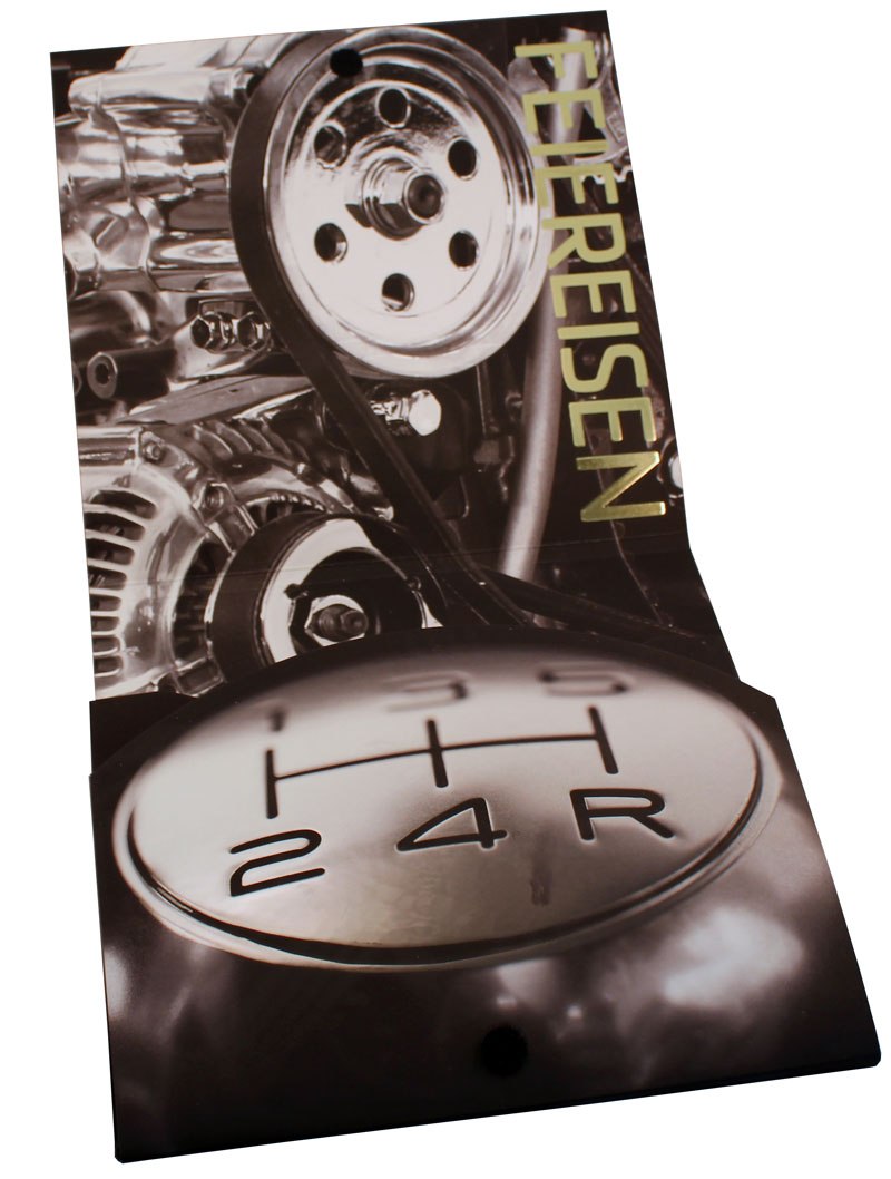
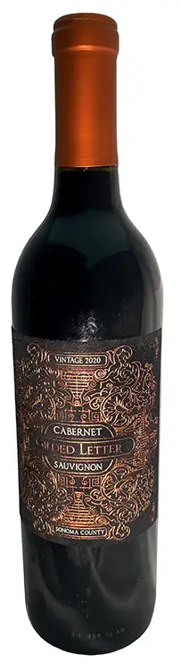
The wine and spirits segment is one of many market segment specialties in MCC’s portfolio. Its experts are in all major wine-producing regions helping to make every label project a success, whether it’s through embellishments, specialized inks, alternative materials or other printing specialties. One such success story – that of Gilded Letter Cabernet Sauvignon. The team at Penrose Hill had been collaborating with the team at MCC on producing their unique labels.

        “Penrose Hill was intrigued when the digital team at MCC presented the velvet stock as an innovative option,” said Scott Amoroso, director of operations at MCC. “After a few trials, the finished product ran beautifully and is now seen as the design today.”

        MCC was tasked with telling the story of a wine rich with flavor – with layers of oak and spice – from vineyards in California’s Sonoma County with its label. The team started with 155 lb. flocked black velvet stock. The team at MCC revised and proposed an improved design for the Gilded Letter label, as there were some limitations with the velvet stock. They added gold and copper foil in a thin and intricate design. Foil was supplied by KURZ and Metal Magic supplied the foil/embossing dies.

        “Specific spacing between foils was necessary to be applied to the velvet material to avoid the distortion that the felt material could cause,” Amoroso said.

        The Gilded Letter label was printed on an HP Indigo digital press and then hot foil stamped and diecut offline on an ABG Digicon press. One of the advantages of the ABG Digicon is that the hot foil stamping can be accomplished with flat dies versus a brass rotary hot stamping engraving, providing an enormous cost savings for the customer for small to medium-sized label runs.

        The result: A label that captures the essence of this limited release wine.

        “The client loved it!” Amoroso said of Penrose Hill. Judges at the FSEA’s 29th annual Gold Leaf Awards took notice, too, awarding MCC with a silver for Best Use of Foil/Embossing Label – Digitally Printed.

        “We actually created a series of these wines – cabernet, chardonnay, pinot and zinfandel – always different color velvet and different foil combos in order to create a broader luxurious and opulent brand series,” said Carolin Meier, chief wine officer, Penrose Hill.

        According to www.firstleaf.club, Gilded Letter Cabernet Sauvignon’s flavors are dense and concentrated with modest acidity and a dry finish. The wine’s tasting notes include violet, vanilla and blackcurrant, and it pairs well with bone-in Ribeye, Polenta and Italian Beef Ragu. Cheers!

        Fragrance Box Matches Its Floral Sensation

        June 8, 2022

        Edited by Erin La Row, editor, PostPress

        The Viktor&Rolf Flowerbomb rigid box (a recent winner in the Foil & Specialty Effects Association’s 29th Annual Gold Leaf Awards) was a showcase of McLean Packaging Corporation’s production capabilities.

        Established in 1961 as a small box manufacturing facility outside of Philadelphia, Pennsylvania, McLean Packaging’s facility and expertise has grown over time, now operating three manufacturing facilities with over 200 employees. McLean’s specialty is helping its customers enhance their presence in the marketplace.

        “Our customer wanted to create a set that showcased the product and created visual dimension and interest,” said Stephanie Deisley, McLean Packaging.

        The award-winning rigid box included a pearl coating that was used on the pink background of the box to match the brand’s color. The flowers were created out of silver cold foil supplied by ITW Foils with a gloss coating all printed inline on McLean’s KBA offset press. It was then embossed to help show definition of the decoration on a Bobst using embossing dies supplied by Metal Magic.

        The corner ribbon is printed black with silver cold foil to display the Viktor&Rolf logo. The ribbon also includes an embossed pattern to mimic a real ribbon. The cartouche was formed on McLean’s thermoformer and applied inline during production to give the seal a shiny, wax like look.

        One of the challenges the team faced in the production of the display box was the intricacies of the floral pattern diecut around the window.

        “From the original concept, we had to round a few corners and made less-severe angles to limit any concerns of tearing or lifting during production,” Deisley stated. “We worked closely with the customer on what needed to be edited and they supplied artwork to the modifications.”

        The result is a box as enchanting as the now iconic fragrance. The lid is a heavier weight wrap for smoothness and firmness of material around the diecut glued to a 58 pt Wood White board. The window is .012 APET with 25% PCR. The cartouch seal is .017 Black rPET.

        “In the end, the final production piece came together beautifully and showcased the product on shelf,” Deisley said.

        All You Need is Love – Playing Card Box Befitting of Music Icons

        June 8, 2022

        By Erin La Row, writer, PostPress

        theory11’s special edition The Beatles playing cards and box set, made in collaboration with The Beatles, pays tribute to a band that has shaped the world’s music scene for decades – nearly 60 years after Beatlemania hit US shores. The individual card boxes represent the iconic Sgt. Pepper’s Lonely Hearts Club Band marching band uniforms worn by John Lennon, Paul McCartney, George Harrison and Ringo Starr.

        The project came together when Studio On Fire, based in St. Paul, Minnesota, was hired by theory11, a producer of luxury, designer playing cards, to plan and execute production of The Beatles playing cards. Another partner in the project, Mattson Creative, was tasked with designing graphics conveying that Sgt. Pepper’s flair in a cohesive way across the set.

        “It was up to us to make sure the decks lived up to previous theory11 releases and that the special edition box felt luxurious and worth purchasing,” said Sam Michaels, creative manager at Studio On Fire.

        The team got started by asking questions: What is the best way to achieve those bright colors? How can this be done on budget? Where was it worth the splurge?

        Designing and planning

        There are many physical production steps involved in a project of this scale, and equally the same amount of work happening in the studio before paper even enters the building.

        The first step was to design the structure that would house the four decks of cards. Studio On Fire’s talented CAD department created several mock-ups that were reviewed and tweaked to get the final product. Questions had to be answered to settle on the final structure: How does this fit on a sheet, which would affect the press run and cost? Does budget allow for hand assembly? Does it hold the weight of the decks? Does it feel premium?

        “That last nugget, does it feel premium, is a question we ask ourselves a lot,” Michaels said. “Small things go a long way to pushing something into ‘premium’ territory. For example, the satisfying ‘click’ of a closure, the heft of a thick stock or the sturdiness provided by a custom insert.”

        The project’s graphics were designed by Mattson Creative. “Working with a studio that understands our capabilities helps the process, though we’re always pushing our boundaries and attempting things that really shouldn’t be attempted,” Michaels said. “But end up looking really cool, so it’s always fun to see what gets asked of us.”

        Before the design process was complete, Studio On Fire looked at initial files to start planning for potential production problems – a must in today’s world of continuous supply chain issues. The team was able to guide some final material and design choices based on availability of papers, foils, etc.

        Then it was the prepress department’s time to shine. Production processes go down one layer at a time, so it takes time to rip files into their specific passes. Michaels said the trapping, choking and altering of art all happens in this step when they’re creating the proof.

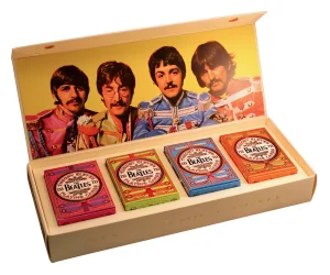
        “The Beatles box set also has a beautiful emboss happening and it’s our prepress department’s job to call out how that works: What type of emboss? What pieces of artwork? They’re making sure things won’t crack or get too close to scores,” Michaels added. “It’s a really detailed, specific set of decisions that are made in order to set the production team up for success.”

        The next step in the process is getting client approval of the proof. Then it is time to start buying materials such as paper, foil tooling, cutting dies and rolls of foil.

        “What some folks don’t realize is that a good chunk of production planning is for materials to arrive in sync with when open press time will be,” Michaels said. “It’s truly a behind-the-scenes ballet.”

        Production

        The Beatles box set is comprised of five main components: four decks of cards and the outer special edition box that houses them. Before anything can hit the press, the paper must be cut down from parent sheet size to press sheets. Everything at Studio On Fire is run sheet-fed. From paper prep, the job starts its tour of presses at the shop. The selected paper for the box set and inner tray was the Neenah Folding Board Natural White Vellum Finish.

        The outer box has three passes of foil – white, gold and black – all executed on a large format Saroglia press. After foils, the Saroglia completed the beautiful emboss, giving the artwork the tactility Studio On Fire pieces are known for. The foil for the project was supplied by Infinity Foils, Inc. and Kurz Transfer Products. The engravings for both the foil stamping and embossing were supplied by Universal Engraving. Inc.

        Both the outer box and internal tray/insert were diecut on a second Saroglia before vending out for final assembling, including the addition of a magnetic closure.

        A rare occurrence for Studio On Fire, the four tuck cases started with a vendor partner who laid down four colors of offset ink and a pass of aqueous coating before Studio On Fire took it in house. Once the sheets were on the floor, they took three trips through Studio On Fire’s Kluges to get gold, black and red foils laid down. A pass through the Saroglia for a beefy emboss before moving on to the second Saroglia to be diecut. The fold/glue team finished off the set of tucks, folding and gluing each of the four-color versions and getting them neatly packed.

        “These were made with love,” Michaels said. “Each step, from planning to production, is painstakingly executed by a staff who cares deeply about making a quality product that can’t be made anywhere else.”

        Embellishments and challenges

        “So much foil” – that is how Michaels described the project. Layers after layers of foil were laid down on every type of foil press Studio On Fire has at its disposal. After the layers of foil, everything was hit with a heavy emboss, carefully as to not crack the layers of foil, but heavy enough for the team to question whether it was too much.

        “It’s never too much,” Michaels said.

        The Studio On Fire team initially was given a rigid box concept. Michaels said the team moved this to a folding carton structure to get a more tactile result by having the ability to hit the artwork with a deep emboss. The team also chose to keep the entire product paper instead of defaulting to a foam insert, which added complexities but produced a more environmentally friendly product.

        Best of Show

        The result: The most vibrant and eye-catching playing cards ever produced by theory11. Studio On Fire entered The Beatles box set into FSEA’s 29th Annual Gold Leaf Awards, winning “Best of Show” for all the Best Use of Foil and Embossing categories.

        “Projects like this reflect a great relationship and effort between client, design, planning, and production,” said Ben Levitz, owner of Studio On Fire. “Focusing on projects with that synergy is what we love to do; we think that love is reflected in the final product and thus pushing it to ‘best of show’ level work. We’re honored.”

        The Beatles cards are available for individual purchase or in the premium special edition box set at theory11.com.

        Special Diecuts Showcase the Yule Log Christmas Card

        December 9, 2021

        By Cienna Sorell, writer, PostPress

        The Yule Log has been a comforting inspiration since its debut in 1966. The film of the burning yule log ran in New York for 23 years – up until 1989 – on the television network WPIX. The Yule Log was brought back to television due to unanimous wishes from a grieving nation after the attack on the Twin Towers in 2001, and ever since the film has been shown on WPIX on Christmas Day. 

        All American Labeling & Packaging, Dublin, California, created the Yule Log Christmas Card during the winter of 2020. After such a difficult year, the company wanted to make its annual gift to its customers really stand out with a unique concept. Leslie McCoy, director of marketing for the company, said, “With everyone experiencing the pandemic and being sheltered in place, we wanted the card to tie into the theme of the box, also while sending the sentiment home that they are not alone, and we can still gather and celebrate together even if we can’t physically be together.” 

        McCoy accredited the concept and design to All American Labeling & Packaging Creative Director Samantha Gomez. McCoy stated that, “Gomez concepted a retro TV showing the Yule Log fireplace to artistically show the Christmas Eve TV tradition that Fred M. Thrower had started in 1966. Much like the Yule Log Christmas Eve TV tradition did, our card gave everyone the opportunity to gather around the same fireplace even though we couldn’t physically be  together.” 

        All American Labeling & Packaging was born in 1995 out of a need for a full-service label company that could partner with its clients to help build their success and drive quality products. The company offers digital, flexo and offset printing as well as folding cartons, flexible packaging, grand format printing, prototyping, digital plate making and shrink sleeves, all produced in-house. This project was custom designed in the company’s in-house creative design studio. 

        What made the Yule Log Christmas Card unique was the special use of diecut layers as opposed to other finishing processes. McCoy commented, “Samantha wanted to keep a retro feel to the piece and let the diecutting and design
        stand out vs. showcasing other finishes for this particular piece.” 

        “During the design stage, Samantha created many physical and virtual 3D prototypes to show various iterations of the design and how it could be executed on press,” remarked McCoy. “Our team created a custom CAD and printed the project on the Heidelberg Speedmaster CD102+6L. It then went to the diecutter (MK Easy Matrix) and off to the blanker (TRX 1100). The cards were then hand-glued and folded,” answered McCoy, when asked to describe the processes used to create the Yule Log Christmas Card.

        The Yule Log Christmas Card embodies the essence of the holiday season in a remarkable way. The comfort can not only be seen, but also felt. This card showcases such a timeless, nostalgic feeling alongside the unparalleled craftsmanship of a diecut work of art – but with an original idea comes original challenges. 

        “The whole concept was built from scratch,” stated McCoy, “So there are always challenges when developing a new CAD with no reference point. We have a great collaborative team that rose to the challenge and used physical and 3D visualizers to establish the final piece. In finishing, the only challenge we ran into was efficiently gluing the product to get consistent folds. Our team ended up hand-gluing them to ensure perfection!”

        Upon first glance of the card, the viewer takes in the warm hues of orange and yellow gleaming from the burning yule log in the center. The 3D card, made on 100# C2S paper stock, offers four specialty diecut layers to really draw the viewer into the TV set that is showcasing the burning yule log. A string of diecut red and green stockings hangs over the hearth, making the 3D effects of the fire pop. 

        Once the card is open, the viewer can see the inner workings of the TV set on the left side and a note from All American Label & Packaging on the right describing the Yule Log fireplace. The sign-off from the company reads, “May your days be Merry & Bright! Sending local love your way from your friends at All American Label & Packaging.” Once the card is closed, the backside shows the rear of an old-fashioned television set, to bring home the idea of the original concept brought to life by Fred M. Thrower.

        During the process of creating a 3D card, many ideas and concepts must be considered. When asked if there was any special steps or precautions to take in the way of making the card, McCoy answered, “We work with the best suppliers in the industry, allowing us to run tighter tolerances on our diecuts than most. We pushed the limits on this tool to get the best effect and created a stripping jig to help punch the intricate pieces. It started with hand stripping in the beginning, but we were able to find a more efficient and consistent way in the end.”

        As far as reviews from customers, the card was a vast success. “We were thrilled with how this project turned out, and it has inspired our creativity for this year’s (2021) card and box. Our customers and employees gave nothing but rave reviews for the card. Some still have them on display on their desks and in their homes. Best compliment we could get,” remarked McCoy. 

        The Yule Log Christmas Card received silver in the 28th Annual FSEA Gold Leaf Awards for Special Diecut.  

        UV Enhances Print Project

        September 9, 2021

        By Lara Copeland, writer, PostPress

        Performing print finishing services, Feiereisen, Inc., is a family-owned business with headquarters in Cedar Rapids, Iowa. In business since 1933, the nationwide provider recently created a custom-designed, diecut pocket folder with a series of single, two-sided inserts, titled Finish With Style, to promote itself as a graphic arts finisher. Touching on some of the more traditional finishing techniques, like diecutting and laminating, this piece also “stresses one of Feiereisen’s newest available services, which is an extremely high-end digital enhancement press that prints inline digital spot UV and digital foils,” Feiereisen’s President Greg Ortmann commented. 

        The Konica Minolta MGI JETvarnish 3DS with iFoil was used to create the a unique product. This digital decorative solution is the only print enrichment process to utilize three inline methods of curing: IR is for low-level, flat 2D spot coats and rounded, domed smooth effects; the LED is for freezing and pinning high-build 3D textures and sculpted image effects; and the full-powered UV is for final curing of all clear ink (varnish polymer) treatments. Additionally, the UV lamp system provides the final curing method for embossed foil applications where a hyper-sensitive foil roller is calibrated with pixel-to-micron inkjet management. Knowing what the JETvarnish can do, Ortmann said Feiereisen decided to use this equipment to showcase the company’s capabilities.

        “With this product, we simply wanted to show off what the press is capable of doing,” Ortmann said. “The incredible high-end finishing of UV and foil now is available in a streamlined digital process that not only is fast but delivers incredible flexibility for custom-designed finishes without the cost of traditional dies, plates, screens and foil stamp setup.” The machine also opens the opportunity to do limited runs of any size, large or small, all while keeping the costs affordable and much lower than traditional processes.

        Finish With Style features a tactile design, “begging the viewer to pick up the pieces one-by-one and touch them, feeling the difference in variable depth foils and UV,” Ortmann said. The piece also highlights the way light affects the finishes. “Watch it electrify the foils,” he continued, “making them pop off the page, and see how the light truly enhances the 3D qualities of the depth of the UV in key areas.” 

        The secondary focus of this design was to convey the overall power, speed, style and the limitless capabilities of the press, “not to mention the finishes that could be added to virtually any printed piece.” Feiereisen’s customer base is wide, and Ortmann said the design team planned to make the pocket folder project relatable to them all on a personal level, which was key in the process. “This subtly shows what could be done for their particular industry or market segments.”

        When it came time to create this intricate piece with five inserts, the team was challenged to find the best process for the multiple layers and effects. “We tested various processes to figure out how to make each image come to life,” Ortmann said. “How do we make chrome pop, or paint colors look like they are shimmering in the sunlight?” Feiereisen worked to add depth and dimension to each image, making the viewer want to touch the piece, “as if it were the real thing,” he said, “not simply a photo.” Ultimately, the team labored to figure out how many layers could be built on top of one another. Ortmann said this “really pushed the limits of the digital press – using multiple layers of foil and variable depth layers of spot UV.”

        Cedar Graphics, Hiawatha, Iowa, printed the folders and inserts, and both were produced on 14pt Carolina C2S. Each piece was laminated with a matte finish on a GBC Genesis. They then were moved to the new digital foil and UV press, where each insert had its multiple layers of foil from Crown Roll Leaf and UV applied. 

        The project earned a Gold Leaf award for Best Use of Digital Inkjet-Coating from the Foil and Specialty Effects Association (FSEA).  

        Special Sales Gala Invitation Draws Rave Reviews

        September 9, 2021

        By Jeff Peterson, executive director, FSEA

        Goya Foods, Inc., headquartered in Secaucus, New Jersey, is the largest Hispanic-owned food company in the United States and the premier source for authentic Latin cuisine. Goya provides consumers with over 2,500 food products from the Caribbean, Mexico, Spain, Central and South America. 

        Each year, a Sales Gala is included as part of Goya’s annual sales meeting. Goya has called on Wharton, New Jersey-based Sunset Printing and Brand Management Solutions to produce the gala invitation for several years. Sunset Printing is a third-generation, family-owned company providing print, finishing and brand management services. Sunset specializes in special event collateral and works with companies throughout the world. “We have printing and other specialty processes that we do in-house, including offset printing, foil stamping, raised thermography, embossing, diecutting, foil edge gilding, grommet inserting and hand finishing,” stated Sunset Printing President Rob Wainer. 

        The theme of the Goya Sales Gala this past year was “Celebrating Women.” Wainer and his team sat down with representatives from Goya to discuss ideas and decide on an invitation style. “We had previously created a pop-up-style card for the event the year before and they wanted something that would be interactive and suggest a feminine quality,” explained Wainer. “The client mentioned a fan, and my design staff suggested a multi-blade fan design with a grommet holding the blades together.” Goya loved the concept. A string attached to the back of the fanned-out invitation would limit the opening so the words and graphics would line up. The final step in the design was working with Goya to choose the color of the foils to complement the image of the woman and the butterfly.

        The decision was to use offset printing, foil stamping, clear digital UV gloss coating and glitter thermography to create the special effects. The first process was printing the graphics in 4-color process on a 5-color Heidelberg offset press. Registration marks were printed on each sheet for the post-press UV digital spot coating. After the initial printing, the sheets were foil stamped with two separate passes on a Kluge press to create the front cover of the fan design and add details on the place and time of the gala. Magenta and gold metallic foils from Kurz Transfer Products were used with copper flat stamping dies from Universal Engraving. The next step included applying a clear varnish and glitter thermography to the invitation over the printed butterflies that flew toward the graphic of the women. The last decorative step (that was not hand finished) was applying a spot UV coating perfectly registered to the image of the woman using a Duplo Raised Spot UV Coater.

        Goya InviteAfter all the different processes, the sheets then were diecut into the different fan blades. The Kluge operator had to be extremely careful to maintain the proper registration with the magenta foil border on each fan blade. After the diecutting, the fan blades were separated, and 17 diamonds were glued onto the front cover – all accomplished by hand. After applying the diamonds, each fan blade was collated into a finished set and a grommet was inserted to create the fan-out effect. Lastly, after inserting the grommet, each fan was spread out on a table and a connecting string was applied on the back of each blade by hand with hot glue to limit the opening so each printed and decorated blade would line up perfectly when the invitation was fanned out. 

        “Each sheet went through six separate presses and each step had to be in perfect registration,” added Wainer. “Trying to keep the same gripper as and side guides was a huge challenge.”

        Once the entire invitation was complete, the fan was inserted into an outer box that was foil stamped with the same design and then mailed with a response card and reply envelope. 

        The Goya Sales Gala 2020 invitation was not only well received by the customer, it caught the eye of the judges for the 28th annual FSEA Gold Leaf Awards where it won Gold for Best Use of Foil/Embossing – Announcement/Invitation (Creative).  

        “The customer was ecstatic with the finished product,” ended Wainer. “It was a fun project for all of the press operators and hand finishing staff involved.”  

        Diecutters Go High-Tech

        December 9, 2020

        by Hallie Forcinio, writer, PostPress

        Like virtually every other postpress operation, diecutting is becoming more automated and connected. Advanced features on flat platen diecutters reduce makeready time and ensure consistent running speed.

        “We have identified connectivity, digitalization, automation and sustainability as the cornerstones of packaging production now and in the future,” explained Bodo Junge, product marketing director Folding Carton at BOBST North America Inc., Parsippany, New Jersey. “With these four cornerstones front of mind,” he said, “BOBST is aiming to create a seamless packaging supply chain where machines and tooling communicate with each other to deliver optimum quality and performance, while reducing errors, waste and costs at every point.”

        Heidelberg_AGT_00003_Mastermatrix_F51_HG_weiss
        A new MasterRake in the blank separator section of Heidelberg’s Mastermatrix 106 CSB diecutter simplifies positioning and fastening of individual rake rods and shortens the makeready process.

        At BOBST, its MASTERCUT 106 PER autoplaten diecutter combines a high level of automation and ergonomics with its TooLink digital recipe management tool to deliver an entirely connected packaging production system that increases production flexibility, decreases job turnaround time and boosts machine productivity. Rated at up to 11,000 sheets of paper, paperboard or corrugated per hour, the machine can cut, strip and blank in one pass. Sheet sizes range from 13.78 x 15.74 inches to 29.37 x 41.73 inches.

        The diecutter minimizes the need for operator intervention by automating functions and settings from feeder to delivery from a single point of control. A camera-based Matic Plus system completely automates stripping and blanking tool settings by measuring the position of tools and automatically aligning them in register to the printed sheet. The machine also features automated jam detection and setting and has a nonstop rack system in the delivery section. The new features shrink set-up time by 15 minutes.

        The TooLink platform connects the diecutter with tooling to bring together the entire converting process. The unique digital ID of the diecutter enables instant recognition of tools. When the machine detects chip-equipped tools, the machine’s operator interface calls up a production-ready job recipe. This reduces waste, cuts changeover time and recalls jobs without any operator intervention.

        “TooLink connects, digitalizes and automates converting,” said Alex Volery, head of Tooling Division at BOBST. “It creates a true converting ecosystem that addresses the key production concerns of efficiency, control, speed, quality and sustainability. With TooLink and its suite of IoT applications, packaging manufacturers have complete oversight of their dies, recipes and job histories and access to a higher level of production data and insight.”

        The diecutter lineup from Heidelberg USA, Kennesaw, Georgia, addresses needs from entry-level to high-production blank-separating machines. “Combining the technology and productivity focus of Heidelberg with the engineering strengths of Masterwork, the diecutter range includes many features to help automate processes,” reported Chris Raney, vice president of Postpress/Packaging Product Management at Heidelberg.

        High outputs depend on a continuous, reliable infeed. The Masterset optical registration system, available on Promatrix, Powermatrix and Mastermatrix diecutters, ensures sheets feed more consistently and are more precisely positioned because sheets are held by a vacuum plate and registered according to a printed mark, not to the sheet’s edge. “Conventional sheet registration using front and side guides is simple and relatively accurate but can be susceptible to stops due to misaligned sheets,” explained Raney.

        In the cutting station, the use of a chase with quicklock saves considerable time – up to 15 minutes – when compared with the lock-up system used previously. It also is more precise and repeatable. The use of thin (1mm) cutting plates is widespread in the industry and allows the creasing matrix on an inexpensive plate to be saved for use when a job repeats. On Heidelberg’s latest model, the 9,000-sheet-per-hour Mastermatrix 106 CSB diecutter, the 1-mm plate can be locked into the machine without the use of any screws, further reducing changeover time.

        In the stripping and blanking stations, makeready time has been cut by the implementation of fixed frames that can accept just the wooden tool. “In the past,” recalled Raney, “hours were spent setting up stripping pins in frames and creating blanking grids, etc. Today, thanks to . . . improvements . . . in the quality and accuracy of the tooling, the wooden stripping tools or the fabricated blanking grids quickly can be locked into the machine. Every frame in the machine offers a fine adjustment capability so that precise alignment of the tooling can be achieved once locked up in the machine.” As a result, on a 41-inch diecutter equipped for stripping or blanking, this makeready can be completed by one operator due to the light weight of the tooling and the simple lock-up.

        MagicCarpet
        The Magic Carpet blank interleaving device on Koenig & Bauer’s CutPRO Q 106 SB diecutter eliminates the use of traditional swords that require time and finesse to prepare for each job and cuts makeready time to zero.

        Koenig & Bauer (US) Inc., DFW Airport, Texas, introduced its own diecutter in October 2020, the CutPRO Q 106 SB model. Under development for three years, it draws on engineering from the printing side of its business. The result is a machine with a unique blanking section that cuts costs and makeready time. “It’s fairly simple engineering, but different from anything that came before,” said Tom Fitzgerald, director, Post Press Products at Koenig & Bauer. Designed for higher performance and greater throughput of folding cartons, the CutPRO Q 106 SB diecutter features a zero makeready blank interleaving device called the Magic Carpet. This system eliminates the use of traditional swords that require time and finesse to prepare for each job. “Even with quick-lock or auto-locking sword systems, this process can take up to 10 minutes,” noted Fitzgerald.

        KB-Cut2Print
        The Cut2Print registration system on Koenig & Bauer’s CutPro Q 106 SB diecutter helps ensure high throughput and perfectly registered sheet handling with virtually any substrate.

        Another new feature is the Cut2Print registration system, which was designed from the SIS platform on Koenig & Bauer’s Rapida printing presses. The Cut2Print system utilizes up to two cameras to read printed marks in the color bar or three cameras for sheet-edge reading. Capable of reading both the top and bottom of the sheet, the system is particularly well-suited for folding carton or litho laminate boxes. The CutPRO Q 106 SB diecutter also features a new driving device for the stripping and blanking frames and full memory recall for repeat jobs.

        Diecutters from Young Shin USA Limited, Schaumburg, Illinois, the North American Division of Young Shin Industries – South Korea, also emphasize efficient set-up and shorter makeready times. Accommodating substrate sizes measuring from 40.9 x 29.1 inches to 98 x 67 inches, many Young Shin diecutters include non-stop feeders that facilitate rapid feeding and free the operator for other tasks. High-quality electronics support high output, ease of operation and low cost of ownership and generate higher production, superior accuracy and a rapid return on investment.

        Young-Shinn-Revotec-106SB-
        The flexible Young Shin REVOTEC 106SB (stripping and blanking) automatic flatbed diecutter offers on-pallet delivery when blanking or normal exit delivery when running as a standard diecutter.

        Integrated pre-makeready tables expedite the preparation of the die for the upcoming job and also allow the operator to prepare the next job while the current job is running to maximize productivity. “The quicker an operator can get the next job up and running, the more rapid gains in profitability can be realized,” explained Phil Mack, vice president of Young Shin USA.     

        Other throughput-boosting features include automated set-up for feeder and stripping and delivery operations.  In fact, some Young Shin diecutter models allow the operator to save up to 10,000 separate set-ups for later recall to substantially cut the time needed to begin the next job.   

        Dual touchscreens, one in the feed section and one in the delivery area, reduce the time needed to make adjustments. Most operators position themselves near the delivery area so if they wish to speed up the machine or make any adjustments, the second touchscreen allows changes to be made without walking to the front of the machine. “The placement of the two touchscreens, as well as other automation features . . . can save 10 to 15 minutes off each job’s normal set-up or makeready time,” said Mack.

        Celebrating in Style – SpongeBob Turns 20

        December 9, 2020

        By Brittany Willes, editor, PostPress

        “Who lives in a pineapple under the sea?” – SpongeBob SquarePants Theme Song

        Few people could hear the iconic opening line to one of Nickelodeon’s most well-known shows and not immediately feel the urge to shout “SpongeBob SquarePants!” while singing along with rest of the song. First aired in 1997, the show boasts an impressive record as the number one kids’ animated series on television for 17 years – an accomplishment that all but demands celebrating.

        Commemorating 20 years of the pop culture icon, Nickelodeon released a press kit – SpongeBob 20 Best Year Ever – which takes SpongeBob out of his pineapple to be showcased in an interactive package designed to appeal to anyone familiar with the beloved character.

        When it came to creating the interactive packaging, “It was a challenging but rewarding process,” said Mitch Holsborg, president of C&C Bindery and Packaging, Farmingdale, New York, who worked with Nickelodeon to design and construct the press kit.

        At first glance, the presentation box delights viewers with colorful artwork depicting the well-known images and landscapes of SpongeBob’s undersea home, Bikini Bottom. The graphics originally were created by Nickelodeon before being fine-tuned in-house, along with the final package design, by C&C Structural Engineer Richard Vallone.

        It wasn’t enough for the presentation box to simply showcase some of the show’s iconic artwork. That art needed to pop out at viewers. Various specialty effects and coatings were incorporated into the design to make this happen. The outside of the box features Infinity Blue metallic foil and spot UV coating to help draw attention. Sheets were diecut on a Bobst 102EII diecutter, with foil stamping performed on a Saroglia foil stamper. The package was offset printed, with the spot UV coating applied over the offset. All dies were supplied by Universal Engraving, Inc.

        With the final artwork nailed down, attention turned to creating the presentation box itself. As the package was meant to be interactive, a sturdy structure was crucial. As a result, C&C opted for 100lb text stock that then was mounted two sides over e-flute. Part of the challenge of the box was that each one had to be folded, glued and assembled by hand.

        Another challenge C&C faced was figuring out how to incorporate a plastic SpongeBob figurine into the packaging while having it remain an interactive element. The plastic figure features moveable arms with a rainbow glued to its hands. The SpongeBob figure wasn’t the only interactive element that had to be incorporated into the inside packaging, however. Nickelodeon also provided a USB in the shape of a pineapple that would need to be showcased as well.

        “Making the figure and the USB stand out and seem animated were  challenges,” said Holsborg. In the end, SpongeBob was secured inside the display box using ties and reinforced with a cardboard stand. “Integrating a plastic figure with paper and coatings and making it interactive took the talents and experiences that C&C has been known for,” he reaffirmed.

        C&C’s efforts to create a truly unique interactive presentation box were well received. According to Holsborg, the box continually has been described as one of the best interactive package designs ever. Furthermore, the box received a silver award in the 2020 FSEA Gold Leaf Awards in the Best Use of Foil/Embossing – Rigid Box category.

        Elevating Magazine Covers with Embellishments

        September 12, 2019

        by Katy Ibsen, managing editor
        PostPress

        First impressions mean a lot, especially for print magazines and catalogs. A cover image carries significant responsibility, capturing enough of a reader’s attention to be picked up. Iconic artwork isn’t going away, but many publications now are incorporating texture and specialty effects on covers for added impact.

        “Neurological studies show that humans gather their information through all senses, and people remember things longer and more clearly if they address more than just the eyes,” said novum Editor-in-Chief Christine Moosmann. “Consumers quite happily spend more money on packaging that is well designed and uses a paper with interesting haptics or elaborate printing.”

        novum is known for eye-catching covers that feature a variety of applications, but the magazine isn’t alone. Overwhelmingly, consumer, business to business (B2B) and catalog publishers are seeing embellishments as a critical value-add to differentiate themselves from competitors or to elevate their brand.

        PostPress explores this trend by visiting with a few magazine publishers that have found print embellishments beneficial to their brand awareness.

        Worth magazine

        WorthWorth is a global media brand connecting to an audience that embraces worth beyond wealth. “Worth informs and inspires a community of affluent, influential and aspirational individuals to be their best selves,” said Amy Petriello, art director.

        The quarterly print magazine regularly uses spot gloss for its masthead/logo and dull UV on the balance of the cover to create a matte effect.

        “We almost always feature an original illustration on the cover and have [art] submitted to us as vectors, so that the illustration can have spot UV applied on portions we’d like to highlight,” she added.

        Worth’s “Power 100” edition, recently released, features a 4-color silver metallic ink with gloss UV coating.

        “This is our 10th Annual Power 100 issue, about the most powerful people in the world of global finance, so it is a special issue that we wanted to celebrate,” she said.

        According to Petriello, postpress applications have helped to emphasize Worth’s covers, which showcase beautiful lasting artwork, intended to be kept, displayed on coffee tables and collected.

        novum – world of graphic design

        novum Magazinenovum, a cult design magazine, was founded in 1924 under the name of Gebrauchsgraphik. Published in German, English, French and Spanish, novum is read by designers all over the world.

        “Now in its 95th year, novum has certainly written design history and still has a very high standing in the design community,” said Christine Moosmann, editor-in-chief.

        As one would expect, a design magazine strives to set itself apart and novum doesn’t disappoint readers with its captivating covers, featuring many variations of specialty applications. In 2000, the brand began experimenting with fine papers and various print finishing techniques on the cover.

        “In the beginning, we just did it for fun, but we got a strong response from our readers. They loved the papers, the finishings and the inspiration they got this way,” said Moosmann “Eventually, paper manufacturers and printers realized that our covers were a great marketing tool for their products and services. So, whenever a new paper or a new printing technique came up, we got the chance to try it out on our cover – designer’s heaven!”

        While Moosmann believes specialty effects are an important element of communication today, they can be overused.

        “It is important to use papers and finishings intelligently,” she said. “A lot of ‘bling bling’ foils do not necessarily make a successful product. Sometimes, a rough paper combined with an unusual printing technique will do the trick. It is important to design with care; readers and consumers can sense that.”   

        A sampling of novum covers include foil on the entire cover, diecut stacking dolls and even a cover which featured a playground for stickers found inside the magazine. The cover of the August 2019 edition showcased a highly pigmented silver on deep black cardboard for a visual and textured effect.

        mg

        mg MagazineServing the cannabis industry is mg magazine, a B2B publication covering retail, business and branding. According to its publisher, Darren B. Roberts, the magazine’s mission was to create a reflection of who is really behind the industry, not just on a manufacturing level, but on a legal level.

        “We strive to put out an image that represents the level of professionalism, skill and education [in cannabis],” he said. That mission allowed the magazine to be more creative.

        “Most B2B publications are not spending money and exploring what can be done in print – some industries don’t require it,” he said. “I think that for B2B, service companies or products, whether they be printed products, panels or whatever it is they are putting out there, it’s important that they reflect the personality and the people of the industry. And in this particular industry, you have a mix of professionalism and creativity.”

        mg has achieved respect within the cannabis marketplace, elevating itself as a creative, yet trustworthy resource for industry leaders. In part, it has reached that designation as a result of its attractive covers.

        An edition that covered the vape sector featured a multi-layer emboss with both high and dull varnishes. The “50 Best Companies to Work for in Cannabis” featured a matte varnish, gold foil and trapped emboss. Roberts explained that mg wanted to represent all the various sectors of the industry on the cover, which was designed by The Hybrid Creative.

        “Applications really do have an impact. And it does matter,” said Roberts. “Just the coating that you use on the cover will keep somebody reading the publication longer … and it’s all on a subconscious level. It’s very fascinating.”

        Sustainability with Ecofoil®

        Crystal Ecofoil
        Crystal’s Ecofoil process allows foil to be added to the inside pages of magazines or brochures at a feasible cost.

        Mark Kempster, Managing Director of Crystal Press Ltd, has seen brands and publishers wanting more and more foil embellishments, with multiple colors and more complex foil designs. To achieve this, many have used a metallized polyester (MetPol) material and printed over the top. However, sustainability has become an serious issue for MetPol users due to it being a PET laminated stock which cannot be recycled. As a solution to this issue Crystal recently launched its range of Ecofoil boards that apply the foil without the need for the lamination process. The Ecofoil board range contains no PET or any other plastic product so it is 100% recyclable and can be branded as such.

        “In my opinion the use of MetPol is one of the single biggest issues facing the packaging industry and it seems likely that it is only a matter of time before there is a huge backlash against packaging materials that contain MetPol. However with the introduction of Ecofoil there will still be a cost-effective and practical way to produce foil-based packaging in all run lengths,” stated Kempster.

        The Ecofoil process also provides an economical way to add a metallic foil to other pages within a catalog or magazine beyond just the cover. Crystal has one customer who has used hot foil stamping on its covers for several years; however, switching to its Ecofoil process has allowed them to add foil within the inside pages of their high-end brochure at a feasible cost.

        “Ecofoil has created a massive change in our business,” concluded Kempster. “I believe it will become the biggest part of our business within the next 12 – 18 months.”


        From the Printer With Love

        Direct SupplyPrinters are equally in tune with the emerging trend of distinguishing covers. Chris Haag, director of sales at Royle Printing, spoke to the printer’s role in helping deploy embellishments to create unique catalog covers – which must stand out among other printed matter.

        “We have actually seen an uptick in interest in applying creative covers in particular to printed materials, whether that’d be in catalog form or magazine form,” he said. “Both of those segments are exploring it, and there has been a recognition that print provides a much more tactile delivery of information than electronic means.”

        Royle’s capabilities include gloss and matte UV in line on the web press; gloss, dull or satin varnish on sheet-fed press; soft touch, UV or aqueous coatings in line; strike through (such as spot gloss UV) with a dull varnish; and reticulated strike through UV.

        According to Haag, cost of applications is a factor for many publishers, suggesting that embellishments often are used for annual, anniversary or special issues.

        Diesel Forward“You’re going to see those [applications] in a higher value catalog that is displaying products that are higher dollar volume, and in particular those catalogs are meant to have a one-year shelf life. So, we see them a lot in those applications,” he said.

        Examples of catalogs printed by Royle include Direct Supply and Diesel Forward.

        In general, Haag has seen an increase in applications over what was used 10 years ago. As for the next 10? Hopefully, more of the same.

        “People are recognizing that print is really mission critical to a multichannel approach. And so, even brands that might live and start online are coming into print. And then, once they get into print, they’re looking for ways to stand out in the mailbox and raise response rates, too.”

        Next Page »


        The Official Publication of the Foil & Specialty Effects Association
        © 2025 All Rights Reserved
        Peterson Media Group | publish@petersonmediagroup.com
        785.271.5801
        2150 SW Westport Dr., Suite 501, Topeka, KS 66614