• Home
  • Article
    • Article Archive
    • Digital Archive
    • ENews Archive
  • Buyers Guide
    • Buyers Guide
    • 2025 Online Form
  • Advertising
    • Ad Options
    • Media Kit
    • Editorial Calendar
    • Electronic Files
  • Awards
    • FSEA Gold Leaf
  • Subscribe
  • Video Vault
  • Webinars
  • Amplify
  • Contact
  • Events
    .smi-preview#smi-preview-10580 { --smi-column-gap: 10px; --smi-row-gap: 20px; --smi-color: #ffffff; --smi-hover-color: #90c43c; ; ; --smi-border-width: 0px; ; --smi-border-radius: 0%; --smi-border-color: #3c434a; --smi-border-hover-color: #3c434a; --smi-padding-top: 15px; --smi-padding-right: 0px; --smi-padding-bottom: 0px; --smi-padding-left: 0px; --smi-font-size: 20px; --smi-horizontal-alignment: flex-end; --smi-hover-transition-time: 1s; ; }
    • Skip to main content
    • Skip to secondary menu
    • Advertise
    • Subscribe
    • Contact
    • Events
      PostPress

      PostPress

      Print Decorating, Binding and Finishing

      • Home
      • Articles
        • Article Archive
        • Digital Archive
        • ENews Archive
      • Advertising
        • Ad Options
        • Media Kit
        • Editorial Calendar
        • Electronic Files
      • Buyers Guide
        • Buyers Guide
        • 2025 Online Form
      • Awards
        • FSEA Gold Leaf
      • Subscribe
      • Video Vault
      • Webinars
        • Upcoming Webinars
      • Amplify

        Foil Stamping

        UV Enhances Print Project

        September 9, 2021

        By Lara Copeland, writer, PostPress

        Performing print finishing services, Feiereisen, Inc., is a family-owned business with headquarters in Cedar Rapids, Iowa. In business since 1933, the nationwide provider recently created a custom-designed, diecut pocket folder with a series of single, two-sided inserts, titled Finish With Style, to promote itself as a graphic arts finisher. Touching on some of the more traditional finishing techniques, like diecutting and laminating, this piece also “stresses one of Feiereisen’s newest available services, which is an extremely high-end digital enhancement press that prints inline digital spot UV and digital foils,” Feiereisen’s President Greg Ortmann commented. 

        The Konica Minolta MGI JETvarnish 3DS with iFoil was used to create the a unique product. This digital decorative solution is the only print enrichment process to utilize three inline methods of curing: IR is for low-level, flat 2D spot coats and rounded, domed smooth effects; the LED is for freezing and pinning high-build 3D textures and sculpted image effects; and the full-powered UV is for final curing of all clear ink (varnish polymer) treatments. Additionally, the UV lamp system provides the final curing method for embossed foil applications where a hyper-sensitive foil roller is calibrated with pixel-to-micron inkjet management. Knowing what the JETvarnish can do, Ortmann said Feiereisen decided to use this equipment to showcase the company’s capabilities.

        “With this product, we simply wanted to show off what the press is capable of doing,” Ortmann said. “The incredible high-end finishing of UV and foil now is available in a streamlined digital process that not only is fast but delivers incredible flexibility for custom-designed finishes without the cost of traditional dies, plates, screens and foil stamp setup.” The machine also opens the opportunity to do limited runs of any size, large or small, all while keeping the costs affordable and much lower than traditional processes.
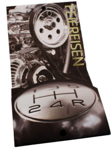
        Finish With Style features a tactile design, “begging the viewer to pick up the pieces one-by-one and touch them, feeling the difference in variable depth foils and UV,” Ortmann said. The piece also highlights the way light affects the finishes. “Watch it electrify the foils,” he continued, “making them pop off the page, and see how the light truly enhances the 3D qualities of the depth of the UV in key areas.” 

        The secondary focus of this design was to convey the overall power, speed, style and the limitless capabilities of the press, “not to mention the finishes that could be added to virtually any printed piece.” Feiereisen’s customer base is wide, and Ortmann said the design team planned to make the pocket folder project relatable to them all on a personal level, which was key in the process. “This subtly shows what could be done for their particular industry or market segments.”

        When it came time to create this intricate piece with five inserts, the team was challenged to find the best process for the multiple layers and effects. “We tested various processes to figure out how to make each image come to life,” Ortmann said. “How do we make chrome pop, or paint colors look like they are shimmering in the sunlight?” Feiereisen worked to add depth and dimension to each image, making the viewer want to touch the piece, “as if it were the real thing,” he said, “not simply a photo.” Ultimately, the team labored to figure out how many layers could be built on top of one another. Ortmann said this “really pushed the limits of the digital press – using multiple layers of foil and variable depth layers of spot UV.”

        Cedar Graphics, Hiawatha, Iowa, printed the folders and inserts, and both were produced on 14pt Carolina C2S. Each piece was laminated with a matte finish on a GBC Genesis. They then were moved to the new digital foil and UV press, where each insert had its multiple layers of foil from Crown Roll Leaf and UV applied. 

        The project earned a Gold Leaf award for Best Use of Digital Inkjet-Coating from the Foil and Specialty Effects Association (FSEA).  

        Special Sales Gala Invitation Draws Rave Reviews

        September 9, 2021

        By Jeff Peterson, executive director, FSEA

        Goya Foods, Inc., headquartered in Secaucus, New Jersey, is the largest Hispanic-owned food company in the United States and the premier source for authentic Latin cuisine. Goya provides consumers with over 2,500 food products from the Caribbean, Mexico, Spain, Central and South America. 

        Each year, a Sales Gala is included as part of Goya’s annual sales meeting. Goya has called on Wharton, New Jersey-based Sunset Printing and Brand Management Solutions to produce the gala invitation for several years. Sunset Printing is a third-generation, family-owned company providing print, finishing and brand management services. Sunset specializes in special event collateral and works with companies throughout the world. “We have printing and other specialty processes that we do in-house, including offset printing, foil stamping, raised thermography, embossing, diecutting, foil edge gilding, grommet inserting and hand finishing,” stated Sunset Printing President Rob Wainer. 

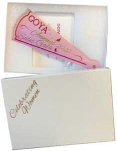
        The theme of the Goya Sales Gala this past year was “Celebrating Women.” Wainer and his team sat down with representatives from Goya to discuss ideas and decide on an invitation style. “We had previously created a pop-up-style card for the event the year before and they wanted something that would be interactive and suggest a feminine quality,” explained Wainer. “The client mentioned a fan, and my design staff suggested a multi-blade fan design with a grommet holding the blades together.” Goya loved the concept. A string attached to the back of the fanned-out invitation would limit the opening so the words and graphics would line up. The final step in the design was working with Goya to choose the color of the foils to complement the image of the woman and the butterfly.

        The decision was to use offset printing, foil stamping, clear digital UV gloss coating and glitter thermography to create the special effects. The first process was printing the graphics in 4-color process on a 5-color Heidelberg offset press. Registration marks were printed on each sheet for the post-press UV digital spot coating. After the initial printing, the sheets were foil stamped with two separate passes on a Kluge press to create the front cover of the fan design and add details on the place and time of the gala. Magenta and gold metallic foils from Kurz Transfer Products were used with copper flat stamping dies from Universal Engraving. The next step included applying a clear varnish and glitter thermography to the invitation over the printed butterflies that flew toward the graphic of the women. The last decorative step (that was not hand finished) was applying a spot UV coating perfectly registered to the image of the woman using a Duplo Raised Spot UV Coater.

        Goya InviteAfter all the different processes, the sheets then were diecut into the different fan blades. The Kluge operator had to be extremely careful to maintain the proper registration with the magenta foil border on each fan blade. After the diecutting, the fan blades were separated, and 17 diamonds were glued onto the front cover – all accomplished by hand. After applying the diamonds, each fan blade was collated into a finished set and a grommet was inserted to create the fan-out effect. Lastly, after inserting the grommet, each fan was spread out on a table and a connecting string was applied on the back of each blade by hand with hot glue to limit the opening so each printed and decorated blade would line up perfectly when the invitation was fanned out. 

        “Each sheet went through six separate presses and each step had to be in perfect registration,” added Wainer. “Trying to keep the same gripper as and side guides was a huge challenge.”

        Once the entire invitation was complete, the fan was inserted into an outer box that was foil stamped with the same design and then mailed with a response card and reply envelope. 

        The Goya Sales Gala 2020 invitation was not only well received by the customer, it caught the eye of the judges for the 28th annual FSEA Gold Leaf Awards where it won Gold for Best Use of Foil/Embossing – Announcement/Invitation (Creative).  

        “The customer was ecstatic with the finished product,” ended Wainer. “It was a fun project for all of the press operators and hand finishing staff involved.”  

        Capturing Creativity with Konica Minolta’s Extreme Digital Guide

        September 9, 2021

        By Jewlissa Frickey, writer, PostPress

        “The ongoing renaissance of print is driven by the desire to create a touchpoint in an increasingly touchless world,” said Print Panther in the Konica Minolta Extreme Digital Guide. “Power in print is evolving, materializing into an all-encompassing medium that is able to captivate and inspire. Print, as it is today, is rekindling the connection between art and exhibition, providing the wanted corporeal element to brand, product and experience.”

        The FSEA Gold Leaf Awards program assessed entries submitted from around the world by finishers and binders that want to compete against the best in the industry. New technologies have fueled growth with expanded award categories in areas such as digital foil and other specialty UV coatings. Entries are judged on design, execution and level of difficulty in more than 35 categories, with a gold, silver and bronze award presented in each category.

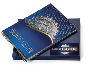
        Best of Show Honorable Mention at the 28th Annual Gold Leaf Awards went to Print Panther for its Konica Minolta Extreme Digital Guide for showcasing the inspiring, tactile coatings and foils that now can be achieved digitally with Konica Minolta’s MGI JETVarnish 3DS with iFoil-S. “We wanted to make print an experience,” said Christine Yardley, president of Print Panther, “and I think we accomplished that with this piece.” 

        Every feature was deliberate, conveying a message with each design and copy. “The lead page says Extreme – and we wanted to say that first because print is becoming extreme,” said Yardley. “Having something with a touchpoint gives it that extreme edge.” 

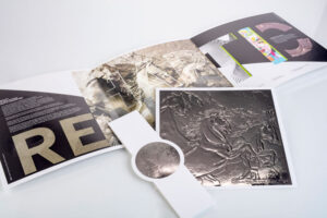
        Each page features a unique image and technique. Print brings bears to life with the use of Invercote 11.4pt paper combined with a matte lamination, spot varnish, copper foil and matte gold foil. Imagery expands on another page as viewers sense the crisp coolness of a soda can where condensation leaves a vivid mark on Supreme Matte Cover 110lb paper with soft-touch lamination and spot varnish.

        The guide used a cross section of papers and laminates and included foils, spot varnishes, flood varnishes, foil on foil, varnish on foil, and multiple foils. Each page utilizes a different effect, highlighting topography and the design elements. “We worked with amazing typography, photography and illustration – each page had a purpose,” Yardley said. 

        Each page was meant to exhibit a different embellishment with the print quality of the AccurioJet KM-1e LED UV inkjet press and the AccurioPress as the colorful backdrop. However, the guide required the use of various machinery, including the AccurioJet KM-1, AccurioPress, AccurioWide 160 and MGI JETVarnish 3DS with iFoil-S.

        Within the guide is a detailed production note page. It outlines the types of paper, lamination, varnish, foil and any other specifications used for each page. “Papers such as the Neenah Starwhite Astrosilver Cover were the perfect papers for the Accurio KM-1 LED UV inkjet press, really illustrating the amazing print quality on a textured stock” Yardley said. 

        Other papers featured throughout the guide include a Supreme Gloss Cover, Pacesetter Semi Gloss Label Stock, Tango C2S, Cougar Cover and more. 

        Extreme-Digital-GuidebookThe paper stocks were accented with gold foil, silver foil, diecuts, soft-touch and matte laminations and raised spot vanishes – all bringing to life toucans, zebras and bears … oh my!

        With so many moving parts, so comes its challenges. “We had to tweak a few of the diecut pages, but overall once we had the plan in motion it ran wonderfully,” noted Yardley. The decision on using a split bindery method with wire-o was no exception to the challenges. “It made the process more time consuming, but overall, it was worth it in the end,” Yardley said. 

        Despite the global pandemic, Print Panther saw an opportunity to reach people with its digital guide. “The world is going to be looking for new ideas when we emerge from this, and print can tell a story like nothing else can,” Yardley said. 

        Print Panther’s objective was to make print an experience. Completing the project left only one question: Inspired? On the last page of the digital guide, viewers were left to contemplate the imagery they had seen, the last attempt to rekindle the connection between consumers and print. From design to copy, every part conveyed a message. The lead-in page delves into the renaissance of print and the desire for touch.

        The overwhelming response to Print Panther’s Konica Minolta Extreme Digital Guide solidified its placement at the FSEA Gold Leaf Awards. “It was a labor of love that did us proud,” said Yardley. “I still smile when I look at the Inspired? page. It’s just a wonderful marriage of foil, typography and message.”  

        Working Through Challenges with Today’s Paper Stocks and Coatings

        September 9, 2021

        Compiled by PostPress Staff

        Paper stocks and coatings usually are the culprits of potential challenges with foil stamping and embossing. Foil and/or embossing can be a smooth process when the proper stocks and coatings are used, but when there is not communication about the selection of stocks and coatings to match the foiling and/or embossing, roadblocks can occur.

        Communication is the key to matching foils to the right coatings or paper stock. Greg Faddis, direct sales professional with UEI Group, which supplies dies and foils through Universal Engraving, Inc. and Infinity Foils, Inc., shared that the substrates chosen and the coatings used can pose problems. These problems especially occur when the print finisher plans a job with the expectation that the finishing will be applied to virgin or uncoated stock, but learns only when the job arrives for processing that a coated stock has been used. In addition, Faddis noted that pairing the stock with the correct foil is essential, especially when wide coverage is involved. “Fineline detail type is great, but when you get into the large panels and it’s on a coated sheet, air entrapment becomes an issue,” he said. To avoid these kinds of surprises and problems, “We encourage our customers to send us a sample of their sheet, or we can supply samples of our foils for the customers’ own testing. We also have worked with paper suppliers, arranging for them to send us developmental products to test before they hit the market.”

        Sean Hurley, vice president of sales for MCD, Inc., a Madison, Wisconsin-based print finisher, added his own take on problematic coatings. “We definitely have seen challenges,” he said. “A lot of soft touch is being used inline, and it seems to never be the same. You would like to say that soft touch is soft touch, but that is not necessarily the case because different printers have different chemistries.” Hurley also has seen challenges posed by inline specialty coatings. “We benefit from doing offline UV coating because we understand the coating side, which then helps us deal with challenging coating-related issues,” he explained.

        Dave Leyrer, finishing department manager with Orlando, Florida-based SunDance, echoed that soft-touch coating and laminates can be problematic. “Everybody seems to just love the soft touch, which is great,” Leyrer said, “but it can be pretty challenging to foil stamp on, whether it is a laminate or coating. It seems like we will use a coating on one job and it works beautifully, and three days later we will coat another job with the same coating and we have issues. It’s daunting to try to figure out what exactly the right combinations are.” Suppliers, however, are introducing coatings and laminates that work better with foil stamping. “The soft touch in particular has become much, much better,” he said. “One vendor has come out with a soft touch plus, and it is wonderful for applying coatings and also for foil.”

        Derrick Unger, field service manager for BOBST North America, was asked if he has seen soft-touch coatings create challenges on larger platen presses. “The first time I ever ran into soft touch, it was a coating and not a laminate,” said Under, “it blew my mind because it felt exactly the same as the lamination.” While he hasn’t seen specific problems with soft touch, he pointed out that coating, in general, is an element that requires thorough understanding and close attention. “As far as the coating aspect goes, along with UV coating and over-stampable UV coating, what I see most is cross-contamination.” This occurs, he said, when proper cleaning has not been done between jobs or during coating changes. Unger would like to see coating companies and print press manufacturers collaborate to provide training on crossover and change-out of coatings so that cross-contamination is avoided.

        Faddis noted that his team always uses a dyne pen to test whether a substrate will accept foil stamping. This device can be sourced online by searching for a dyne surface energy testing pen. “The minimum dyne pen level that we have found to accept foil is a level 38,” said Faddis. “It is important to do a dyne test because then you know what coatings will accept foil or won’t accept foil.” This is a great insurance policy to check that a coating is foil stampable. 

        Saving a Job

        There are many times that a UV-coated foil stamping job comes to the print finisher and there was no communication between the printer and finisher in using the correct coating. Leyrer recommended that print finishers carefully pair coatings with compatible paper stocks. “In careful selection of the coating,” Leyrer said, “you want to work closely with your coating manufacturers and your paper manufacturers to make sure you are using products that are compatible with each other.” That, however, isn’t the end of it. “There always is a lot of testing involved at the final stage in production,” he said. “And keep really good notes on your testing; it is very useful for future jobs.”

        Unger offered a method for saving a hot foiling job when the substrate unexpectedly is difficult to stamp with a coating on it. “For some coatings and surfaces, a way to break the surface tension is to use good old 400-grit sandpaper,” said Unger. This method involves putting a piece of sandpaper over the die area, running the sheets through with the sandpaper in place, then removing the sandpaper and running the sheets through again to add foil. “In order to save the job,” said Under, “you have to run it twice but many, many times that does work.”

        “Another option to break up the surface tension of the sheet is by using a corona treater, although that’s more common in the label industry than it is in sheet-fed,” stated Faddis. Some finishers have a corona treatment tower on their press, and this allows them to fracture the coating to create pores, which will allow the foil to stick.”

        MCD’s Sean Hurley weighed in on the issue: “We foil stamp over the top of UV coatings on a regular basis. We work closely with printers to make sure they are using coatings that are considered glueable and stampable, and they understand the importance of handling the coatings properly. A good press cleaning is critical in preventing contamination.” Hurley described how his team proceeds with problem coatings. “When we see a job where the dyne level is low, say a level of 32, we try to bring the dyne level up so we can get the foil to stick,” he said. “One way to do that is to try corona treating the sheets. We also might try to flash sheets to get the surface energy to change. If we find that the dyne level is very low to start, we know that the wrong UV was used or somehow contaminated. At that point, we will definitely look for a foil that is manufactured for UV coatings, apply corona treatment, or do something with a sandpaper pass.”

        Substrate Tips

        Today, there are a large variety of substrates on the market, including coated, uncoated and synthetic papers, as well as plastics sheets and film. 

        Faddis shared a simple tip when testing a stock for embossing. “Take the corner of the substrate, fold it against itself and let it fall back,” he said. “If it falls back past a 90-degree angle while trying to return to its original state, the stock’s ‘memory’ is weak and it is something that will not hold the embossing well.” He explained that any stock that stays closer to where it was folded to – less than a 90-degree angle – is a substrate that will accept embossing very well. 

        “As for foil stamping,” Faddis continued, “it is one of those things where it has to be tested.” Faddis noted that stocks with a high cotton content are difficult to successfully foil stamp. “It’s very soft, it’s very airy,” he said, “and so when you stamp it – or any textured substrate – you are trying to get a level foil stamp. With any substrate that has a lot of hills and valleys, I would try and stay away from it, only because you are not going to get a consistent look. The higher portions are going to look great, but on the lower portions the foil is going to easily come off because it is not completely foil stamped in the valley area of the substrate.”

        “In reference to those valleys,” said Unger, “with certain linen stocks, I’ve seen them be inconsistent. You really have to smash them pretty hard to bring the top layer to a flat level when flat stamping. You still get to see that texture in the sheet.” Unger also noted that paper stock is dramatically affected by the environment. The relative humidity of a paper stock, for example, starts at a certain level in the pulp factory, but depending on its transport, where the rolls of paper are stored and sheeted, and the finisher’s in-house climate control, the humidity level might change radically and repeatedly. Maintaining a consistent environment for paper stock leads to a better result.

        In Leyrer’s experience, “Every time somebody hands me a stock that feels velvety, like soft touch, I kind of shiver a little bit.” His company has had bad experiences with some stocks that were just not right for the job. “With a stock like Neenah’s Touche®, you can’t really foil stamp with a combo die or do a foil emboss on it; it doesn’t work very well,” stated Leyrer. “But you can flat stamp it and then emboss it and it works beautifully.” 

        There are certain cover stocks, especially those that have a leather-type look, that may obtain plasticizers that can cause problems with the foil a few months after the foil stamping. “We had real challenges getting foil to lay down on a cover stock, and we thought we finally got it working,” explained Leyrer. “But three months later, when we looked back at the product, the foil had bled out – the pigment had bled out into the materials.”

        Neenah’s Touche® paper stock is easily foil stampable if the correct foil and makeready are used. Testing always is recommended before beginning the job.

        Hurley agreed that Touche® can be a tough substrate to work with, but it is foil stampable with the right foil and makeready. “Another stock like Touche® is Plike®, which has a plastic-like surface and can create challenges with foil,” stated Hurley. “We also have seen some of the translucent stocks be problematic with embossing and foil stamping.” 

        It is important for foil stampers to stay abreast of new stock offerings and novel ways to use traditional stocks. Communicate with vendors and suppliers to learn about their products’ strengths and weaknesses. Then communicate with printers so that they understand the possibilities and limitations of the stocks so they provide complete descriptions of materials they are supplying for finishing. In addition, avoiding difficult stocks when possible also can help a foil stamping job go smoothly. 

        Lastly, the best advice for both paper stocks and coatings is to test all processes before the final production run. Of course, this is not always possible, but when time allows, testing first can save an enormous number of headaches down the road.  

        This article was based on a panel presentation – “Working Through Challenges with Today’s Paper Stocks and Coatings,” – which was part of FSEA’s Online Spring Summit in the summer of 2021. Thank you to panel members Greg Faddis, Universal Engraving, Inc.; Sean Hurley, MCD, Incorporated; Dave Leyrer, SunDance and Derrick Unger, BOBST. 

        Foil & Emboss Elevate Mandala Art

        June 11, 2021

        By Lara Copeland, writer, PostPress

        A ritual symbol used in a variety of traditions dating back thousands of years, the mandala, in its most basic form, is a geometric configuration of symbols. Given their vibrant appearance and roots in meditation, it is no surprise mandalas have entered into pop culture – especially in adult coloring books, which have been touted as tools to help adults reduce stress and anxiety. “We do a fair amount of coloring books and see a lot of mandala designs on our floor,” said Patrick Choquet, president at Gravure Choquet, located in Montréal, Québec, Canada. “We have been wanting to create one for us and our customers for some time.”

        The trade finisher works with printers throughout Canada and the Northeast US. Serving a number of industries – including pharmaceuticals, cosmetics and food, clear packaging and security products, such as postage stamps, trade cards and mintage products, to name a few – the company also does application of holograms. With 24 hot stamping presses, Gravure Choquet also engraves its own stamping and embossing dies and does foiling on a variety of special substrates. “We have a prepress department that analyzes every file before going in production to maximize the stamping
        and embossing results and effect,” Choquet added. 

        One day last fall, a request on the company’s website came from a designer, Dominique Cloutier from Mandala Universe. The self-described passionate artist creates work that aims to “elevate vibrations, joy, unconditional love, tenderness, forgiveness, acceptance, compassion and creative power.” Her research helped her discover “the power of colors and mandalas on our vibrations,” and she plans “to bring happiness to the hearts of people, one mandala at a time.” Thus, Cloutier approached Gravure Choquet wanting 50 units of a mandala, but there was one issue: Producing such a low volume would be costly. 

        Yoan Robitaille, technical sales representative at Gravure Choquet, explained that its processes are expensive and become cost effective in larger quantities. The team at Gravure Choquet told Cloutier they’d like to use the
        design for a production of a much larger quantity. 

        The design for this piece was generated in October 2020. Cloutier prepared all the files in Adobe Illustrator for the production, the stamping and embossing tools, “and she did a great job,” Choquet said. 

        Starting production in December 2020 for 2,000 units, Gravure Choquet enlisted help from several companies. RL Lamination supplied the Invercote paper stock and the matte black
        soft-touch lamination that was completed on a Billhöefer laminator. The UV coating and thermochromic UV was produced by Super Lustre on its SPS coating line. MMD supplied the diecut tools (die and stripping jig) and Découpage BM used a Heidelberg cylinder machine to complete the diecutting. “Choquet did the stamping dies and stamped on the Bobst Foilmaster and embossed on our high-tonnage Sheridan press with heat and dwell,” Choquet said. Metal Magic did the multilevel embossing die, and Kurz Transfer Products supplied all the foils. 

        BestOfShowFramed
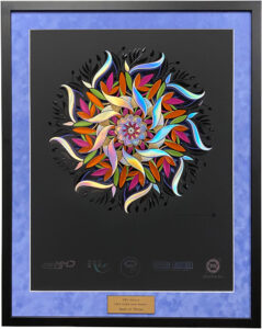
        With its vibrant appearance and roots in meditation, the mandala symbol has become a pop culture icon.

        The most challenging part of this project was keeping everything in register. When foiling started, Choquet said it was important to make sure all six foil passes – the orange, green, pink, gold, silver holographic and lavender – all were precisely in position. “We usually use the embossing die to fit everything perfectly, but the die was not ready, so we used a position film,” Choquet explained.

        Next in the process were the two UV coating runs and two stamping passes for the logos in the bottom section, done in black and clear holographic foil (the seventh and eighth foil). “One of the UVs is thermochromic, so if you press on the black UV over the lavender foil, you will notice that the UV becomes clear,” Choquet remarked. Additionally, the diecut and stripping were completed after the last UV coating pass. The last pass, the multilevel embossing, was produced on a Sheridan embossing press. 

        Gravure Choquet endeavored to complete production before Christmas, but it was finished in early January of this year. Cloutier was given 350 units for fundraising purposes, and the remaining mandalas were distributed to Gravure Choquet’s customers, prospects and suppliers. The mandala poster was extremely well received. 

        “They told us how unbelievable it is; that it’s a piece of art, mystical, and some even said it was the best piece ever produced,” Choquet shared. Honored by the recognition, Choquet said he, too, was quite pleased with the piece. 

        Gravure Choquet entered the mandala into FSEA’s 28th Annual Gold Leaf Awards in 2021 and won not only Gold in the Best Use of Foil and/or Embossing – Self Promotion category, but the judges also awarded it “Best of Show,” which is presented to the overall best entry from all the Gold winners in more than 35 categories. 

        “We are very, very proud, and it’s clear to us that the jury knows about foil and its challenges,” Choquet stated. He shared that the company is entering the mandala piece into two other contests and “we are confident to win further awards.”  

        Art and Paperboard – Metsä Board Showcases Specialty Techniques

        March 12, 2021

        By Brittany Willes, editor, PostPress 

        “There is an increased need for printed educational materials,” remarked Marko Leiviskä, graphic packaging designer for Metsä Board, Espoo, Finland. “The younger generation of designers is focusing more on electronic media formats. Printing and converting is a world of its own where designers can have a greater role in creating something with a ‘wow’ factor vs. just ‘Okay.’ But an understanding of how the process and equipment work to create outstanding visuals is needed. The printer and converter should be seen not simply as the place to print everything but rather as an important part of the creation chain.” 

        With that in mind, Metsä Board set out to create a promotional brochure that would showcase various specialty techniques, specifically hot foil stamping and embossing, demonstrating how printed pieces can be made to stand out. “The brochure serves as a tool for storytelling,” said Leiviskä. “Stories and pictures are easier to recall than technical specifications or details and can be used as a guideline for creating. That’s why we wrapped everything into one brochure.” 

        A particular story told by the brochure is how metallic effects can be utilized and enhanced to create a stunning piece. “Our perspective pays homage to the surface characteristics of metal,” Leiviskä continued. “There are techniques that can be used to enhance the metallic appearance – from cheaper to more expensive. We wanted to highlight and compare these.” 

        Metsa-Graphical-Brochure21-High-resTo do so, Leiviskä opted to have the brochure printed on Metsä Board Prime FBB Bright 355 g/m2 I 23.6 PT. “Because we used hot foil stamping on both sides, heavy grammage was chosen,” he explained. Thickness also played an important role. If the material was too thin, tooling marks easily would be seen from the other side of the sheet when the hot foil was applied with great pressure and temperature. 

        According to Leiviskä, the sense of touch also was an important consideration when selecting the paperboard. The reverse side forms the outside of the brochure; the side that the consumer touches. That’s why Leiviskä wanted to highlight the printing results and capabilities on that side. The front cover actually is the reverse side of the board and the opened spread is the coated side. 

        Because touch would be such an important element of the final piece, Leiviskä specifically chose not to use silver PE/PET laminated board to reduce the use of plastics and to reveal as much paperboard as possible. “Laminated surfaces would impact the touch and feel given that the consumer would be handling the plastic surface instead of paperboard,” he said.  

        The 3-fold design illustrates a variety of foil stamping and embossing choices, including the cover that was first foil stamped with a silver metallic and then overprinted CMYK. Demonstrations of overprinting foil, foil on top of printing, embossing, foil embossing and micro embossing were all present in the piece. “We even foiled on the reverse side, which is not usually done, to show that it is possible,” said Leiviskä. “We added microembossing of the foil to highlight what can be achieved with foils above and beyond applying them on top of the printing.” 

        For replicating the metallic output, “We showcased several options benefitting from the fact that offset colors are transparent, which allowed for the possibility of using overprinting with each process color,” he continued. 

        When it came to printing on the foil, common litho-offset was used instead of UV offset. “This works when special overprintable foil is used,” said Leiviskä. Using the hot foil stamping instead of PE or PET lamination when creating the metallic effect left paperboard surfaces visible on areas where the metallic did not appear and without the plastic lamination. Furthermore, water-based varnishes were used to keep everything as environmental friendly as possible. 

        Overall, the final product went through machinery approximately 26 times, with the final brochure boasting matte and glossy water-based varnishing with five different types of foil and embossing techniques. While the graphics and layout were done by Leiviskä, all specialty treatments, such as the foiling and embossing, were done by specialty finisher Starcke Oy in Eura, Finland. The brochure then was printed using 6-color printing (CMYK plus two Pantones) by Grano, Helsinki, Finland. The brochure was finalized in English before being translated into six additional languages. Luckily, all the special treatments were designed so that only the printing plates needed to be replaced, streamlining the production process and making it more efficient.  

        With so many elements at play, it is no surprise the brochure presented some challenges during the production process. “When you push everything to its limit and beyond trying to achieve perfection, you also face challenges,” Leiviskä confirmed. “For this project, we experimented with several foils before we started the printing process to find the right combination – printable foil that also adhered the best on the paperboard’s less-coated side.” While doing test runs, Leiviskä found that it helped to use water-based varnish on the reverse side, then apply the hot foil on top of the varnish and then print on top of the foil to get the best results. 

        “The foil sticks on the reverse side without the varnish,” he said, “but when you print on top of it, it may cause some challenges.” According to Leiviskä, this is a good example of the importance of knowledge of printing and converting with regard to the designer. “Understanding, pre-working and study of machinery and techniques in general help to overcome the challenges and master the cost effects,” he stated. “We are glad to have professionals like Grano and Starcke to help create such a demanding project.” 

        It is impossible to successfully complete a project like this alone. “This type of project, with this much sophisticated printing and embellishments, must have trusted partners and continued communication,” stated Markus Jensen-Eriksen, production director of Grano. Minna Tervo of Starcke commented that four different over-printable silver foils were tested and KURZ foils were selected for the project. Tervo, who was in charge of the project at Starcke, said that the machinery used for foiling and embossing were both Bobst and Kluge EHG and EHD foil stamping presses.  

        The brochure has been a great success for Metsä Board. “Response has been extremely positive,” said Leiviskä. “It has been warmly welcomed as a tool to communicate further on printing and converting-related subjects. The ‘wow’ effect has clearly been achieved.”  

        Elegant Packaging for “Breaking Bad” Remembrance

        December 9, 2020

        By Lara Copeland, contributing writer, PostPress

        What do a motorcycle club and a premier print consultancy and production firm have in common? They were both founded by the talented and creative David Drucker. In addition to orchestrating motorcycle rides to honor veterans and POWs, and delivering two pieces of steel from the World Trade Center to the Marine Museum in Virginia, Drucker, CEO of high-resolution, located in New York, New York, also has been creating unique commercial productions since 1983. In doing the work other Manhattan printers couldn’t do, Drucker and his company earned a reputation for delivering high-profile, intricate and demanding productions.

        As the hit crime drama “Breaking Bad” prepared for its final season, Drucker was contacted by AMCtv to create a special piece as a remembrance of the show. The idea behind the piece was to combine the show’s branding with design elements that reflect its premise. “We collaborated to produce a desk trophy for a very limited group of people,” he explained. Additionally, highresolution created unforgettable packaging to house the prize. “Each box was built by hand,” Drucker said. “We previously had worked with a particular manufacturer for very high-end, smaller boxes, and we knew he could give us the details we wanted regarding how this box opens, shuts and secures the product inside.”

        Breaking-Bad-2The sturdy packaging highresolution designed to protect the ornament was a heavyweight turned-edge sleeve and box that was wrapped in Hollander’s Arrestox Bookcloth, from Cover Material Sales Inc., Hyannis, Massachusetts. This covering is green linen, matching the show’s brand color, with a water-based acrylic coating, providing increased resistance to blemishes like tears, scratches and stains. The top of the box featured the show’s “Breaking Bad” logo, foil stamped with a green metallic foil.

        The material was wrapped over the edges before being glued to the inside as a hardcover book would be. “We used a nice, thick board on the inside so it would have a straight edge going around it,” Drucker added, “and I think that’s why it has lasted this amount of time.” To this day, years after it was first assembled, there is no fringing on the ends.

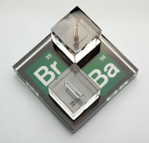
        The black felt-covered inside of the sleeve holds a drawer that easily slides out, thanks to a green ribbon attached to its outside. In the drawer sits a fitted, two-inch-thick section of padding – a piece of foam covered in black flocking – containing four identical cutouts. Two of the cutouts hold a pair of two-inch acrylic cubes each with a glass vial – one with Bromine, one with Barium and both with screen printed acetate featuring the appropriate element’s chemical symbol and atomic number embedded into the acrylic.

        In his mind, Drucker pictured the cubes not on a wooden or metal base where light would detract from the piece, but he imagined light coming through them. “I needed to figure out how to acquire that light,” he said, “so I built a custom-poured acrylic and branded the bottom – something I’d never done before.” This transparent, 5″ x 5″ x 1½” acrylic base sits under the padding and hand-polished cubes, allowing the chemical symbols that have been screen printed reverse image in green, white and black to be visible from nearly any angle. On the bottom of the base are silicone feet, “so somebody could lift it with their finger without it sliding and scratching their desk,” Drucker stated.

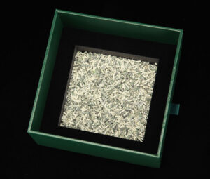
        Breaking-Bad-moneyClearly, a lot of thought was given to each aspect of how this entire piece was built – even to what lies beneath to cushion the trophy. Staying in theme with the show, underneath the base sits a pile of cash. Unfortunately, the $100 bills are shredded, but thankfully they help protect the printing on the bottom side of the acrylic.

        Drucker takes considerable pride in understanding each one of his projects inside and out before he ever writes it up as a job order. “For me, the key is information and quality,” he said. So, it should be no surprise that he knows each hiccup or hardship that comes with a project. For example, in their research, the design team discovered a German company with the two relevant elements encapsulated in acrylic squares, but the company didn’t have enough of either for this particular project. After checking pharmaceutical companies in the US, Drucker said that his client found some in England. “This was the missing link in producing this piece,” he exclaimed. However, during the heating process, one of the capsules began to leak during a test run. “We ended up having to get a new round, and when we ran that test we were able to successfully encapsulate them,” he added.

        “The creative process is what they called me in for,” Drucker noted, adding that his client was quite pleased with the finished product, a blend of old world and modern technology. Starting with the desired end result in mind, Drucker worked backwards – considering substrates, the vehicle for shipping and protecting, and all of the major and minor details to make this a one-of-a-kind treasure.

        All Wrapped Up – Tru-Cut Christmas Box Creates Holiday Magic

        December 9, 2020

        By Brittany Willes, editor, PostPress

        “It’s a yearly tradition at Tru-Cut to do an end-of-year promotional piece that we can give to our customers,” remarked Sales Manager Andy Archuleta. “It’s something that we all get excited about because it gives us a chance to really show off our talents.” In 2019, the company decided to go all out on its end-of-year piece, wanting to showcase a truly one-of-a-kind Christmas box. According to Archuleta, this began the “crazy, difficult and rewarding journey to the incredible box we ended up with.”

        The design and creation of the holiday box required a massive effort from members of the Tru-Cut team, as well as outside sources. The box would feature Tru-Cut’s print finishing, steel rule die and laser cutting abilities, along with a number of other specialty effects. “I wanted to incorporate micro-etching, embossing, combo stamping and spot UV coatings,” Archuleta explained. With that in mind, Tru-Cut Graphic Designer Scott Coggin began developing artwork using a combination of custom and modified stock images to create a final design that was “an absolute monster” in the best possible sense.

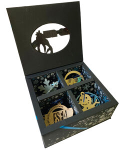
        TruCutThe box itself was designed as a large hollow-wall box with four cavities on the inside – three for ornaments and one for chocolates. Right away, this presented a challenge as it was discovered the box would not fit on a single 28″ x 40″ sheet. As a result, the box was built to require two sheets each. “Our main CAD designers for the structure, Kevin Goodrich and Nicole Farnsworth, really knocked it out of the park with a cool revealed-edge bottom and top that would wrap around the main hollow-wall box,” said Archuleta.

        With the overall structure in place, it was time to focus on the embellishments that would make the box stand out. “We knew, even at a small run of 350 to 400 boxes, that this was going to be quite an undertaking,” he said. In fact, the final box would require 13 passes through the presses. Four passes were needed to apply the spot UV – one clear and three colored coats. Two passes were required for the combo foil and embossed ribbon, with three passes for the main logo, a micro-etched foil stamp, print and emboss (plus the clear spot gloss), as well as a flat foil stamp on both the inside bottom and outside front. Finally, two passes were needed to emboss and deboss areas for the front magnetic closure with hidden sealed-in magnets.

        “We decided on a black box that would allow all the embellishments to really pop,” Archuleta explained. “We got some uncoated 18-point black folding board and started experimenting.” After experimenting with satin, gloss, soft touch and aqueous coatings, the final design utilized three coats of soft touch.

        “I was worried about the paper curling too much or becoming brittle, but the soft touch actually made it very supple and gave it a luxurious coated feel,” said Archuleta. “This saved us a great amount of cost and gave us a very workable and good surface to stamp and work on.”

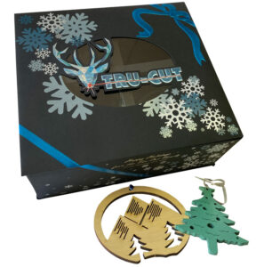
        TruCut-openAs part of the Christmas theme, Tru-Cut adapted its usual logo featuring a laser burst and replaced it with a reindeer with a beaming red nose. The logo was printed 4-color offset on a Mitsubishi Diamond UV press and stamped with over-printed foil provided by Infinity Foils. A critical feature of the box, the logo also was micro-etched and featured a sculpted emboss that needed to line up with the graphics that were over-printed on the foil and sealed with spot gloss UV. Part of those graphics consisted of a hand-drawn, wraparound, combo foiled ribbon and bow that were matched up and fitted together seamlessly.

        “Every single thing we incorporated on this box had to register perfectly to each other,” said Archuleta. To that end, Tru-Cut approached Universal Engraving, Inc. to make the micro-etch pattern die. “As soon as we saw the first stamp of silver with the micro-etch die, we knew we were onto something special. It looked amazing just by itself.”

        Tru-Cut also reached out to one of its customers – International PaperBox – for assistance. “International PaperBox had the task of hitting this small patch of silver on a solid black sheet with a screened-back printed graphic to allow the foil and micro-etch to shine under the print,” said Archuleta. Once that was accomplished, Archuleta realized the ink would need to be protected. To do so, it was sealed with spot gloss UV, which allowed the ink to shine and pop off the paper.

        Before the sheets could be embossed, the rest of the colored spot UV and combo foiled ribbon work had to be completed. “The ribbon running around the full box had to be combo stamped to make it look like the ribbon was sitting on the surface,” Archuleta stated. The process required some trial and error, but with the help of Universal Engraving, the sculpted foil and embossed detail was perfectly rendered.

        With so many elements in play, it is little wonder the box presented some challenges. As Archuleta mentioned, the diecuts had to line up perfectly with the graphics, resulting in Tru-Cut designing and building two diecutting dies in-house. The boxes also had to be glued and assembled by hand, including inserting a clear window on the lid. “All of the gluing was hidden with folded-over panels to give a polished and finished look,” he said. Furthermore, to create the colored spot UV snowflakes, Tru-Cut had to get even more creative.

        Using blue and white UV inks supplied by Graphic Inks, Archuleta began hand mixing the ink with Fuji clear coating, trying to get the right colors. “I had to get enough white in the mix to get the blue to show up on the paper,” he said. “I finally was able to get three distinct colors that were opaque enough to pop on the black and that matched with the colors that were printed on the main logo.”

        The combo ribbon likewise presented its own special challenges. The etch on the die was fairly deep, and the combo foil/emboss would need to go over areas that were going to be scored and folded. “Anyone who has done combo work knows it is very easy to crack the paper on the edges of the stamp,” Archuleta remarked. “Plus, the paper wasn’t the most forgiving. It took us a bit, but we finally were able to get our pressures and temperature right to get a nice, clean stamp without breaking the paper.

        In addition to the box, special Christmas ornaments also were created to fill the inside cavities. “Our CAD department had the idea to laser cut some ornaments out of all the wood we had lying around,” said Archuleta. After being laser cut, the ornaments were spray painted, assembled and tied with ribbon.

        “We wanted to push the boundaries of what we usually see in this industry and invent new processes that could be repeated if customers wanted to incorporate these processes into their own pieces,” Archuleta affirmed. “It was a lot of trial, error and evolution through the process. Luckily, we have people with decades of experience and knowledge in all of these areas, and we knew many of our ideas were going to work if we pushed hard enough.”

        Pushing hard certainly paid off. Several Tru-Cut customers stated the box was one they won’t be able to throw away. For Archuleta, this represents an incredible accomplishment. “To create a box that people feel is too nice to throw away…We don’t get that honor too often in this industry. To have our company name and logo right on the front is pretty neat.”

        Tru-Cut’s Christmas box was submitted for the 2020 FSEA Gold Leaf Awards where it received a gold award for Best Use of Foil/Embossing – Self Promotion (Holiday).

        Celebrating in Style – SpongeBob Turns 20

        December 9, 2020

        By Brittany Willes, editor, PostPress

        “Who lives in a pineapple under the sea?” – SpongeBob SquarePants Theme Song

        Few people could hear the iconic opening line to one of Nickelodeon’s most well-known shows and not immediately feel the urge to shout “SpongeBob SquarePants!” while singing along with rest of the song. First aired in 1997, the show boasts an impressive record as the number one kids’ animated series on television for 17 years – an accomplishment that all but demands celebrating.

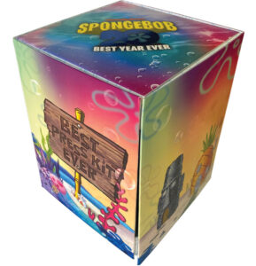
        Commemorating 20 years of the pop culture icon, Nickelodeon released a press kit – SpongeBob 20 Best Year Ever – which takes SpongeBob out of his pineapple to be showcased in an interactive package designed to appeal to anyone familiar with the beloved character.

        When it came to creating the interactive packaging, “It was a challenging but rewarding process,” said Mitch Holsborg, president of C&C Bindery and Packaging, Farmingdale, New York, who worked with Nickelodeon to design and construct the press kit.

        At first glance, the presentation box delights viewers with colorful artwork depicting the well-known images and landscapes of SpongeBob’s undersea home, Bikini Bottom. The graphics originally were created by Nickelodeon before being fine-tuned in-house, along with the final package design, by C&C Structural Engineer Richard Vallone.

        It wasn’t enough for the presentation box to simply showcase some of the show’s iconic artwork. That art needed to pop out at viewers. Various specialty effects and coatings were incorporated into the design to make this happen. The outside of the box features Infinity Blue metallic foil and spot UV coating to help draw attention. Sheets were diecut on a Bobst 102EII diecutter, with foil stamping performed on a Saroglia foil stamper. The package was offset printed, with the spot UV coating applied over the offset. All dies were supplied by Universal Engraving, Inc.

        With the final artwork nailed down, attention turned to creating the presentation box itself. As the package was meant to be interactive, a sturdy structure was crucial. As a result, C&C opted for 100lb text stock that then was mounted two sides over e-flute. Part of the challenge of the box was that each one had to be folded, glued and assembled by hand.

        Another challenge C&C faced was figuring out how to incorporate a plastic SpongeBob figurine into the packaging while having it remain an interactive element. The plastic figure features moveable arms with a rainbow glued to its hands. The SpongeBob figure wasn’t the only interactive element that had to be incorporated into the inside packaging, however. Nickelodeon also provided a USB in the shape of a pineapple that would need to be showcased as well.

        “Making the figure and the USB stand out and seem animated were  challenges,” said Holsborg. In the end, SpongeBob was secured inside the display box using ties and reinforced with a cardboard stand. “Integrating a plastic figure with paper and coatings and making it interactive took the talents and experiences that C&C has been known for,” he reaffirmed.

        C&C’s efforts to create a truly unique interactive presentation box were well received. According to Holsborg, the box continually has been described as one of the best interactive package designs ever. Furthermore, the box received a silver award in the 2020 FSEA Gold Leaf Awards in the Best Use of Foil/Embossing – Rigid Box category.

        Foil Innovation Catches the Eye for Added Value Brand Packaging

        December 17, 2019

        By Lara Copeland, contributing editor
        PostPress

        The visual appearance of a package is critically important to a product’s success and lasting shelf appeal. The packaging itself offers the brand owner the last opportunity to convey important messaging to discerning consumers and influence their purchase. Through the use of special effects beyond printing, the look of the package can be elevated to a new level to engage, stimulate and tempt the consumer, producing a premium brand experience. It also provides a measure of deterrence against piracy.

        Fresnels Inc., Stamford, Connecticut, manufacturer of optical variable foils, hot stamping foils and laminates, called upon Glory Innovations, Inc., New Taipei City, Taiwan, to help create a special wine box to showcase the company’s foil capabilities. Glory Innovations is a printing company and luxury rigid box manufacturer with locations in Taiwan and China.

        The Tenute Glory wine box, entitled Spumante Brut – Rosé, was first 4-color printed with a vibrant flower design on white carton stock from Iggesund. Fresnel’s optically variable clear Peacock foil then was applied to spell out the word “ROSE” with a separate letter on each side of the wine box. This was foil stamped on the white surface to see the shifting of color utilizing an etched die from Carlo Gasperini that created a “chiseled” effect within each letter.      

        The Peacock foil also was used with a combination (foil and embossing) die from Carlo Gasperini embossing the 4-color printed flowers in perfect register.

        “The idea was to showcase our clear optically variable foil on both a flat white background and also on a colorful embossed image for viewers to see it used in both types of applications,” explained Fresnel’s COO Dr. Glenn Wood. “It was amazing the perfect registration that was achieved with foiling and multi-level embossing the flower image.”

        The other important embellishment that Fresnel wanted to showcase on the box was its Cellini technology. It is a nanotechnology-based imaging technology that creates colorful, 3D holographic images. A special image with the Fresnel and Cellini name was created and applied to each wine box utilizing a hologram registration system to read each hologram as it enters in position.

        Custom-made using proprietary technology designed for high-security application, each Cellini image contains three levels of security. Level one is overt and intended for consumers. Level two requires a handheld device, such as a magnifier, which can reveal features such as microtext. Level three is the forensic level, which is discussed only with the brand owner who can feel reassured that this decorative feature is doing double duty as an eye-catching print enhancement feature and an anti-counterfeit device.

        Glory_Rose_GoldLastly, a soft copper metallic foil was applied to display a Tenute Glory logo on three sides of the wine box and a circular pattern of dots around the word “Rose” on the front side of the box.

        The Spumante Brut – Rosé promotional wine box has been recognized by FSEA, receiving the Gold Leaf Award for technical difficulty in the Best Use of Foil Embossing on Folding Carton category. As relative newcomers to the stamping foil market, Wood was pleased to accept the award.

        “It’s encouraging to be recognized as serious players in the highly competitive market,” he commented. “We are bringing highly innovative, eye-catching features to luxury packaging, which incorporate advanced optical technology. This provides packaging designers with new graphic tools in response to the current trend for color-shifting effects and provides a measure of deterrence against piracy.”

        « Previous Page
        Next Page »


        The Official Publication of the Foil & Specialty Effects Association
        © 2025 All Rights Reserved
        Peterson Media Group | publish@petersonmediagroup.com
        785.271.5801
        2150 SW Westport Dr., Suite 501, Topeka, KS 66614